Sophie Lamb, postgraduate intern
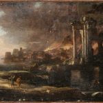
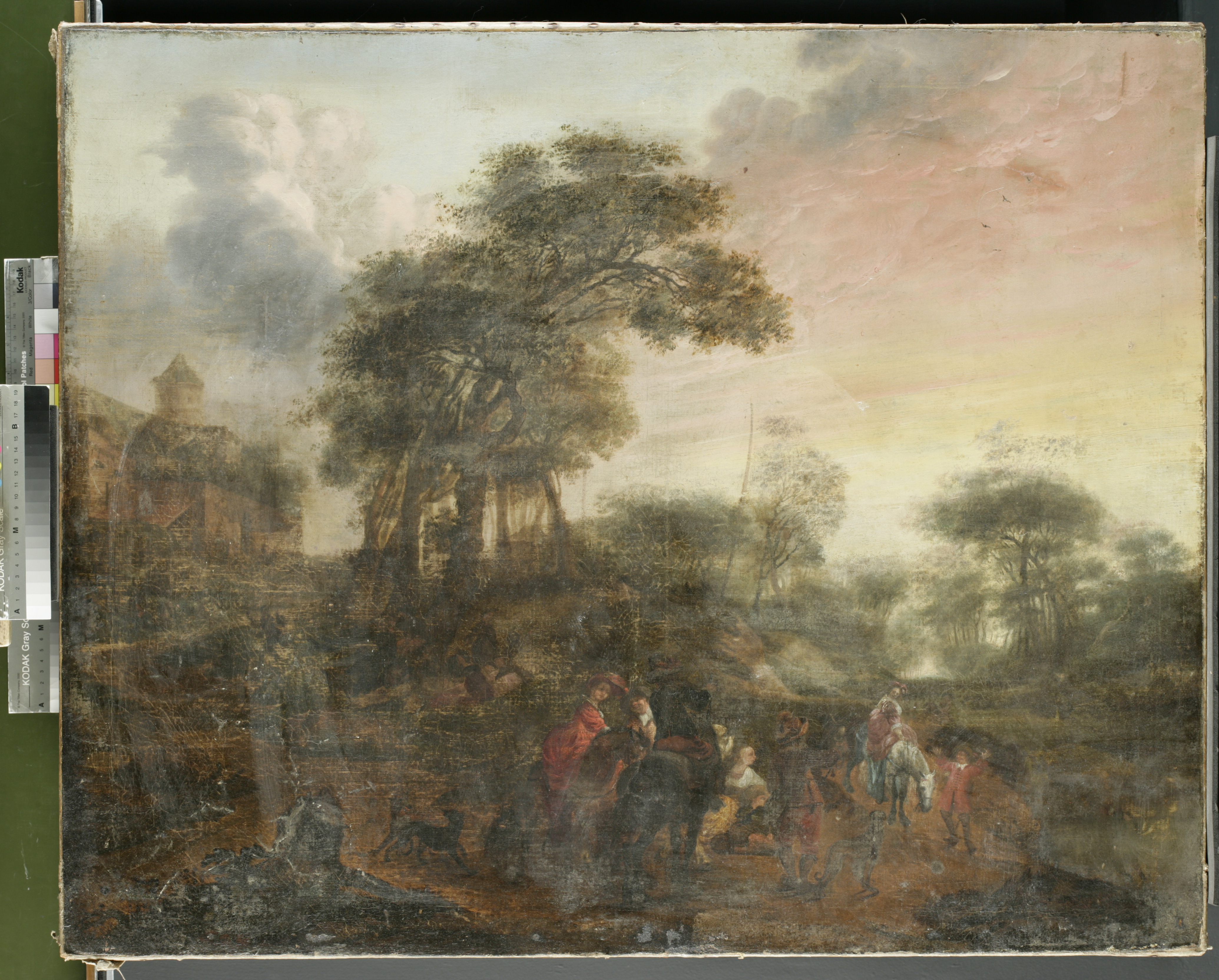
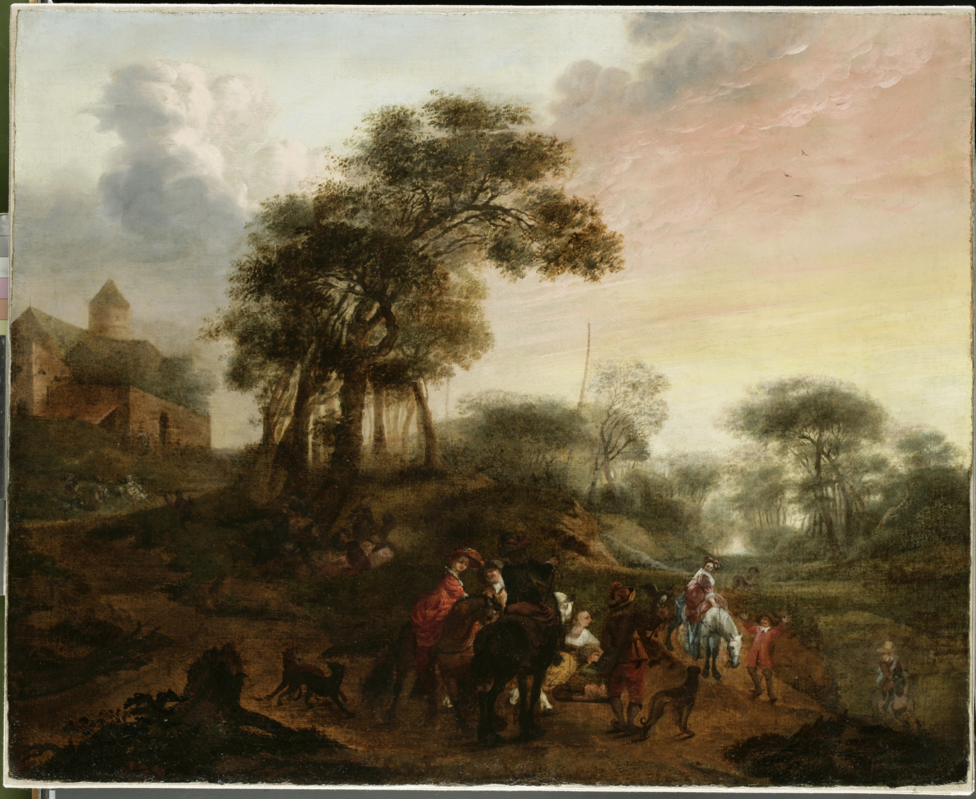
Flowers, Insects and Reptiles by Otto Marseus van Schrieck is an oil painting on canvas, dated 1673. This work was brought to the Hamilton Kerr Institute for treatment and investigation, after receiving generous support from the Woodmansterne Art Conservation Awards in 2019. The painting belongs in the Fitzwilliam Museum collection. It was bequeathed in 1834 by Daniel Mesman and is one of three paintings by this artist in the Museum. Only two other paintings by van Schrieck are held in public collections in the UK.
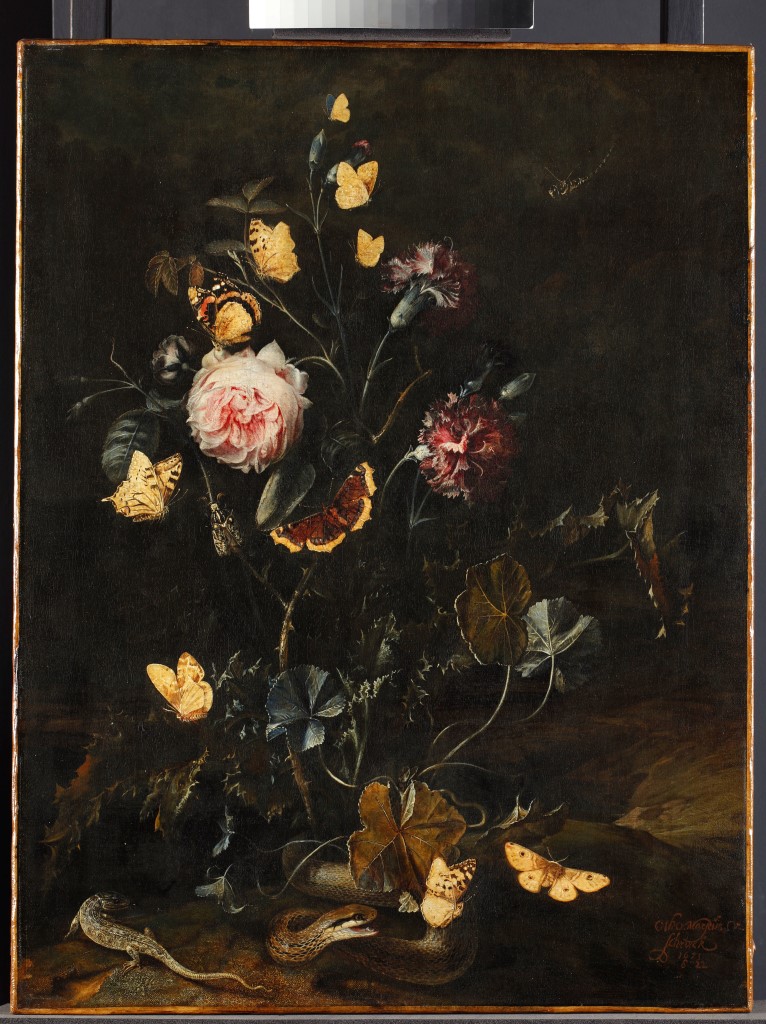
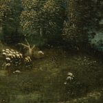
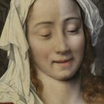
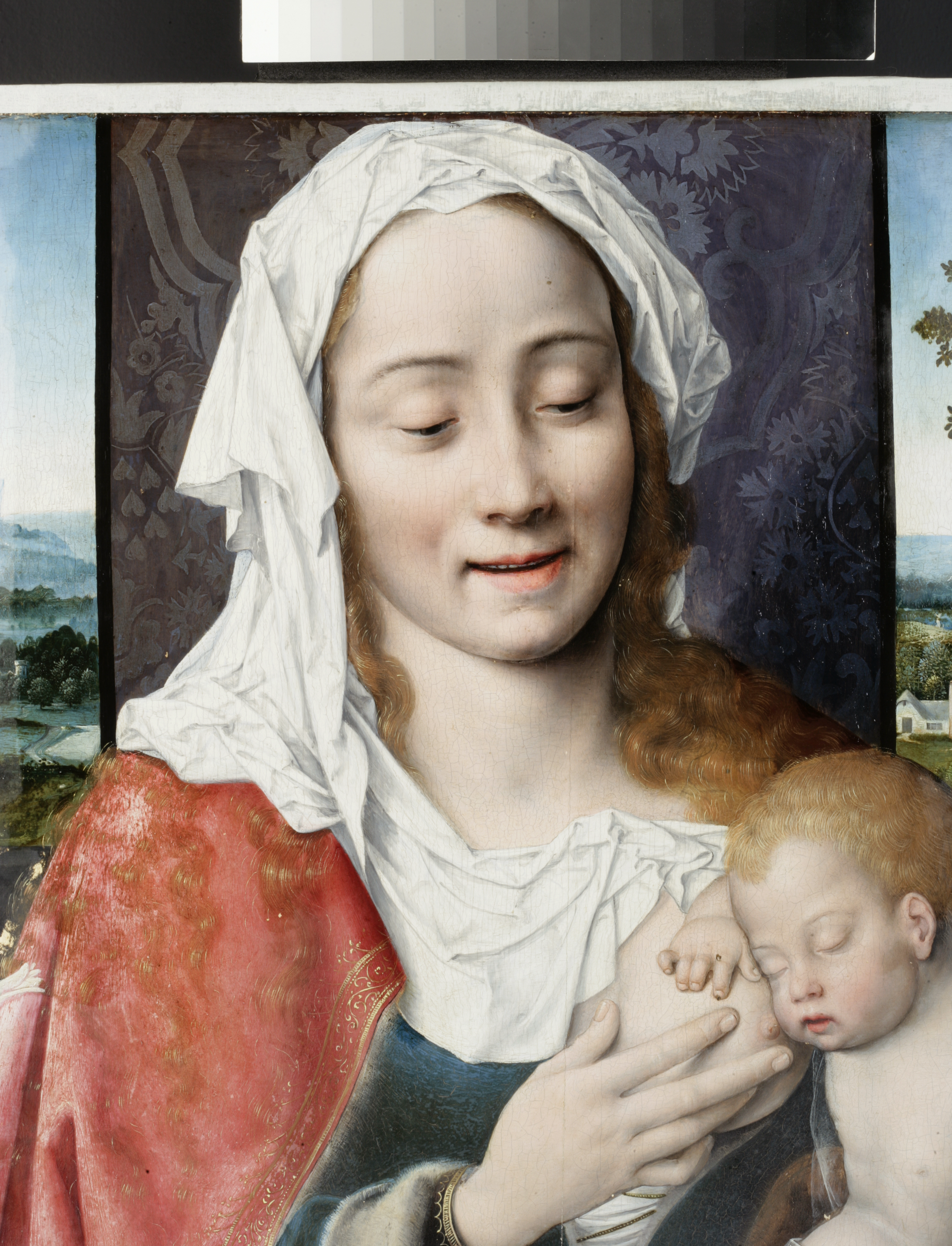
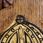
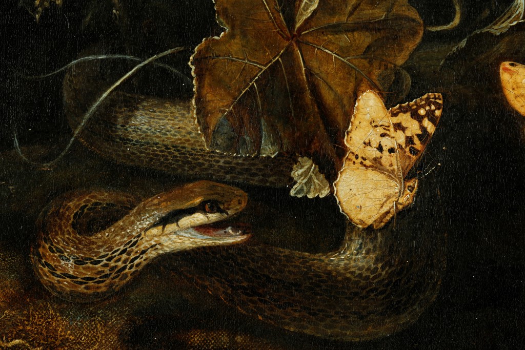
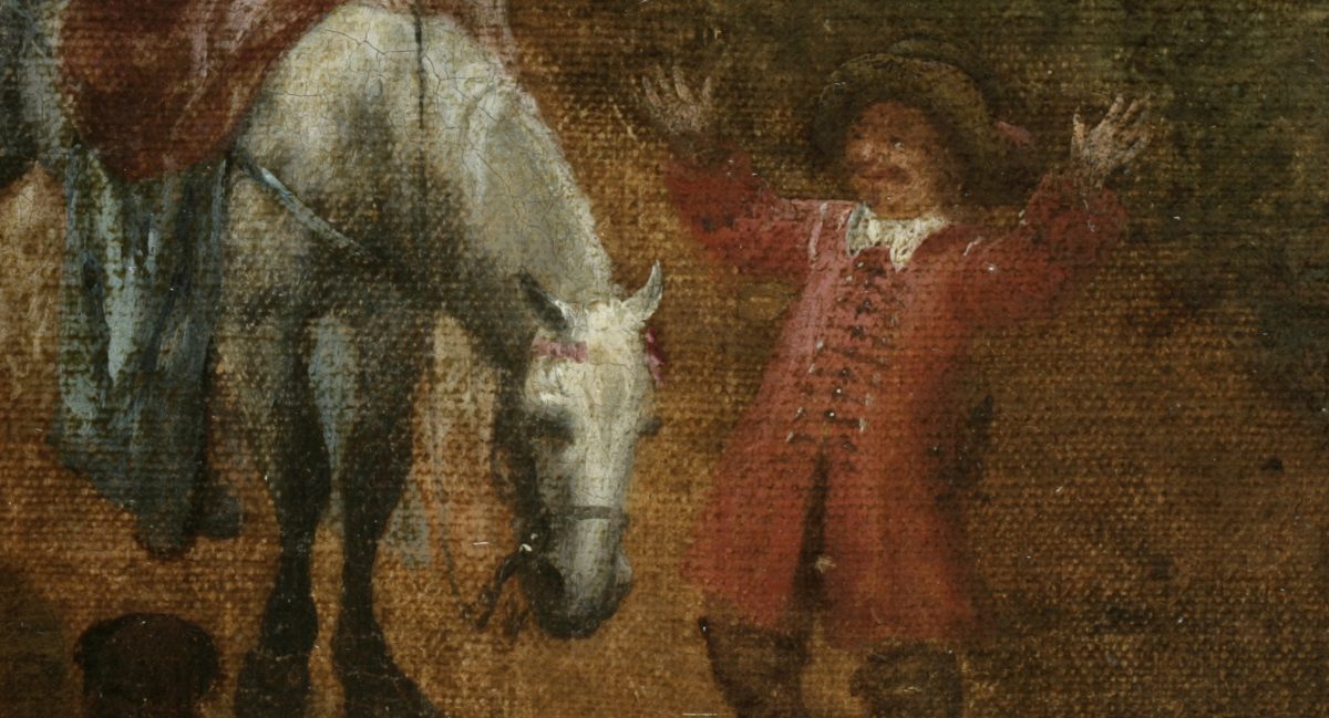
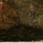
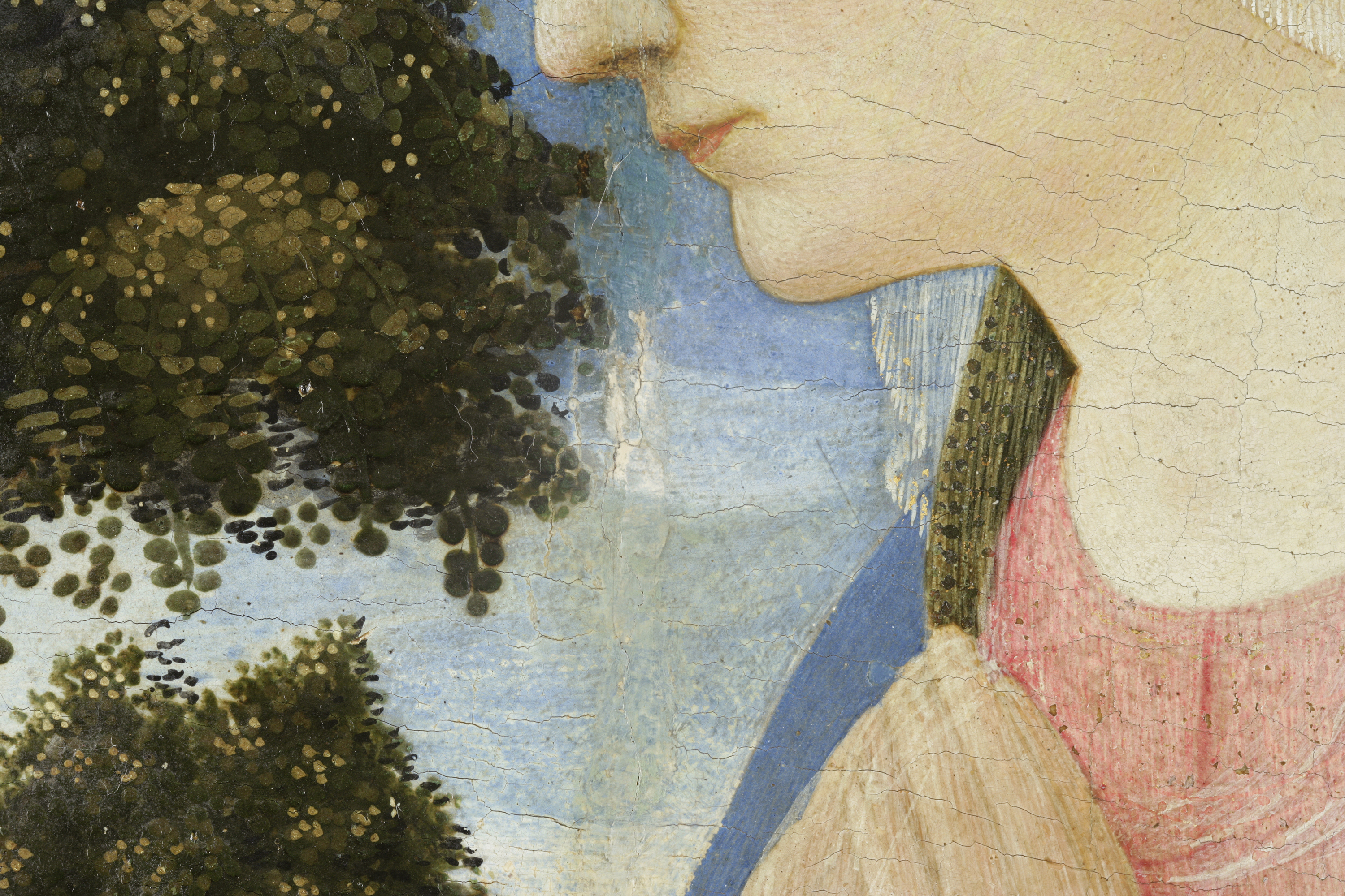
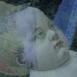
Flowers, Insects and Reptiles depicts a nocturnal gathering of creatures by the edge of a pool of water. The grouping is lit by pale light coming from the left-side of the composition. From a mossy patch of earth in the foreground springs a cluster of thistles, weeds, carnations and a rose, and around this composition are numerous butterflies and moths, dragonfly, lizard and a snake, which snaps out from behind a leaf at a passing butterfly.
Otto Marseus van Schriek was a Dutch-born painter active in the later part of the seventeenth century. He travelled to Rome early in his career and later set up his home and studio in the marshy outskirts of Amsterdam known as “the land of snakes” (Jorink, 2014). He is known for creating a signature genre of painting, the forest floor still-life, which is often termed sottobosco in Italian. This genre developed from conventional floral still-life painting, shifting the floral ensemble out of vases and into the forest, resulting in eye-level portrait of the dark world of the undergrowth and the creeping fauna that inhabited it. His works teem with reptiles and amphibians, toads and snakes, and, hovering above, butterflies and moths.
Otto Marseus Van Schrieck was fascinated by animals and was especially intrigued by the small reptiles and amphibians that could be found around the ponds and wetlands near his home, just outside Amsterdam. Collectors and dealers visiting his studio would be shown the menagerie of snakes and creatures he bred and kept as models for his paintings. He spent so much time hunting around the damp woodland and undergrowth that he earnt the nickname ‘Snuffler’ amongst the circle of painters he socialised with (ibid.). Van Schrieck worked on the borders of art and science (Seelig, 2018); he was interested in Natural History and especially in the discussions around spontaneous generation, which is reflected in the accuracy of the animals depicted in his works, although set in fanciful imaginative situations.1
Van Schrieck’s technique and use of butterflies
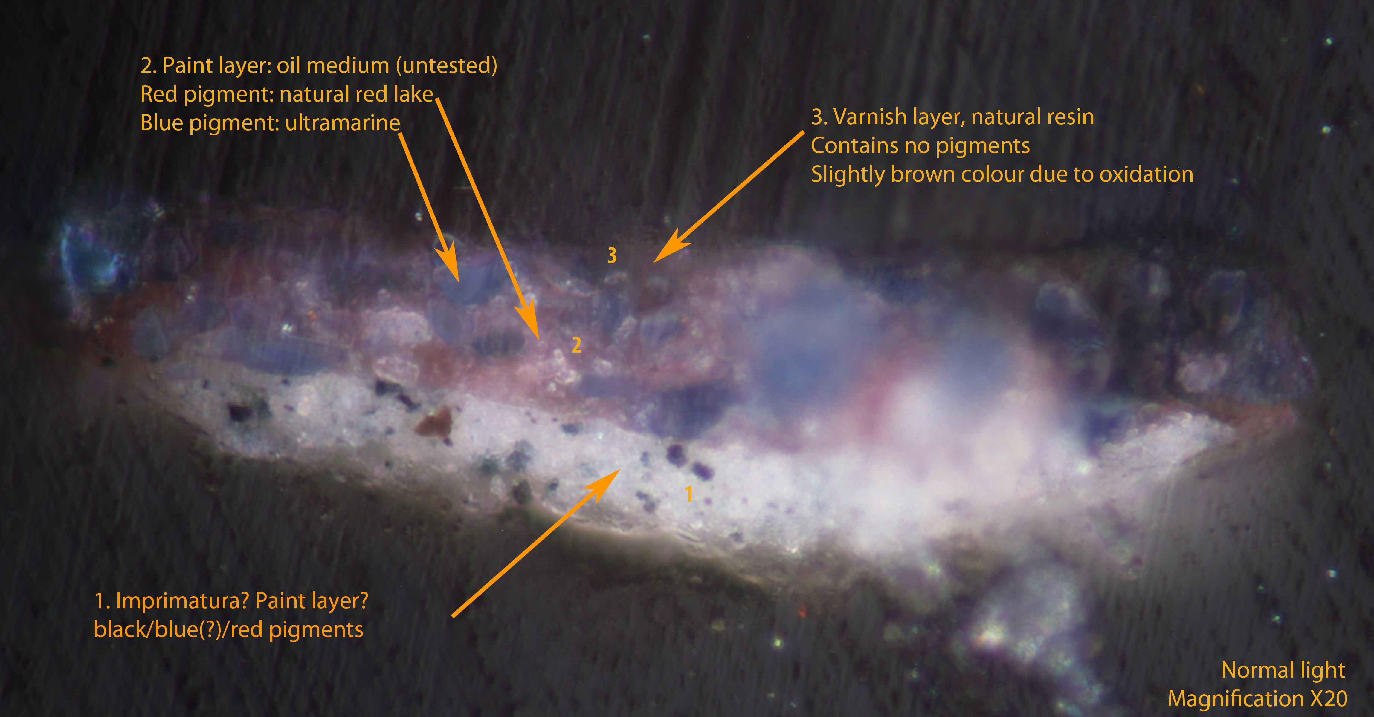
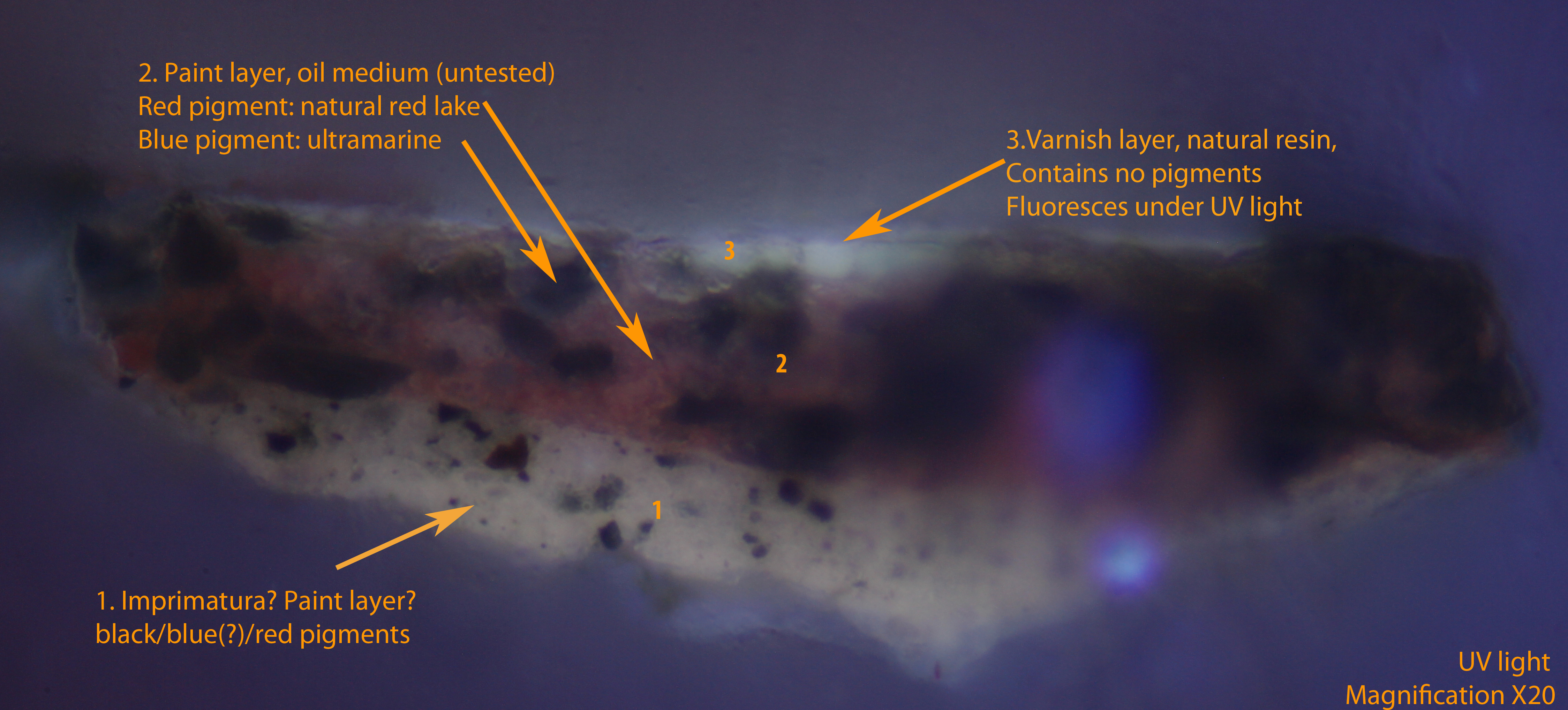
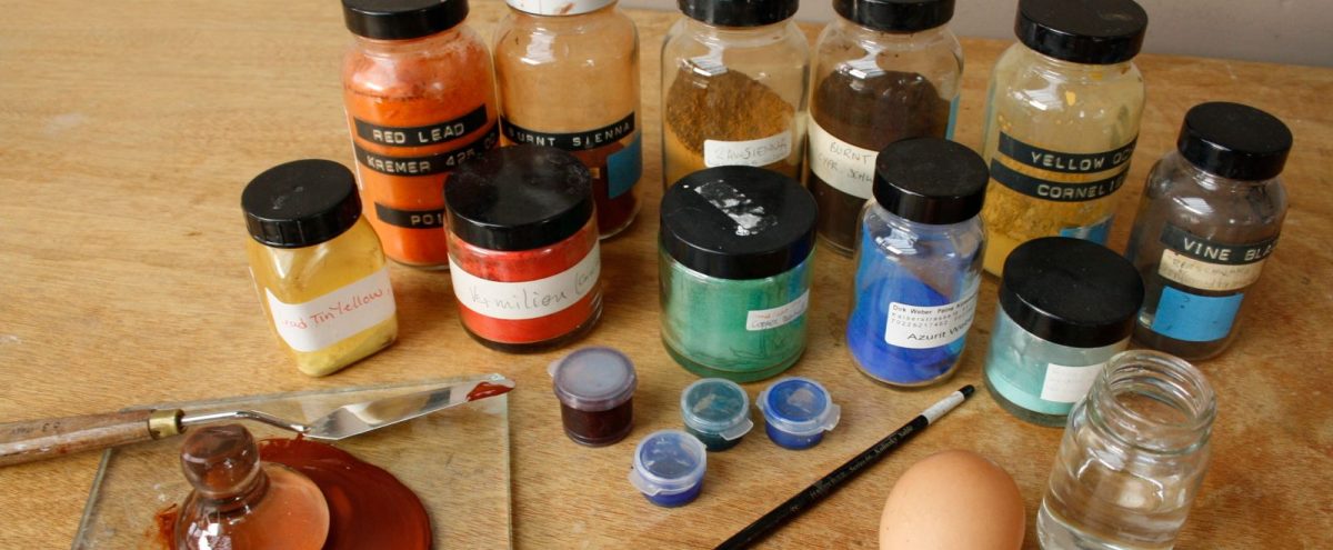
Van Schrieck was commercially successful in his lifetime, and so would have developed a methodical approach to painting, since it would be economically effective to do so (Madeleine, n.d.). In terms of the materials he used, it is likely that he did not prepare his own canvases, since readily prepared canvases were available to buy in the Netherlands at the time (Wallert, 1999). A canvas maker would typically size the linen canvas with an animal glue such as rabbit skin, in order to protect the fabric from the potentially damaging effects of oil paint. Following this a ground layer would have been applied to provide a suitable surface on which to paint. This painting has a reasonably thick application of a white ground, which may be either lead or chalk based. It was often the case that an artist would apply a second layer of priming in a preferred colour to work on; however, it is not clear whether van Schrieck applied this second priming before painting (Howard, n.d). He would then start by making a detailed drawing on the priming; artists contemporary to van Schrieck were known to make the underdrawing in silverpoint, black chalk, or ink. The painting would then be built up in layers, consisting of an imprimatura (a first wash of a single colour), then the dead-colour (a flat wash of colour for each form depicted), followed by successive layers of glazes to model shadow and form, and finally fine details such as patterns and highlights (ibid.).
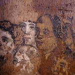
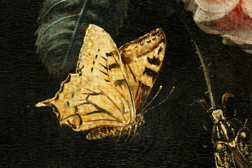
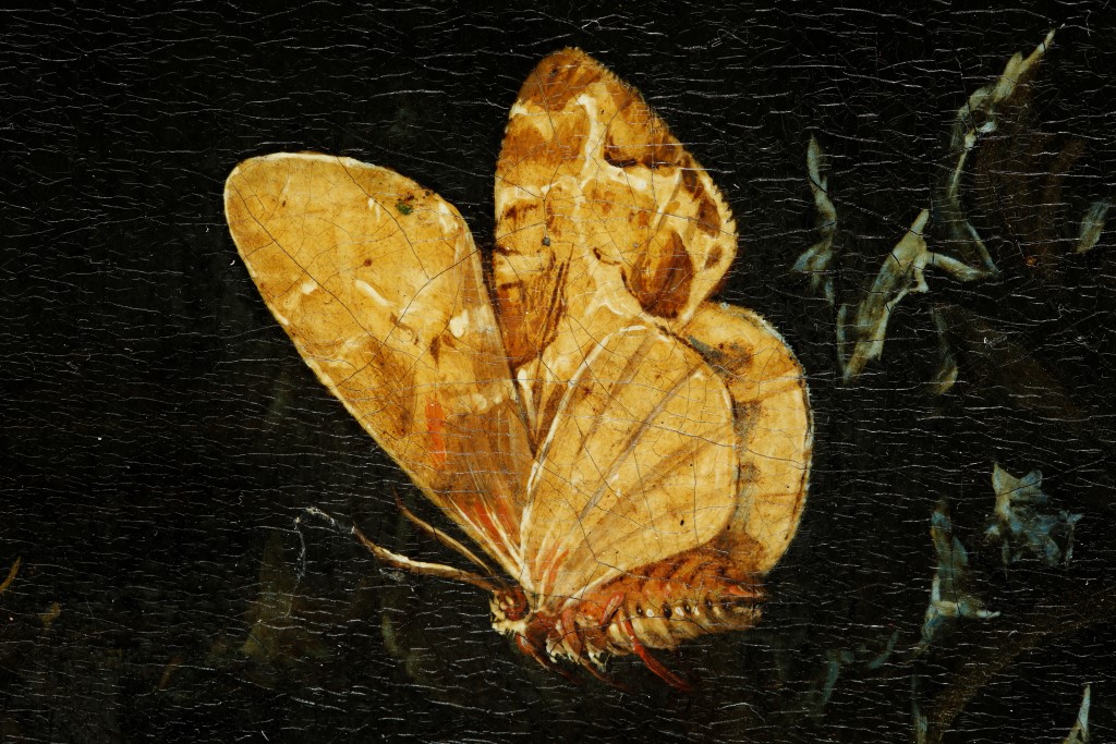
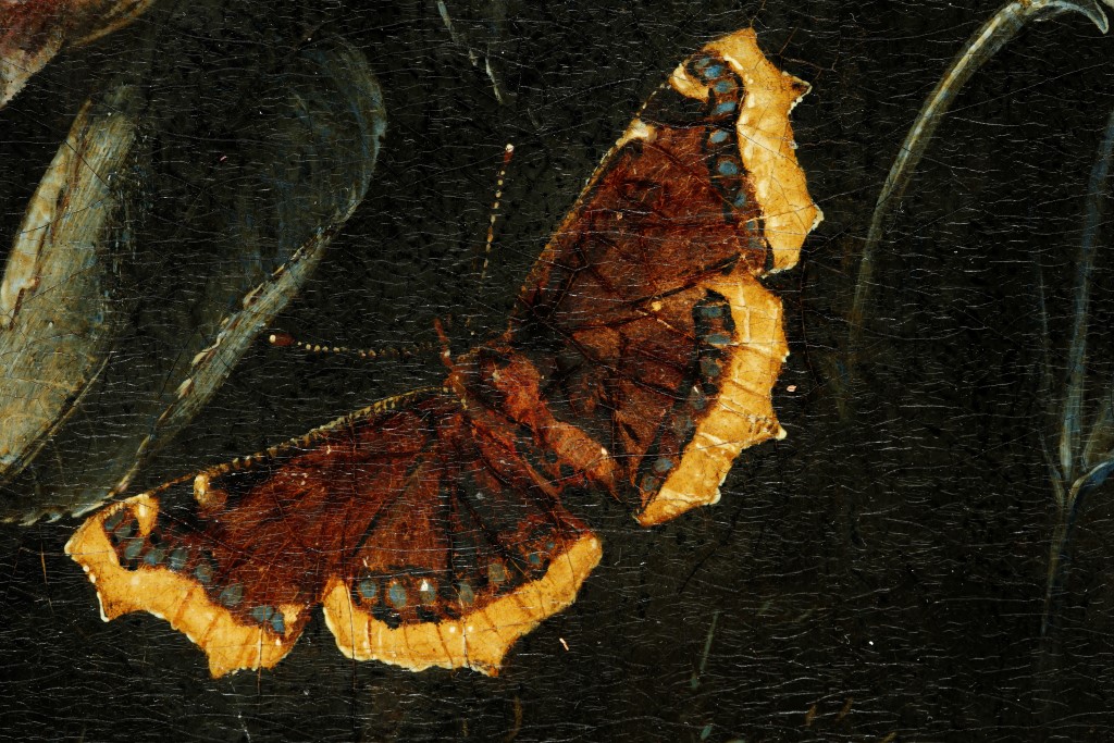
Van Schrieck carefully arranged the composition of the intertwining thistle, flowers and reptiles to give an illusion of movement and depth. For example, the thistle shown in the left of the foreground is depicted convincingly in a three-dimensional space; pale light reflects off its prickly edges. The lighting of the scene is complex with emphasised contrasts of light and dark, and this gives it a sense of tension and movement. One feature stands out arousing curiosity: the butterflies. These have a stiff and static appearance, which contrasts with the naturalistic depiction of the foliage and reptiles around them. The butterflies appear noticeably pale and yellow against the dark background, as if they exist in a plane superimposed onto the rest of the composition.
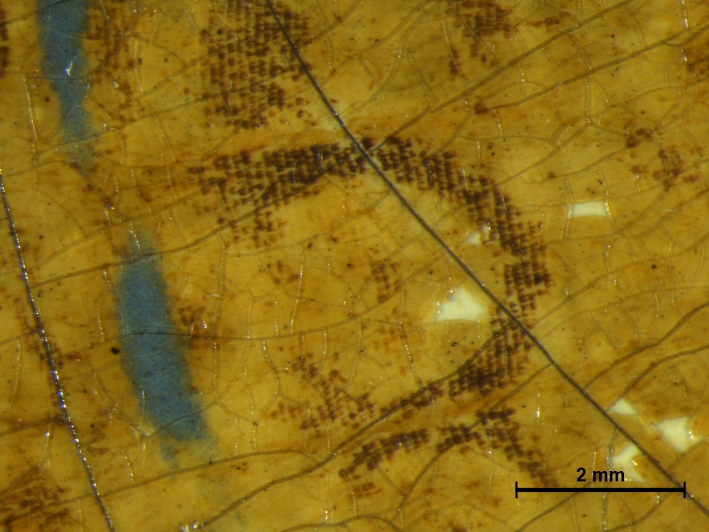
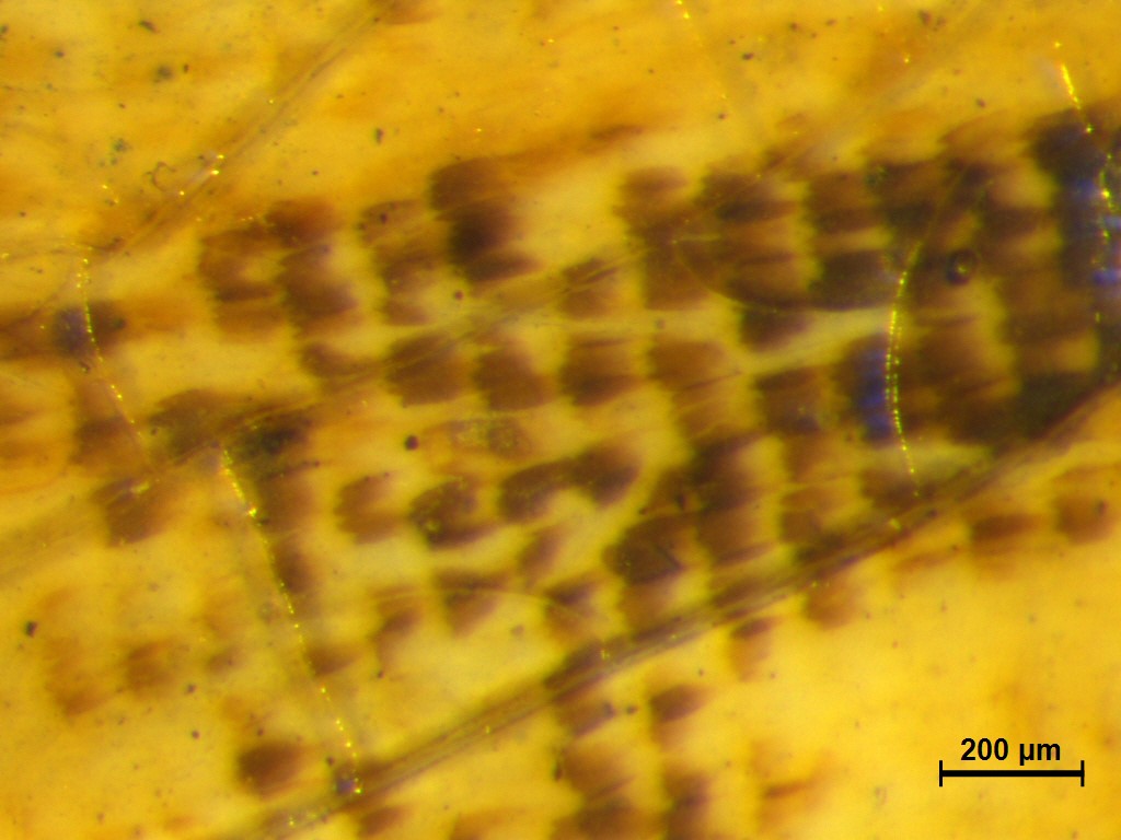
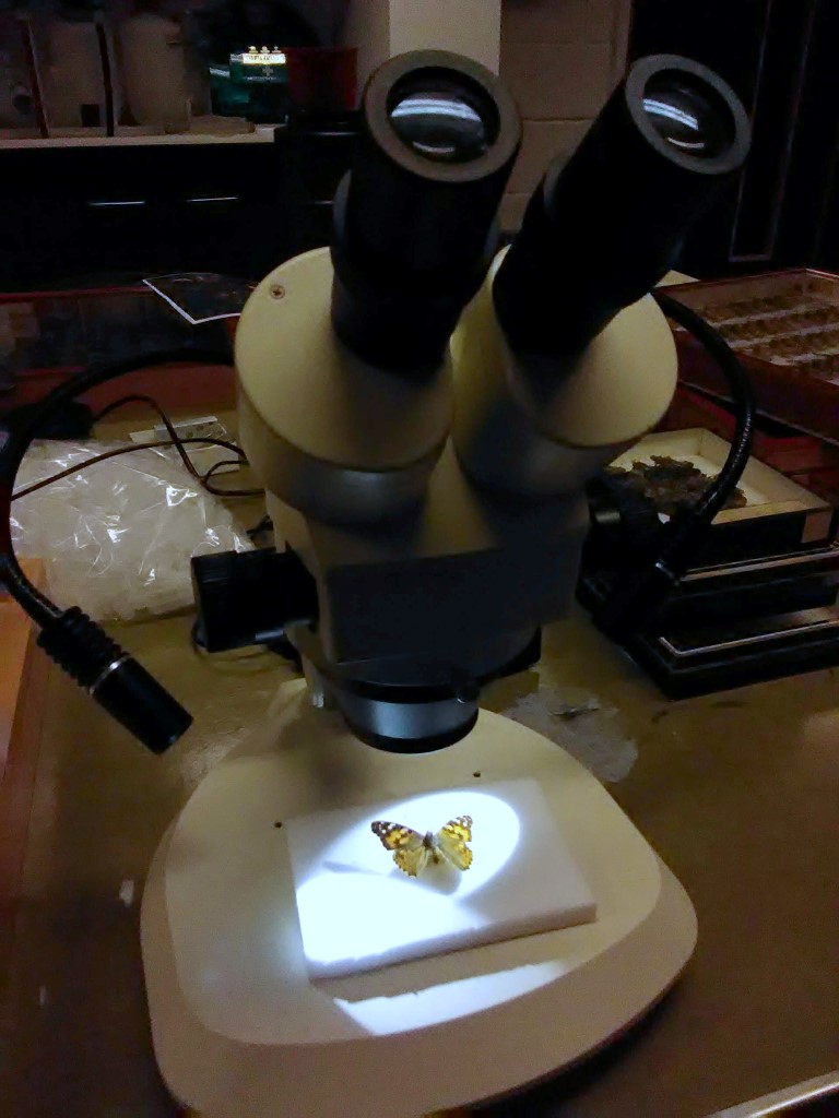
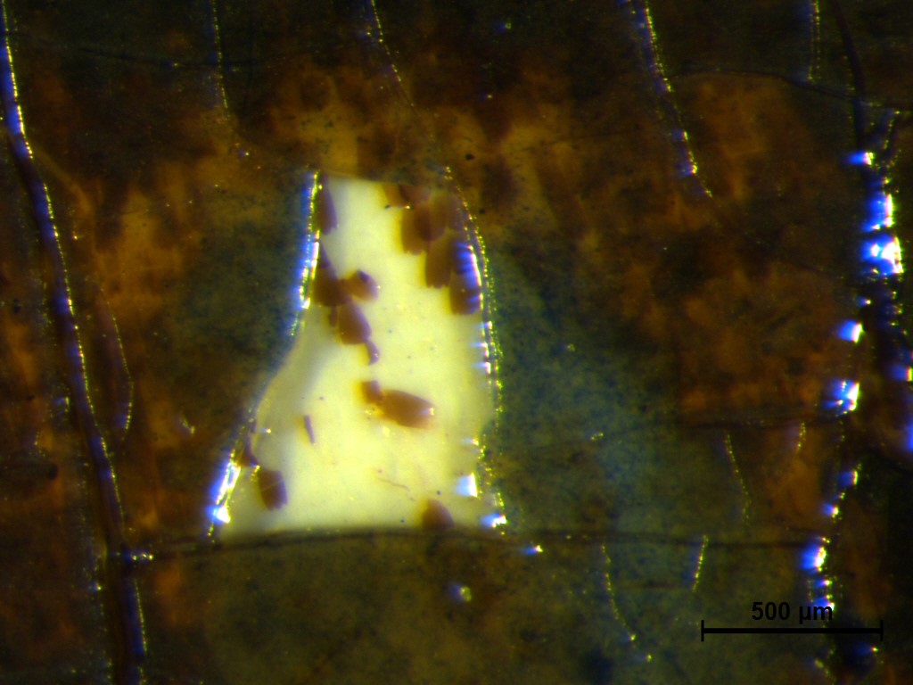
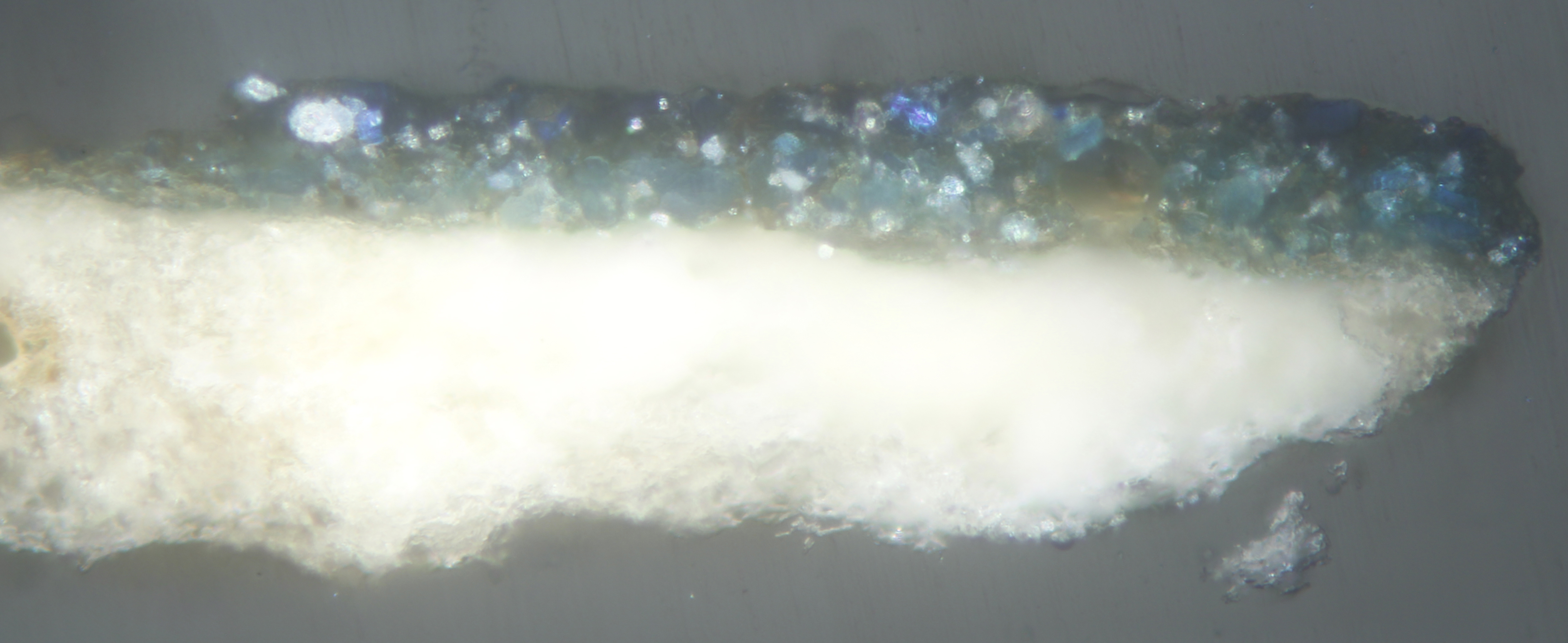
On inspection under a microscope, a regular pattern of minute scales can be discerned on the butterflies’ painted wings (Webexhibits, n.d.). Van Schrieck practised the unusual technique of pressing butterfly wings into wet paint so that the tiny scales remained caught in it, and the butterfly’s natural colours became a part of the painting. Using a brush he would then paint in the body and make small corrections. In order for the wings not to disappear against the dark background paint, a butterfly-shaped reserve would have been created in white prior to their application, to allow reflected light to shine through their colours (Steensma, 1999). This technique, which has been identified in other works by van Schrieck, is also evident on this painting (Ibid; Beier, 1987).
Opinions differ about precisely how the scale transfer technique was carried out; one theory is that van Schrieck pressed the wings directly onto a prepared patch of paint in the shape of the butterfly (Steensma, 1999). Another idea cites a set of instructions for a ‘double-pass’ technique whereby the wings would be first pressed to dry between sheets of paper coated with gum arabic. On peeling the wing membrane away, the scales would remain adhered to the gum arabic. The paper sheet would then be cut to the outline of the wing, and this would be placed face down onto freshly varnished paint. This would then be left to dry. Since varnish is hydrophobic, the scales could be released from the paper using water, leaving them embedded in the varnish the correct way up (Berthier et al, 2008).
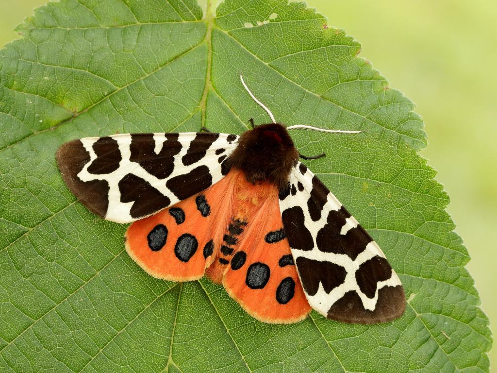
The butterflies have greatly changed in appearance since they were applied fresh. Most of the scales have faded due to exposure to light – the effects of even small doses of UV light exposure will accumulate over time – and have now become colourless. Their yellow appearance is due to the presence of an overlying discoloured varnish. Some reddish scales have not faded, and enough remains to help with the identification of the corresponding species (with thanks to Russell Stebbings of the department of Zoology, University of Cambridge, for his help). The butterflies in this painting were identified as being native to the Netherlands and would have been also native to Cambridge, although the Large Tortiseshell is now considered extinct in the UK and the Garden Tiger Moth is declining in numbers.
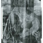
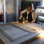
Condition of the painting
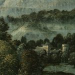
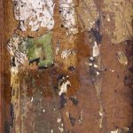
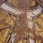
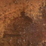
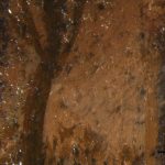
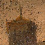
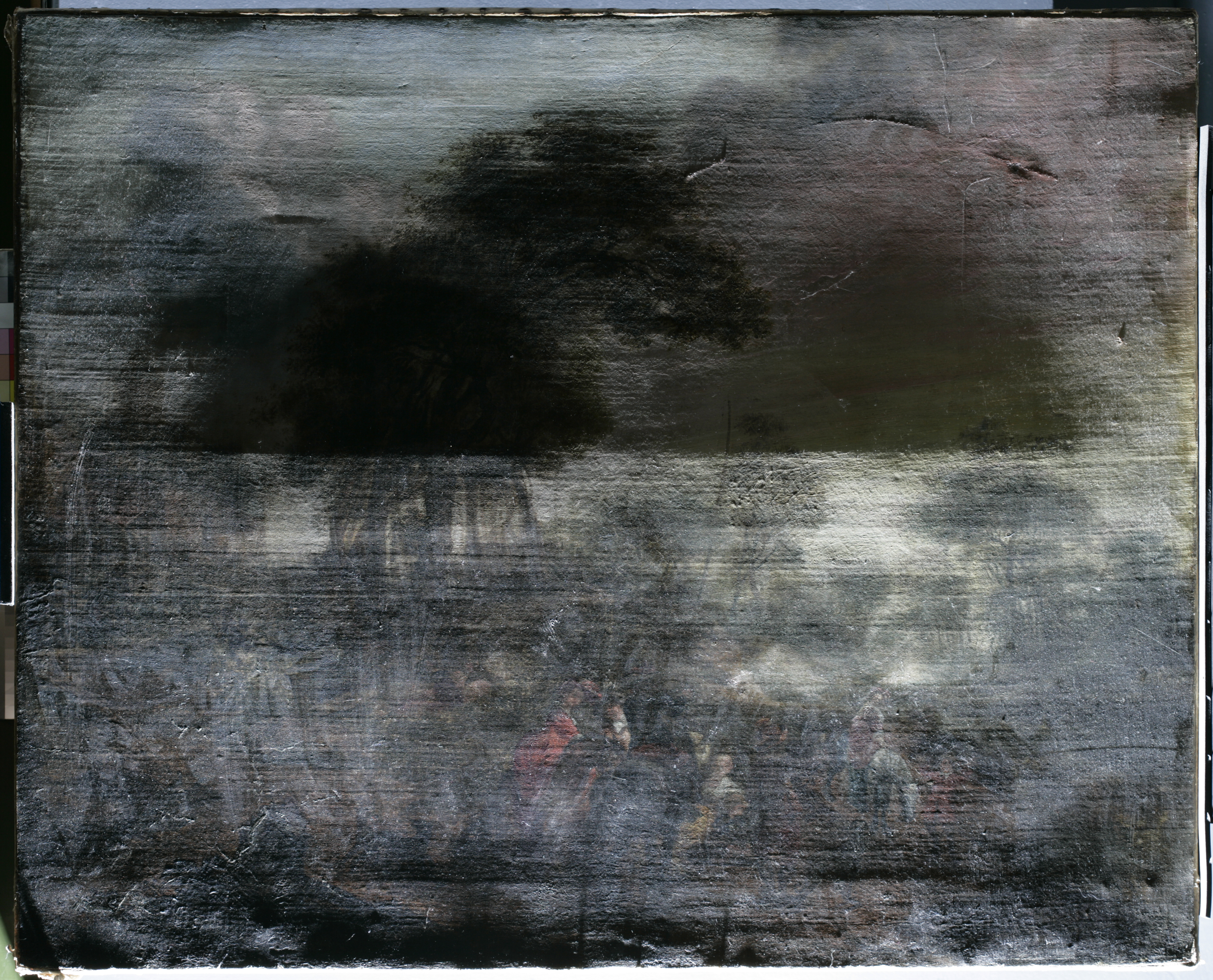
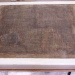
Although the painting was in a stable condition when it arrived, its image was partially obscured by multiple layers of very old, non-original natural resin varnish that had degraded. This substantial varnish layer had become hazy, extremely yellowed and rather opaque, making it appear as if one were peering at the scene through thick fog. The dulled original colours and their reduced tonal range resulted in the loss of the sense of depth and many details of the artist’s intended composition were obscured, including the skyline and the intricate detail of the foliage. It was decided that removing the discoloured varnish would greatly improve the appearance of the painting and restore these aspects that are so central to van Schrieck’s oeuvre and philosophy. The application of a new varnish would then re-saturate the colours and provide renewed protection to the paint surface.
Conservation treatment
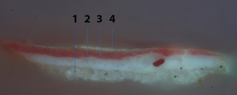
Minute paint samples were taken from two locations (one from the background and one from a butterfly wing) in order to ascertain whether it would be possible to safely clean the varnish without affecting the delicate paint layers. Examination of the samples in cross-section indicated that there were at least four layers of varnish present. These samples further showed that the scales were placed onto the painting and then varnished. The scales appear to be embedded in a varnish layer, possibly the varnish used during the double transfer method. This is, however, distinct from the main upper varnish. It was decided, following a series of testing and further observations, that cleaning this later coating gradually whilst leaving the imbedded scales intact would be possible.
Cleaning of the painting is currently underway. The painting also presented a layer of modern synthetic varnish, which was applied when the painting last visited the Hamilton Kerr Institute in the mid-1990s in preparation for an exhibition. This topmost varnish was removed first before the older discoloured natural resin varnishes were tackled. A water-based method of cleaning was developed to safely remove these layers gradually, avoiding the excessive use of organic solvents and swab action which could potentially disturb sensitive layers such as oil glazes or the varnish containing the embedded scales.
The treatment is ongoing at the time of writing this blog. Once the varnish has been cleaned from the paint layers, I aim to carry out further technical examination to gain more understanding of the pigments, binders and the technique used, in particular the butterfly scales application. I will then fill and retouch any losses to the paint layer whilst leaving the butterflies untouched. Afterwards a final varnish will be applied. I am also working on reconstructing the technique so that I can learn how it might have been used, but also to gain a glimpse of how the painting may have appeared originally. We know that the butterflies and moths have drastically changed over many years and it is not possible to restore their original appearance on the painting, but it might at least be possible to see the original intention on a reconstruction.
Conserving this painting is an interesting challenge in terms of trying to find a safe way to clean the painting whilst preserving the very fragile remains of the butterfly wings, especially since the artist’s precise method for transferring the scales is not yet fully understood. It is hoped that this project will bring new insight into the study of van Schrieck’s painting methods, and perhaps open further research into experiments with embedding organic material in paintings and methods for treating them. Flowers, Insects and Reptiles is proof of van Schrieck’s inventiveness and skill as an artist and of his parallel interest in the natural world.
Many thanks to Alice Tavares da Silva, Henrietta Ward and Russell Stebbings for their guidance and support.
With thanks to the Woodmansterne Art Conservation Awards for their generous support in funding this project.
References
Beier, B., 1987. >>Contre-Epreuves<< in der barocken Stillebenmaleri. Maltechnik 1. Restauro. pp. 35-39.
Berthier, S. ; Boulenguez, J. ; Menu, M. ; Mottin, B. 2008. ‘Butterfly inclusions in van Schrieck masterpieces’. Techniques and optical properties. Applied Physics A, 2008. 92(1). pp.51-57.
Howard, H. N.D. Support and Ground. The National Gallery. [online] Available at: https://www.nationalgallery.org.uk/paintings/research/meaning-of-making/vermeer-and-technique/support-and-ground. Accessed 9th March 2020.
Jorink, E. 2014. Snakes, Fungi and Insects. Otto Marseus van Schrieck, Johannes Swammerdam and the Theory of Spontaneous Generation, in: K.A.E. Enenkel, P.J. Smith. eds., Zoology in Early Modern Culture. Intersections of Science, Theology, Philology, and Political and Religious Education. 32(2014). pp. 197-234.
Levine, R. and Evers, C. 1999. The Slow Death of Spontaneous Generation (1668-1859). [online] Access Health @ the National Health Museum. Available at: http://webprojects.oit.ncsu.edu/project/bio183de/Black/cellintro/cellintro_reading/Spontaneous_Generation.html. Accessed 12 March 2020.
Steensma, S. 1999. Otto Marseus van Schrieck: Leben und Werk. Hildesheim; Zurich; New York: Georg Olms Verlag.
White, M. N.D. The Highly Systematic Methodology of Dutch 17th-century Painting Techniques. [online] Available at: https://madeleinesartblog.wordpress.com/2018/05/22/the-highly-systematic-methodology-of-dutch-17th-century-painting-techniques/#_ftnref12. Accessed 27 March 2020.
Wallert, A. 1999. Methods and materials of still-life painting in the seventeenth century. In: A. Wallert, ed. 1999. Still Lifes: Techniques and Style: An Examination of Paintings from the Rijksmuseum. Zwolle: Waanders Publishers. Webexhibits. N.D. Causes of Color: Butterflies. [online] Available at: http://www.webexhibits.org/causesofcolor/15A.html. Accessed 27 March 2020.
About the author:
Sophie Lamb graduated in 2018 with an MA in the Conservation of Fine Art (Easel Paintings) from Northumbria University. Prior to this she completed her BA (Hons) in Fine Art from Oxford Brookes University. While there she won an Erasmus scholarship to study oil painting and drawing at the Vilnius Academy of Art. Additionally, she studied on the foundation year in Engineering and Physical Sciences at the University of Manchester. Her projects at Northumbria included treating a 19th century painting on millboard, which led on to an extended research project investigating unusual materials for painting supports and investigating an 18th century painting on papier-mâché board. During her training she undertook conservation internships with the V&A museum and with various private conservation studios around London and East Anglia.
To contact Sophie: sl979@cam.ac.uk


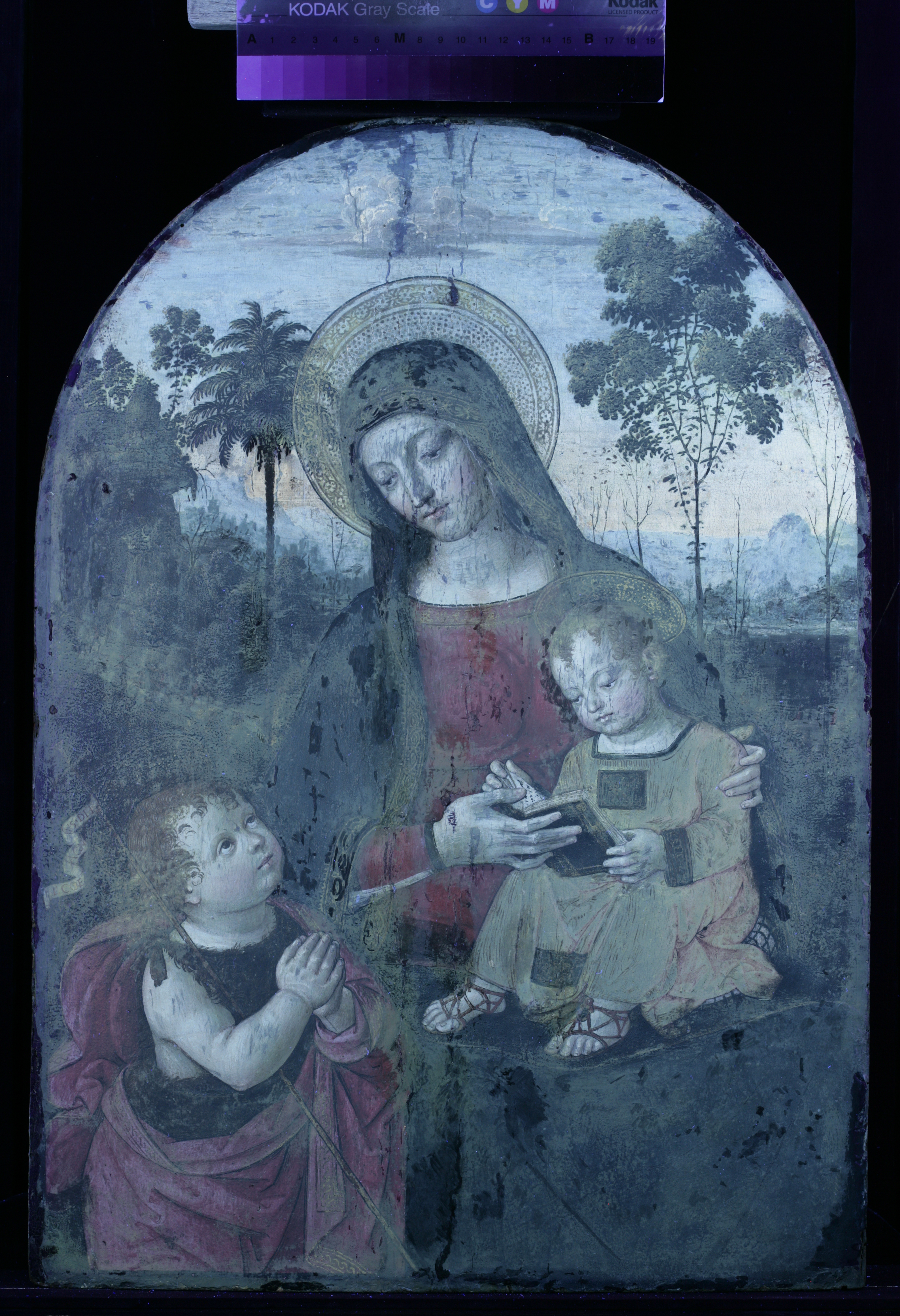
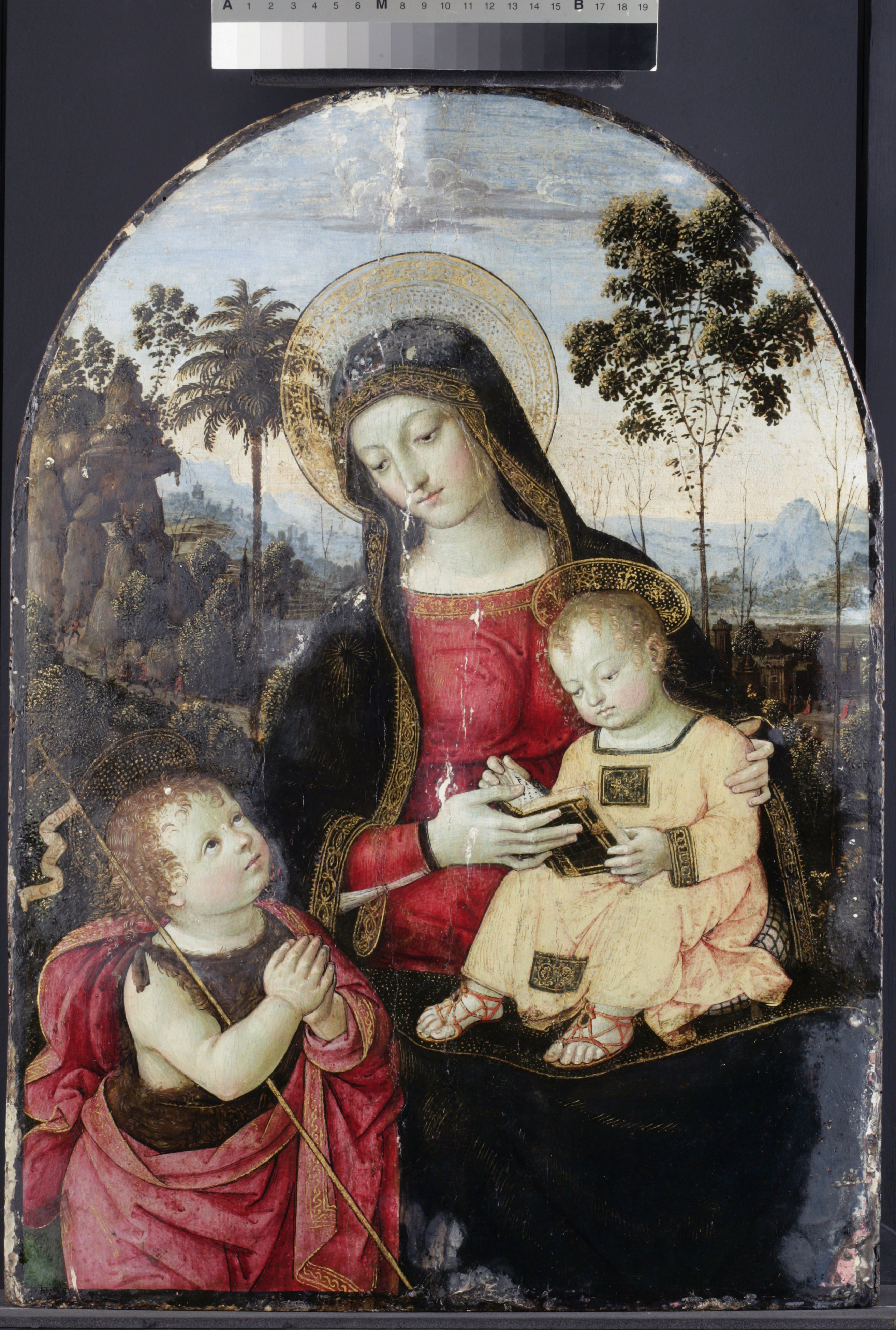
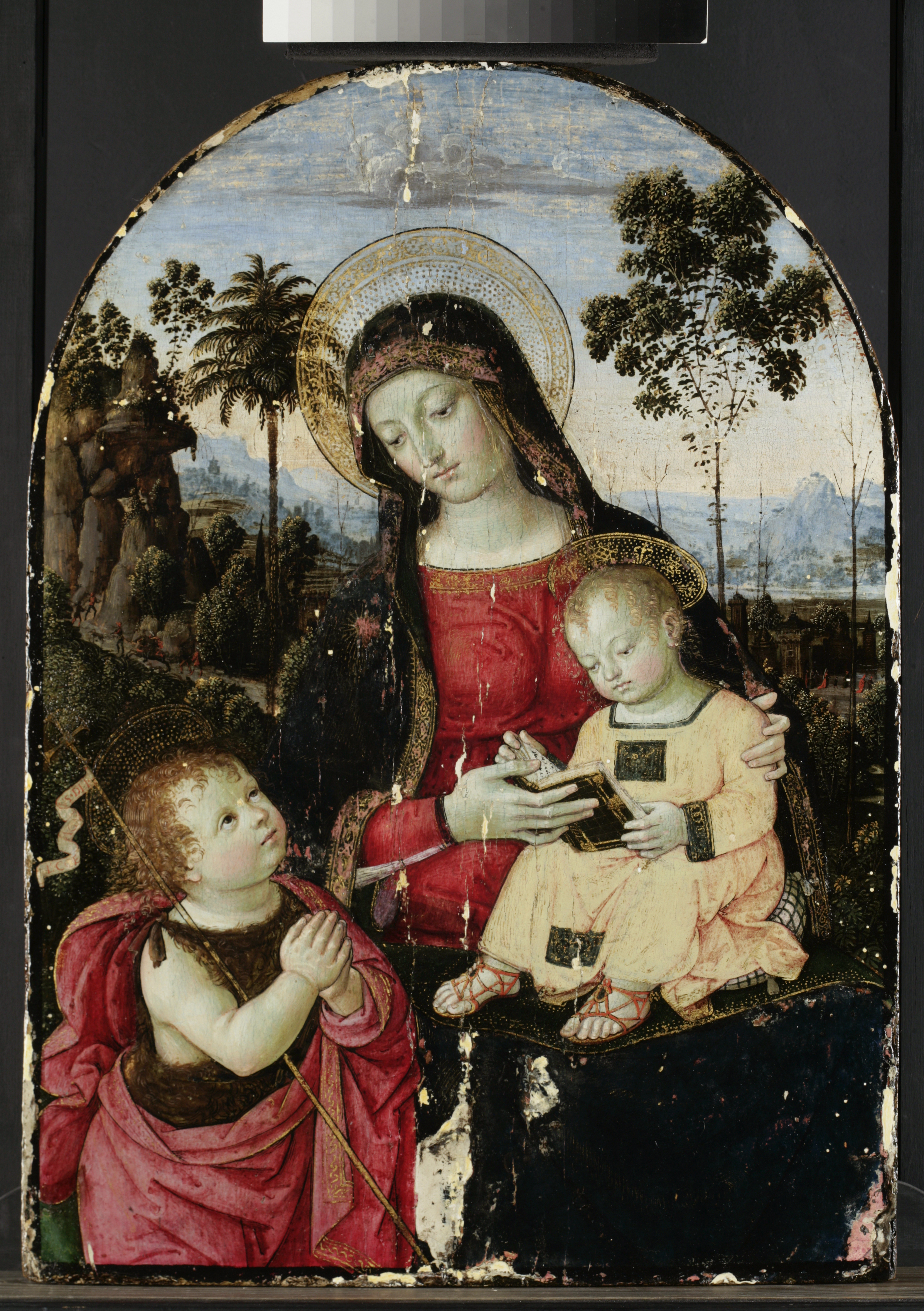
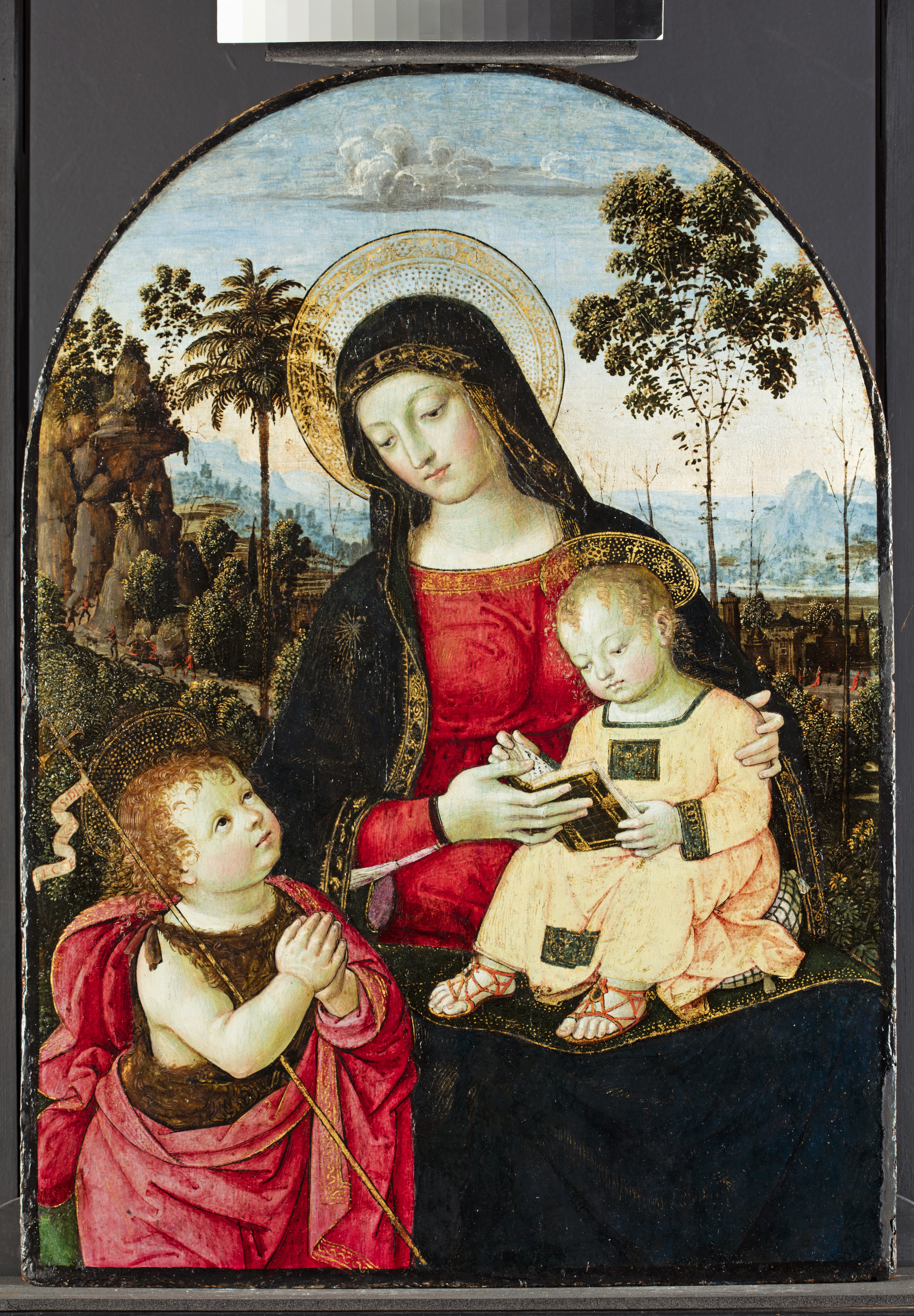
 Titmus)


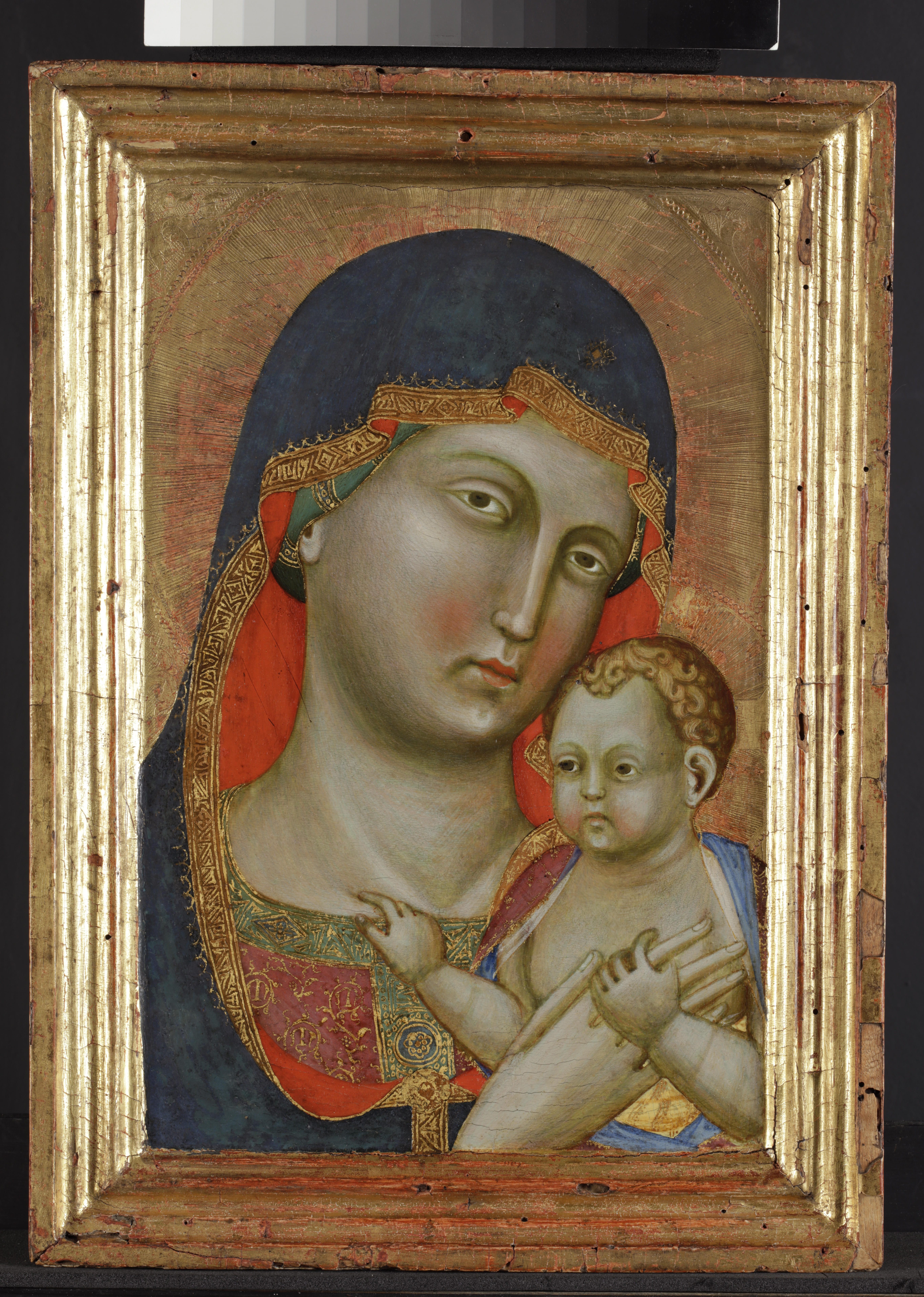
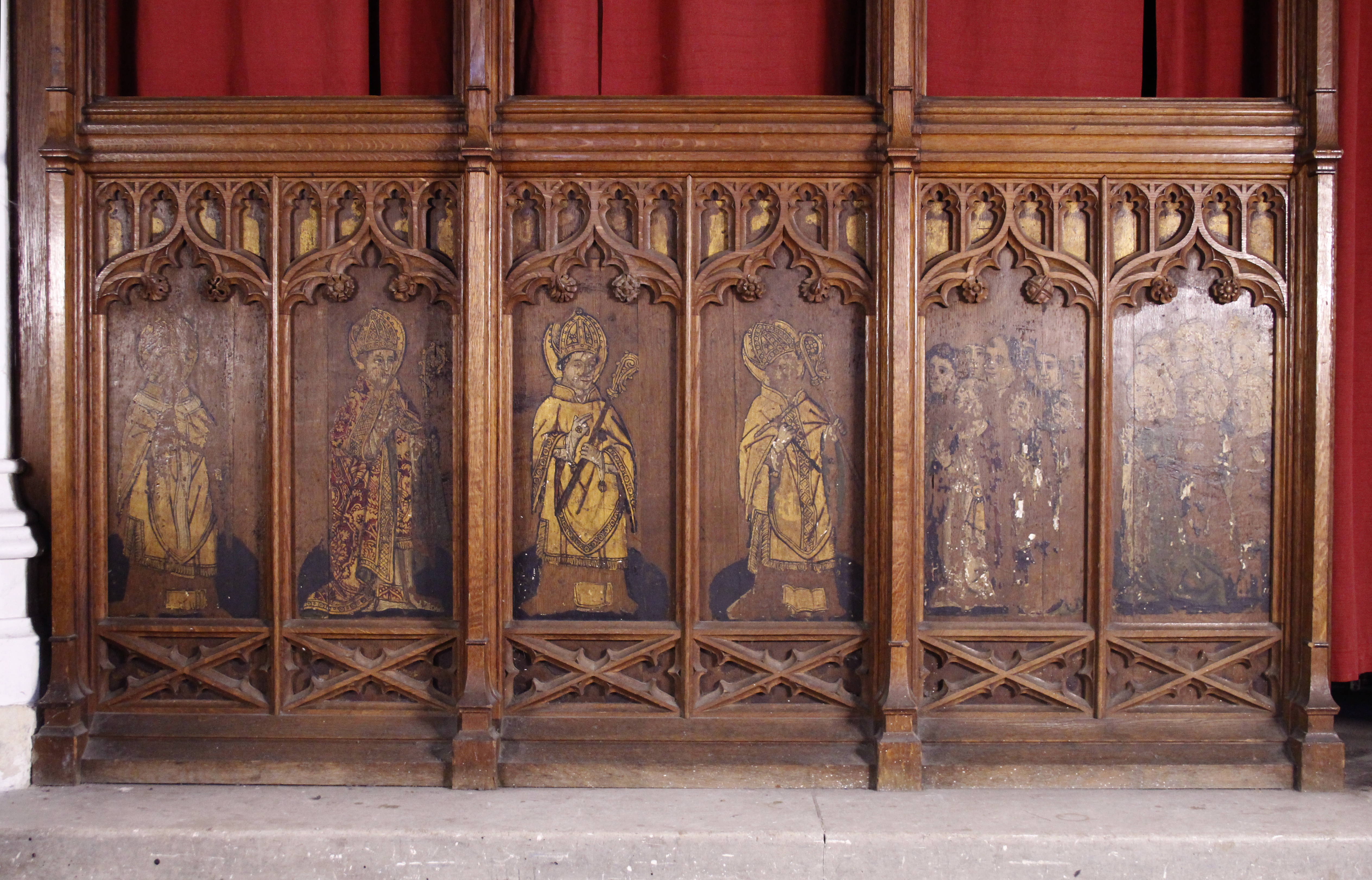
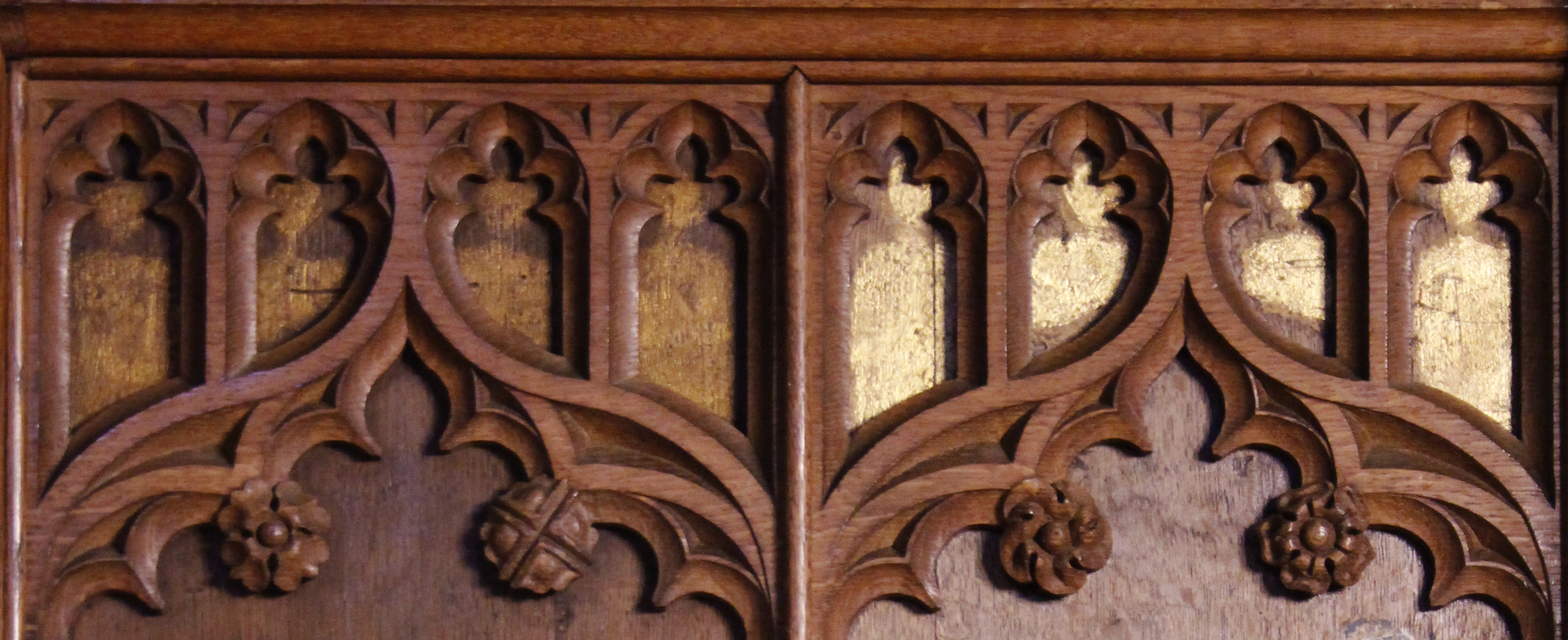
 The losses in the painted areas were toned with watercolour and glazed with Gamblin Conservation Colours. In the gilded areas, the losses were toned in a red colour, slightly lighter than the colour of the original bole.