Dead hand talking

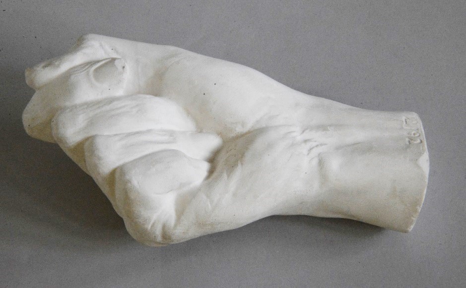
William Thackeray’s hand in The Human Touch exhibition contains tantalising clues to the trade secrets of master Victorian plaster-cast maker Domenico Brucciani.

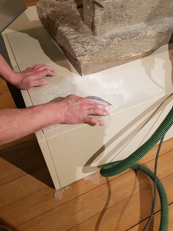
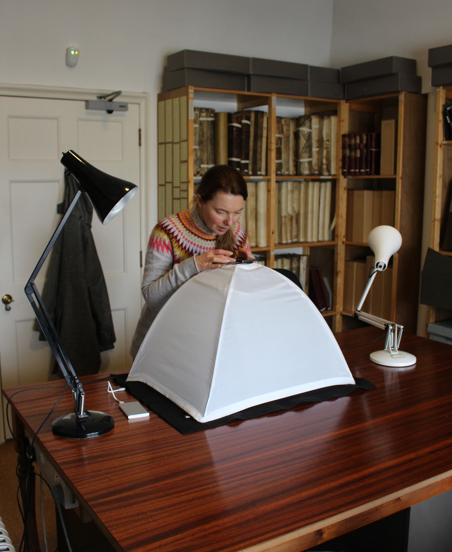
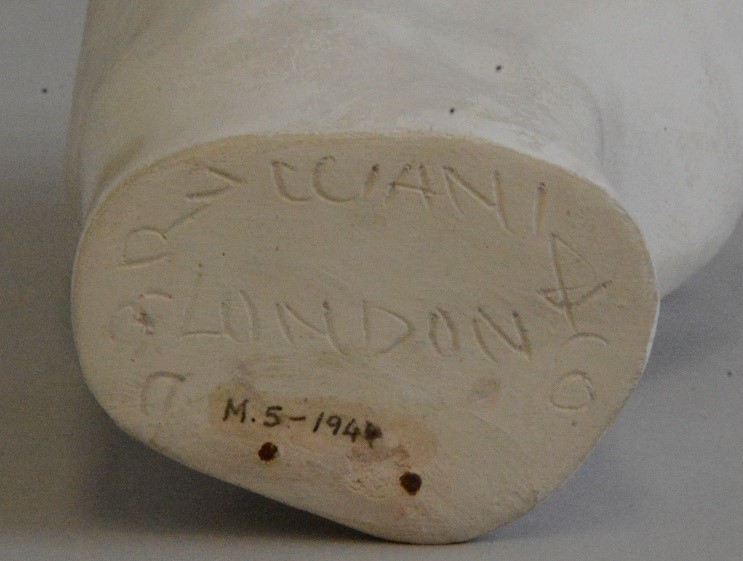
I will admit it up front: I have been making casts of hands and faces from myself and family members on and off since I was a young teenager; so I was particularly intrigued by the cast of William Makepeace Thackeray’s hand (Museum number M.5-1944) which I recently conserved for the exhibition ‘The Human Touch: making art, leaving traces’  (open from 18th May to 1st August 2021). 

The mould for Thackeray’s hand was made on Christmas Day 1863.  Thackeray had died suddenly the day before, aged just 52.  His doctor and friend Sir Henry Thompson was called to confirm the death, and it was he who also sent for the famous and highly respected cast-maker, Domenico Brucciani, to make casts of Thackeray’s face and right hand.  The National Portrait Gallery has copies of both.

William Makepeace Thackeray by Domenico Brucciani Plaster casts
William Makepeace Thackeray by Domenico Brucciani Plaster casts of death-mask and right hand NPG 1501 © National Portrait Gallery, London

The only other known copy of the hand is the one in the Fitzwilliam Museum, which was given to us in 1944 by Henry Thompson’s son, Herbert.  It came with a note written by Henry, which says ‘It is characteristic, recalling for me the original with its long and delicate fingers, the form of the nails &c, very forcibly’. 

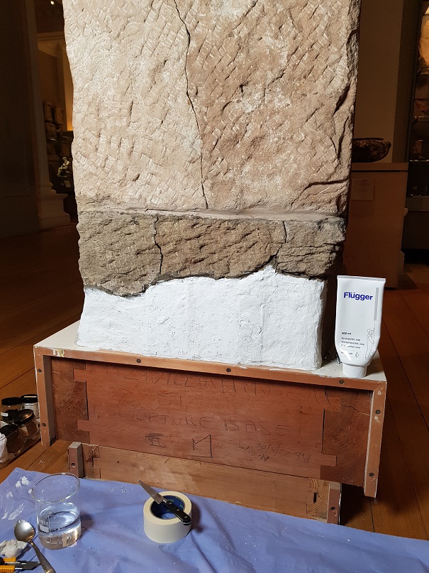
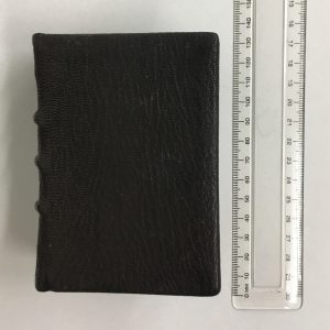
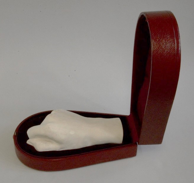
The cast hand has its own special red leather case, similar to a jewellery case but somewhat resembling a very small coffin.

The cast of Thackeray’s hand in its original red leather case

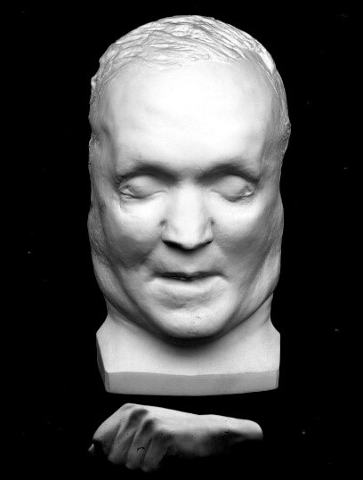
So why did Thompson commission casts of Thackeray’s head and hand?  Although death-masks have been made for many centuries in different cultures, they were particularly popular in Victorian times.  Before photography was widely available, they served as an affordable memento of a loved one who had died.  They were also made fashionable by the pseudo-science of phrenology, which suggested that a person’s character was evident from the shape of their skull.  This stimulated demand for copies of the cast heads of famous individuals, whether they were the great and good or heinous criminals.  Thackeray was ranked second only to Dickens in his own time, and there would surely have been public interest in his death-mask.  But his family very much opposed making the mask and hand widely available and insisted that Brucciani should not make any further copies of them, so in this case they were made purely as personal mementoes.

Taking a cast from a person’s head is quite an undertaking.  A few years ago, my daughter very sportingly allowed her parents to cast her face.  After generously applying Vaseline so that her eyelashes, eyebrows and downy hair would not be pulled out in the process, we made a mould using alginate powder, which is a rubbery casting compound:

Making a mould of a face
Making an alginate mould of my daughter’s face.

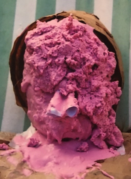
The pink blobs are the alginate mixture and the two cones are paper tubes which my daughter inserted up her nostrils so she could breathe during the few minutes it took for the alginate to harden enough to be removed.  This is the aspect of the process which sometimes makes people panic and pull off the mould before it solidifies: it can be pretty stressful to have to stay absolutely still and breathe only through straws up your nose while someone piles the moulding material onto your face! 

Casting the head of a real person is clearly quite invasive, whether the subject is dead or alive, and not everyone was willing to submit their very recently deceased loved one to the process.  Luigi Finili, who was at one time Brucciani’s chief moulder, said in an interview with the Pall Mall Gazette in 1892: ‘Many people prefer to have a model of their dead friend’s hand instead of the face.  They do not care to let anyone touch the face, but they do not seem to mind so much about the hand.’ Even when a death mask was made, it was often disappointing.  Jack C. Rich in his classic work, The Materials and Methods of Sculpture (1947) explained that ‘There is a tendency of the facial tissues to sag with gravitational pull when the subject is in a horizontal position.  This phenomenon is particularly marked with older and more obese persons.’

Even when a cast is made from an upright model this can still be a problem – the mask we made from my young daughter was also quite distorted by the pressure of the moulding material on her face.  A cast from life may also fail to resemble the subject because it lacks colour and expression, while features like hair and spectacles which contribute strongly to many people’s appearance are hard to reproduce in a plaster cast.  Comparing the death- mask of Thackeray with even a very static-looking photograph of him from 1855 gives an idea of the problem. 

Daguerreotype photograph of William Makepeace
Daguerreotype photograph of William Makepeace Thackeray by Jesse Harrison Whitehurst (1819-1875), digitised by Boston Public Library 2007. Licensed under the Creative Commons Attribution 2.0 Generic license

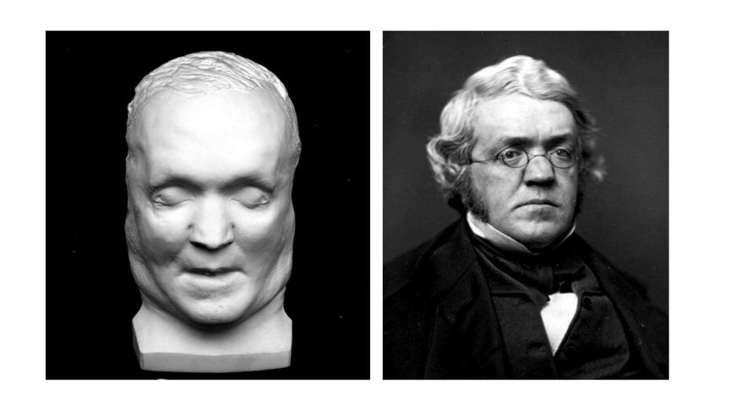
‘By some mischance the [face] was not agreeable, [with] none of the charm of expression so attractive in life & it was rejected.  But the hand is a portrait and recalls to me very strongly the character of the original.’

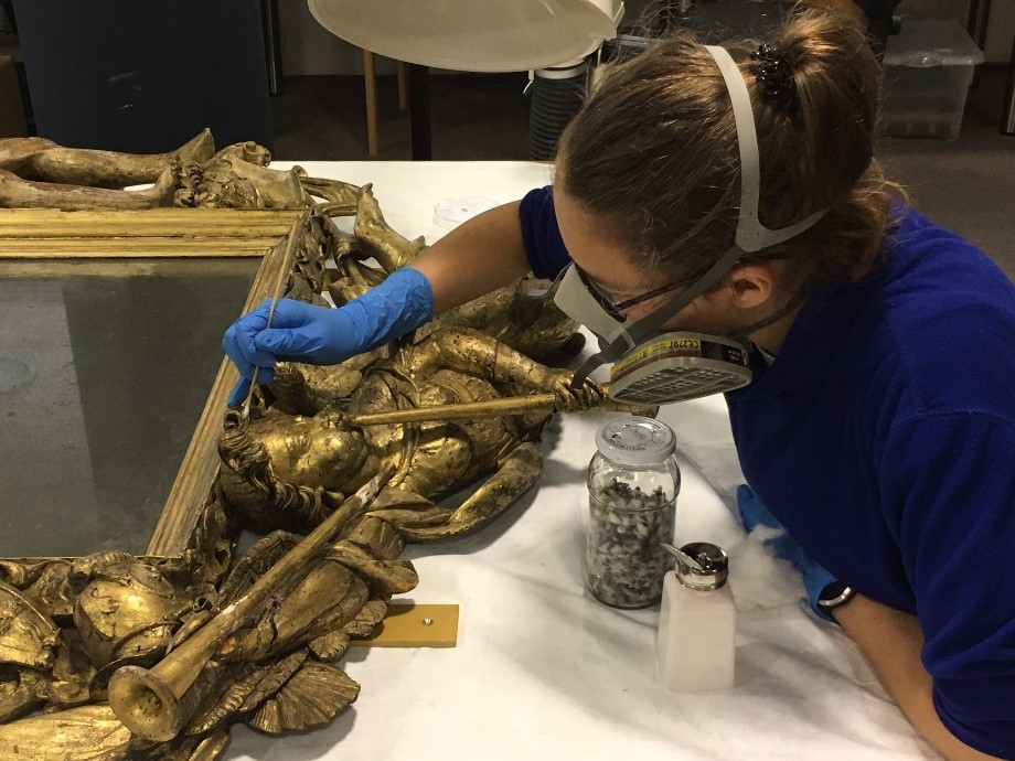
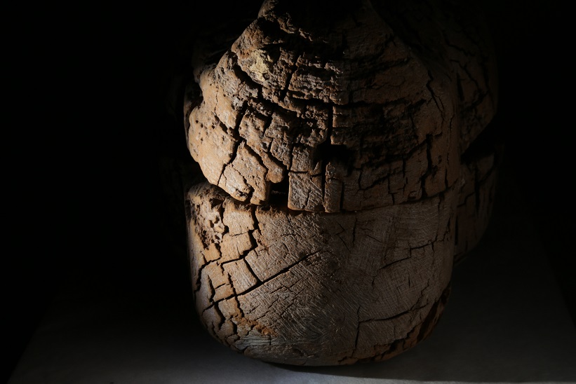
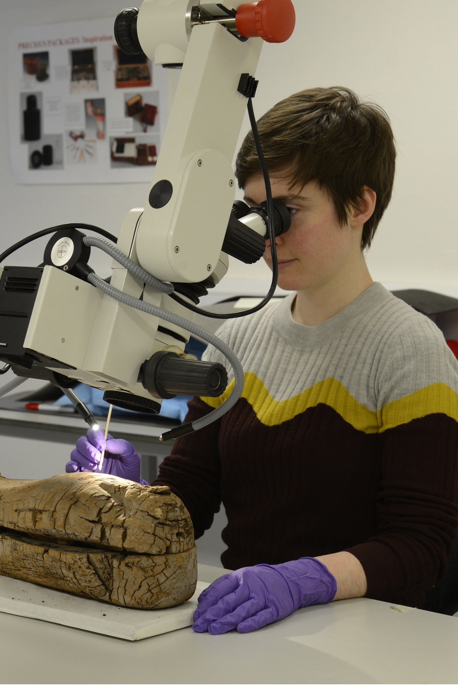
When looking in detail at the cast of the hand, it is clear that it was made by a very skilled craftsman.  The plaster is fine and there are no air bubbles visible at all.  This can be very hard for an amateur like me to achieve.  The detail on the surface is very clear, with the grain of the skin visible in places when the hand is viewed under the microscope.  Small losses from the surface reveal more about the technique Brucciani used to achieve this fine detail.  He seems to have poured a very fine plaster mix into the mould first to get a thin ‘skin’ layer, allowing this to set partially and then filling the rest of the mould with a coarser plaster mix.

Brucciani’s skill at finishing the cast also makes it hard to tell if the mould was made in sections or cast in a soft mould.  A clenched human hand has a number of ‘undercuts’ which would make it impossible to remove from a hard plaster mould made in a single piece – it would need to be made in sections.  The traditional method of doing this involves using a fine wire or waxed thread to split the mould around the hand.  This technique is tricky to master because it relies on expert timing.  Threads are laid on the surface of the hand in the places where splits in the mould are needed.  They are then pulled out at exactly the right moment while the plaster is setting, to split the mould so it can be removed in sections.  If the thread is pulled too soon the soft plaster flows around the place where it was and re-joins the sections of the mould; if it is left too late, the thread may break when it is pulled or even be unable to split the hardened plaster.

The alternative to this hard plaster mould method is to use a soft moulding technique, similar to the alginate we used for my daughter’s face mould.  Alginate was not available in 1863, but soft moulds made from gelatine had recently been invented.  It is sometimes said that this technique was invented around 1865, when it was used by another well-known cast-maker, Giovanni Franchi, to cast Pisano’s 14th-century marble pulpit in Pisa Cathedral for the famous V&A cast collection.  But Brucciani was already using the technique in 1861, when he got into trouble with the British Museum for allegedly staining a Classical mausoleum while casting it using gelatine.  He was actually banned from using the process at the British Museum again without express permission from the Museum’s Trustees – but of course he was still free to use it in projects for other clients.

Gelatine moulds were suitable for making both small and large casts and had the advantage that the final result would not have the seam lines that you get when casting from hard moulds made in sections.  Brucciani’s skill was such that it is not easy to tell whether there were seams on Thackeray’s hand that have been removed; but the stumps of two iron pins in the wrist may provide a clue.

Brucciani’s signature
The pins are visible as two brown dots at the end of the wrist, under Brucciani’s signature.

Plaster heats up quite a lot as it sets.  When using a gelatine mould it is important to remove the cast as soon as the plaster is firm enough so that this heat doesn’t melt the gelatine, or the mould cannot be reused.  The iron pins may be the remains of a hook used to help pull the cast out of the soft mould quickly.  Once the cast was removed, the hook could be snipped off as it would no longer be needed. 

Spending time with the cast of Thackeray’s hand has made me wonder about the maker, Domenico Brucciani.  He came to England from Italy around 1829, when he was just 15, and joined his uncle’s plaster-cast business in Covent Garden.  He stayed in England until his death in 1880.  Unlike most Italian itinerant ‘image-sellers’ at the time, he built a very successful business known for quality, riding a wave of democratization of art, both for people’s homes but also for the great museums and art schools of his day.  He headed a large firm which was responsible for many casts in the V&A, British Museum and Royal Academy, and exhibited his work at the Great Exhibition of 1851 and the International Exhibition of 1862. 

A fascinating recent book by Rebecca Wade, Domenico Brucciani and the formatori of 19th Century Britain (2018) discusses his career and the plaster-casting industry in depth, and yet, despite his renown, Brucciani remains a rather shadowy figure.  A short obituary published in The Builder in April 1880 said ‘although chiefly a plasterman in calling, he was an artist at heart’.  The beautifully made death-hand of Thackeray bears witness not only to the famous writer, but also to the craftsman who made it.

‘The Human Touch: making art, leaving traces’  is open from 18th May to 1st August 2021, and tickets are available to book online

Flipping Admiral Russell’s Frame: how and why Fitz conservators turned a baroque masterpiece upside-down

This magnificent carved and gilded frame was the Fitzwilliam Museum’s birthday present to itself in 2016, when the Museum celebrated its 200th anniversary.  It was acquired with generous support from the Friends of the Fitzwilliam, as well as the V&A Purchase Grant Fund, Henry Moore Foundation, Finnis Scott Foundation, Old Possum’s Practical Trust and private individuals.  It is a fantastic example of a baroque trophy frame, made for Admiral Edward Russell in the 1690s.  The image shows what the public sees in the gallery, but conservators need to examine every nook and cranny during conservation treatment.  It can be quite a challenge to access all areas with an object as fragile and heavy as this frame, so we had to be creative to solve the problem.

Admiral Russell’s Frame
M.2-2017 Admiral Russell’s Frame

The frame is made from carved and gilded lime wood, and is highly elaborate and dramatic, with figures of Hercules on the left and Mercury on the right.  The bottom of the frame shows the winged figure of Fame with two trumpets, one for good publicity and one for bad.  The top is decorated with Tritons (demi-gods of the sea), and realistic seashells rising out of the waves, as well as two cherubs, all surrounding Russell’s coat of arms.  Other details such as shields, helmets and the prow of a ship all show that this was a military trophy frame made to celebrate Admiral Russell’s naval victories against the French in 1692.   There is much more information about the frame and its makers in this short film, and an excellent account of how trophy frames arose out of the ancient practice of taking military trophies from the field of battle in this 2019 blog by Lynn Roberts, a picture frame historian.

The frame was put on display as soon as it came to the Museum, because the public and benefactors who helped acquire it were keen to see it without delay.  There was no time to conserve it in 2016, but recently we had a chance to examine and treat it, ready for a move to Gallery III.

From the start, we knew that conserving this object would be a challenge.  The splendid carving is actually very fragile and worm-eaten, but the whole frame including the mirror is also extremely heavy, weighing around 70kg.  Just moving it safely is tricky, let alone getting access to all sides for conservation treatment.  How could we turn it over to look at the back without the frame collapsing or crushing itself under its own weight?

We started by working on the front to make it completely secure before turning the frame over.  Lily Griffin, who is on a work placement with us for 10 months as part of her conservation MSc course at University College London, worked on the frame with me, and together we cleaned the gilded surface.

Conservator cleaning frame
Lily Griffin cleaning Admiral Russell’s Frame

The gilding is only microns thick and the adhesive attaching it is very sensitive to water, so after vacuuming the surface we swabbed the gilded areas with white spirit.  There was a lot of tarry dirt in the crevices of the carving, which probably comes from fireplaces, candles and tobacco being smoked near the frame where it hung, first in Admiral Russell’s home at Chippenham Park, and then with subsequent owners.  We were careful not to over-clean, but even so, we collected copious numbers of filthy swabs.

Dirty swabs they produced when cleaning an object
Conservators enjoy looking at all the dirty swabs they produced when cleaning an object, and this was a particularly satisfying quantity!

Unfortunately Mercury’s legs have lost most of their gilding and also the gesso layer underneath, leaving bare lime wood exposed.  This might be due to someone attempting to clean the frame with water and having the surface dissolve in front of them.  This would have been very stressful to watch if it wasn’t intentional, and the thought of it reminds me of Mr Bean destroying the portrait of Whistler’s mother – my favourite ‘conservation disaster’ video of all time.  It is possible that someone intended to strip the whole frame and re-gild it, but if so they clearly thought better of it.

As you might expect from an object over 300 years old, there was quite a lot of old damage, ranging from small knocks and chips to a whole section of the lower left corner which seems to have been dropped at some stage and has extensive repairs.  Lily and I spent time securing worm-eaten wood and loose gilding, making small repairs and retouching the most obtrusive old losses so that they would not distract the eye. Once all this was done, it was time to turn the frame over and work on the reverse.

Flipping fragile objects over to work on the back is something of a ‘signature technique’ for me, having done it for an Egyptian cartonnage coffin and a cartonnage mask, both on display at the Museum.  But this frame was much, much heavier than those objects and I was pretty nervous about it.  Luckily, we have a superb team of conservation technicians at the Fitz, all of whom have experience with large, heavy and delicate objects, and all of whom were very helpful in lending both their brains and their muscles to make sure this job went without a hitch.

Firstly, we ordered a transport crate for the frame, of the kind typically used to pack  paintings travelling on loan.  This can be used in future as a storage crate if needed.  Our carpenter then expertly modified the crate with some extra panels to make it work for the unusual proportions of the object.

We placed the frame in the bottom of the crate and then packed it out with blue vacuum bags.

Frame in the crate
The frame in the base of the crate, just before packing the blue vacuum bags around it

These soft bags are filled with tiny beads and have a valve that lets you extract the air in a controlled way until the bag becomes rigid.  Using four large bags, we covered all of the carved areas and manipulated the soft padding so it filled the gaps and conformed closely to the shape of the frame.  When the air was extracted using hand pumps the blue bags solidified to make a completely tailored rigid support for the carving.

frame completely covered and supported by the blue vacuum bags
The sides and front of the frame completely covered and supported by the blue vacuum bags

Next, we packed out the rest of the crate with foam and bubble-wrap to fill the space inside completely, and lastly put a sheet of chipboard over the top.  The whole lot was secured with gaffer tape: it couldn’t be screwed closed because that would stop us lifting the crate off after turning it over.  By now the whole assemblage weighed about 100kg.

The crate packed, closed and ready for turning

Then for the moment of truth: eight of us lifted the crate and turned it over, replacing it on the table.

Staff flipping the crate
The first 90 degrees of the flip….
Staff flipping the crate
…And over it goes!

The gaffer tape was removed and the transport crate lifted away to reveal the back of the frame.

Lifting off the crate from the frame
Lifting off the crate for the moment of truth
Staff seeing the back of the frame for the first time
Seeing the back of the frame for the first time, and sighs of relief all round that everything went well

From the back you can clearly see that the frame is made from just a few large timbers, which would originally have been a similar size to railway sleepers.  The skill needed to create this object is impressive.  It may have been made by the carvers who were permanently employed at the Royal Dockyards in the 1690s, or perhaps by a freelance craftsman working near Chippenham Park, Admiral Russell’s home in Cambridgeshire.  If you want to know more about the possible makers, there is a blog by former Fitzwilliam Museum Director Tim Knox which discusses this in more detail.

Happily we found that the back of the frame was in surprisingly good condition and did not need any treatment apart from cleaning.  We took the opportunity to make sure the mirror was secure in its housing and also replaced the heavy modern oak backing board with something lighter to make the frame easier to handle.  Trying to reuse the old screw holes as much as possible to avoid new damage to the original wood, we used three smaller pine boards to brace the back.  They were covered in aluminium-backed tape to stop acidic gases in the pine from coming out and affecting the frame or other objects in the stores and galleries.  The mounting bars for hanging the frame were also attached to the new bracing boards.

Once conservation was complete, the frame was secured in the transport crate and wheeled to Gallery III. 

Staff moving the crate through the galleries
Admiral Russell’s Frame travelling smoothly in its crate through the galleries, on the way to its new home

The conservation technicians masterminded the delicate process of hanging the frame on the wall, using a stacker to lift it into place.

Placing the frame on the stacker
Placing the frame on the stacker which lifted it into position
Staff positioning the frame precisely on the wall
Positioning the frame precisely on the wall. The blue tape marks show exactly where it need to hang
Technician fixing final screw in frame
Tightening the final screw

The frame looks great against the deep aubergine-coloured walls and can definitely hold its own against its new, equally flamboyant neighbour, the portrait of the Countess of Southampton as ‘Fortune’ by Anthony Van Dyck!

Like all the best projects, this has been a team effort involving not just conservation technicians and conservators, but staff in Facilities, Finance, the registrars and of course curators.  A particularly big thank you goes to the Antiquities Department who let us borrow their Seminar Room so we could do the conservation work in a COVID-safe fashion.  Everyone has been very generous with their time, often dropping everything to lend a hand and always being unfailingly good-natured.  It has been a huge pleasure to work on this together.

Conserving Beethoven Autographs

The manuscript conservators have been enjoying the chance to work on two autograph letters (i.e. documents in the composer’s handwriting) from Beethoven to his pupil and friend Ferdinand Ries in this, the 250th anniversary year of the composer’s birth.  Both letters, dating from 1819 and 1822 respectively, are written with iron-gall ink on paper, and still show the creases and wax from when they were first folded up and sealed ready to be posted.

1822 Beethoven letter
GEN/B/Beethoven/2, showing the original folds, wax seal and post marks

Conservation work was required to stabilise damage to the edges of the leaves and areas of loss where the corrosive ink had eaten through the paper support.

1819 Beethoven letter (detail)
The dark, heavy strokes of Beethoven’s iron-gall ink have corroded their way through the paper support (MU.MS.1014, detail)

Repairs were carried out using tiny supports of fine (4gsm) Japanese paper coated with a remoistenable adhesive.  This allowed us to minimise the amount of moisture we used whilst applying the repairs, an important consideration when dealing with manuscripts written in iron-gall ink.

Beethoven was a prolific correspondent and more than one thousand of his letters survive.  The two examples to Ries in the Fitzwilliam Museum demonstrate the composer’s concerns around the business aspects of musical life: the need to make a living from publishing his works as widely as possible and the problems in getting them into print accurately.  In the letter of March 1819, Beethoven writes that ‘it is hard to compose almost entirely for the sake of earning one’s daily bread.’  The letter of July 1822 demonstrates Beethoven’s concern to sell the Op. 110 and 111 piano sonatas (rather untruthfully described as ‘really not very difficult’!) to a London publisher for £26, but signals his intention to make a deal with a German publisher for the same material.  At this time there was no copyright law to prevent the same composition being published simultaneously in different countries by different publishers, and the extra income from multiple sales was attractive.

Beethoven autographs were sold off after the composer’s death and collected as souvenirs.  Our collection also contains two leaves of autograph music manuscript by Beethoven, which were once part of the sketchbooks he kept to record his musical ideas.  It is interesting to see how all these documents have been treated after Beethoven’s death, when they changed from being working texts or scores to mementos.  The letter of 1822 was mounted between glass and framed, while the 1819 letter is only part of a much longer list of corrections Beethoven needed to have made to the London edition of the ‘Hammerklavier’ Sonata.  (The other leaves are now in a collection in Germany.)

1822 Beethoven letter in 19th-century frame
Gen/B/Beethoven/2 before conservation, showing the 19th-century framing and ebonised wooden box made to hold a treasured autograph souvenir of the great composer

In more recent times, the music autographs were conserved by the famous Cockerell Bindery in Grantchester.  The single leaves which were removed from the original sketchbooks soon after Beethoven’s death were mounted in larger sheets of paper to protect them from direct handling during use, then bound in two slim volumes covered with the instantly recognisable Cockerell marbled paper.

1819 Beethoven Letter detail of margin
MU.MS.1015, detail in transmitted light: the manuscript leaf has been inlaid into modern handmade paper
1819 Beethoven Letter conserved and bound in Cockerell Bindery
MU.MS.288 and MU.MS.289 as conserved and bound by the Cockerell Bindery, July 1980

During our treatment, we were keen to maintain the ephemeral nature of the letters by making subtle repairs and providing good-quality archival folders for them, rather than mounting them permanently as leaves of a book.

1819 Beethoven letter before conservation
MU.MS.1014 before conservation, showing tears and losses to the paper
1819 Beethoven letter before and after conservation
MU.MS.1014, before (left) and after (right) conservation

Two of the autograph sketches, for the ‘Moonlight’ and ‘Hammerklavier’ Sonatas respectively, the two letters described here, and Beethoven’s life mask and pocket watch have just gone on display in Gallery 3 as part of the 250th anniversary celebrations. 

Being a museum courier, COVID style

Fig. 1 – Screenshot of curator Susanne Lambooy and the author talking during a virtual courier trip to the Kunstmuseum in The Hague

International courier trips are often seen as one of the benefits of a museum career. When objects are lent to museums overseas, they are usually accompanied by a member of the collections team to oversee their safe transport, handling, and installation at the venue. It’s an amazing chance to go behind the scenes at some fantastic museums in lovely locations, and you might just squeeze in a few hours’ sightseeing somewhere exotic… Of course, it’s not all glamour! You can just as easily be spending long hours in a cargo shed at an airport, driving long distances in a lorry, or get stuck in customs, without many opportunities for a break or a meal, while making sure your precious artefacts are supervised at all times. But COVID has changed all that; and that is why in June I completed my first ever ‘virtual courier trip’, to the Kunstmuseum in The Hague.
The Fitzwilliam has loaned 15 pieces of English Delftware pottery to the Kunstmuseum for a show called ‘Royal Blue: William and Mary’s Finest Delftware’. The objects were sent out to The Hague in early March, accompanied by Tim Matthews from the Applied Arts department at the Fitz. They had just arrived at the museum when the whole of the Netherlands went into lockdown and Tim had to rush back to the UK to avoid becoming stranded. All plans to install the exhibition were abandoned and the ceramics were placed in store in their travelling crates without being unpacked.
Ten weeks later, the Kunstmuseum was planning to reopen and install the exhibition. But many institutions have lent objects for the display, sometimes from countries which, like the UK, were still in lockdown, and sometimes from museums with staff on furlough. For the exhibition to be possible, we all had to adapt our usual procedures. In this case, we decided to do the courier trip via a video call.
We used FaceTime, which meant I could follow what was happening in The Hague and also look at the loan documents I needed on the computer. (Other platforms could have worked in the same way for a PC.) At the other end, curator Suzanne Lambooy, conservator-restorer Maud Schermer, and the conservation assistant team used phones to video every moment of the process in a live session.
After introducing ourselves, we got on with unpacking the objects. The conservation assistants opened the crates and started to unpack, photographing every stage to make repacking easier at the end of the exhibition, and to have a record of anything untoward that might have happened during the journey. Luckily everything was in perfect order.

Fig.2 – Opening the crates and unpacking the ceramics

All the ceramics were laid out on padded tables next to the display cases and Maud started to check them over. The condition of objects when they leave the Fitzwilliam is documented thoroughly in condition reports and photographs, so Maud and I checked each piece carefully against the records to make sure that there was no new damage. Delftware is very fragile and even well-preserved examples almost always have lots of cracks and chips. Delftware needs to be handled very carefully because it is so easy to damage. Happily, all the staff at the Kunstmuseum are very familiar with this material, and everything they did was exemplary! Maud is a specialist ceramics conservator so was also the ideal person to be doing the real-life condition checking.
Looking at the objects in detail was one of the highlights of the experience for me. All of them are decorated with images of William and Mary, who ruled both England and Holland from 1689 to 1702. The pieces are hand-painted and have quite stylised motifs – for example, the things which to me look a bit like lemons are actually intended to be tulips:

Fig. 3 – Detail of C.2633-1928, a delftware dish, late 17th century, showing stylised yellow tulips

Similarly, the heavy blue clusters of circles topped with birds on this plate are actually a very stylised version of the rock-and-bird motifs found on some Chinese ceramics which were popular in the same period.

Fig. 4 – Detail of C.2483-1928, a delftware dish, late 17th century, showing the stylised imitation of the Chinese rock-and-bird motif on the rim

It was also fun to compare the images of the king and queen, which varied from the frankly jaded…

Fig. 5 – C.2482-1928, a delftware dish, late 17th century, detail

to the quite frisky…

Fig. 6 – C.1633-1928, a delftware dish, late 17th century, detail

and, in this case, reminded us rather unfortunately of Jabba the Hutt!

Fig. 7 – C.2633-1928, a delftware dish, late 17th century, detail

All the designs are unique and quirky, and I could have spent a lot longer enjoying their different characters; but we had to get on with installing the objects in the displays. Curator Suzanne and conservation assistant Bao worked on arranging the dishes and jugs in the display cases, which were painted in William and Mary’s signature orange colour. The blue-and-white ceramics, with their dashes of yellow, really sing out against this background.

Fig. 8 – The Kunstmuseum team installing the ceramics in a display case. Here the plates are arranged in an ‘M’-shape for Mary, and the case next door is arranged in a ‘W’-shape for William.

Soon the displays were finished and the cases could be closed down and locked: they won’t be reopened now until the exhibition closes and it is time to pack everything for transport home.
This adventure in ‘video-couriering’ went amazingly well, not least because the members of the Kunstmuseum team were very experienced and professional, and also lovely people to work with. We had a few challenges with the signal dropping out and batteries going flat – video calls use masses of power so the phone used for the session needed to be on charge for quite a lot of the time. (A portable battery charger would be a big help here!) The video quality is never brilliant so it is also crucial to have good photos of the objects when doing the condition assessments: the main benefit of the video at the condition-checking stage is to help make sure we are all talking about the same thing.
Typically, exhibition installations can get pretty hectic, with precision timing needed to install pieces from multiple lenders in a short space of time. The scene at the Kunstmuseum was almost eerily quiet by comparison. This was partly because only about 15% of their staff were on site, to maintain social distancing as the museum gradually returned to work. Naturally everyone was also wearing a mask and gloves at all times. I asked how they were finding using video to work with ‘couriers’. On the plus side, the exhibition space itself does not get too crowded, and if more than one lender needs to supervise a particular display case being closed for the exhibition, they can attend virtually at a time to suit all. This makes some of the logistics easier to arrange, and reduces time pressure. The logistics of organising even virtual installations were tricky at the time because so many museums were closed and had their staff on furlough, but this has now eased.
This experience has challenged my assumptions about couriering objects on loan in a very positive way. It is encouraging to realise that by being flexible we can develop safer (at the moment) and also more environmentally and financially sustainable procedures, without compromising the safety of objects travelling on loan. And collaborating with the lovely Kunstmuseum team online was almost as refreshing as actually going to The Hague after so many weeks of working from home!

Sophie Rowe, ACR
Conservator of Applied Arts
Fitzwilliam Museum

The Shrine Project

Discussion about replacing the old, worn plinth beneath the Egyptian Shrine (E.40.1902) in the Gayer Anderson Gallery began in 2017 (Fig. 1). We wanted to bring it into line with the other two plinths supporting the largest pieces of sculpture in this gallery.  Plinths provide an important protective function. In addition, they help to create a clearly defined, dedicated space which can offer visual emphasis to objects, like frames around paintings.

Fig. 1 The Egyptian shrine, E.40.1902

People had been observed passing this sculpture too closely, accidentally brushing against it. On one occasion, a boy had climbed up onto the front of the shrine and reversed himself neatly into the niche. Although this was an isolated incident, it increased the urgency to make the necessary improvements. Preservation of this ancient sculpture is vital: in widening the footprint of the plinth, a safer distance could be created between the sculpture and visitors.

I contacted the company who had built the two previous plinths, forwarding them a rough sketch to save time (Fig. 2). In follow-up communications, I included static label holders, required for each of the three main sculptures. To achieve design consistency, they were to match the material and design of those in our Greek gallery. For the plinth itself, we chose Corian, a hardwearing and versatile stone-like material, which was also used for the other main plinths.

Fig. 2 Initial sketch of the shrine and the plinth

The contractors visited to make a plywood template in four sections which needed to follow the meandering edges of the base very closely. The aim was to provide a snug fit but avoid contact with the surface of the object. They were confident that they had all the information they needed to proceed, but to ensure accuracy, I asked for a detailed, scale drawing – to quote an inherited mantra, ‘Measure twice, cut once!’.  After some tweaking, relating specifically to the angle and height of the label holders and how they connected to the plinth, we were able to agree on the plan and set a date for installation.

Work and time spent on the practical, planning stage of a project is mostly unseen and therefore largely unappreciated. Success, however, is apparent in a job well done. Mistakes can prove costly and exceed time limits, so clear, detailed communication with contractors is key. This technical drawing (Fig. 3), showing various angles, views, and elevations, illustrates the result of this process, which took several weeks.

Fig. 3 Detailed drawings of the final design

A structural restoration had been made on the reverse of the shrine using bricks and poorly applied cement mortar (Fig. 4). This was to enable safe, upright display and it continues to serve this purpose. The shrine was previously displayed up against a wall, so no consideration had been given to the appearance of this practical fix.

Fig. 4 Old structural restoration to the back of the shrine

When the Egyptian galleries were refurbished and reopened in 2006, the shrine was moved into the Gayer Anderson gallery and placed in a central space where it could be viewed from all sides. During this busy project, the decision was made to hide the unsightly restoration from view temporarily behind a white shadow board, set vertically into the base.

As technicians, our priorities regularly shift around to provide vital support to our rolling exhibitions and departmental needs. Projects can overlap or happen simultaneously so temporary measures are adopted when time is short. This can sometimes move into semi-permanent status, which is perfectly acceptable if the safety and condition of an object is uncompromised.

However, ten years on, with the imminent installation of a new plinth, it was time to remove the painted board from the shrine, and improve upon the ugly restoration beneath. Minimal intervention is always preferable and, as removing the cement would almost certainly have incurred risk to the shrine itself, the plan was to work with what was already there, making the best possible improvements. I estimated the project would take a couple of months to complete as this was gallery-based work and I was restricted to Mondays, when the Museum is closed to the public.

I enjoyed the opportunity and challenge presented and began to plan how I could achieve the best result. I reviewed all existing documentation on the shrine to see if I could find information that might reveal less obvious areas of fragility or cracks. I also needed to establish exactly where the actual object ended and where the restoration began. This would enable me to take the new infill just up to the edge of the object without creating too obvious a divide, but make the dividing line apparent on closer inspection. This was to keep in line with a general museum conservation rule-of-thumb that infills and repairs should be imperceptible from a distance of six feet, but clearly distinguishable from a distance of six inches.

After thorough examination and consideration, I collected the equipment and materials I would need.  These included:

  • A good task light and extension lead – essential for fine work in our darkened galleries
  • Dust masks and gloves, and something comfortable to sit on
  • Lots of sandpaper, an old chisel, blunt scraping tools, and various brushes (ranging from wide DIY types to thin fine bristle)
  • An inert, conservation-grade filler, called ‘Flugger’ (https://www.flugger.com/en
  • Paint, both acrylic and pigment, and a vessel for water
  • a Henry vacuum-cleaner
  • …and my personal playlist!

On removal of the painted backboard, it was a nice surprise to discover a more modern piece of history – a handwritten note by  my retired colleague, Bob, on the underside (Fig. 5).  I posted a photo of it to him, but we are still wondering what he had meant by ‘No 50 pm’!

Fig. 5 A message from Bob

My first job was to cut away a random, brittle piece of Formica, protruding from the base of the object (Fig. 6). Use of a Stanley knife proved futile, but a quick trip to our friendly Maintenance team produced an essential, sharp, electrical cutting tool. The Formica had been filing a small void at the base of the object, so I made a new fill from pieces of card (Fig. 7).

Next came the use of the filler. The crude surface of the old bricks and cement needed to be covered evenly to reintegrate the area with the sculpture visually, so it was important to make the texture match well with the original surface.

Flugger can shrink a little on drying so needed to be applied quite thinly in stages. It was important to allow it to dry fully before applying the next layer. This fitted well with the rhythm of access that framed the job. At the end of the day, I would re-attach the white board back over my work and have little choice but to allow it the entire week to set before adding another layer.

Regular sanding back of rough, crusty edges (Figs. 8 and 9) and the repeated application of Flugger continued for some time. This resulted in a lot of fine white dust and the regular need to vacuum. Although smoother than the surface of the object, the end goal was not to disguise or confuse but to create a subtle distinction between the object and the new fill.

Once I had completed this stage, I needed to decide on a suitable colour match. I took time to examine the  landscape of textures and differing earth tones on the shrine (Figs. 10 and 11). This  was a tricky decision, particularly because, when viewed from the side, several different colours and tones were apparent. I made colour tests with a mixture of acrylics and  earth pigments, adding a matting solution to prevent surface shine. On comparison of the results, I decided on a muddy combination of them all.

I applied a base coat to the entire area and then began building up layers, stippling with a wide brush to create depth and texture. Challenges arose with the difference in colour of wet, freshly applied paint in comparison to its appearance when dry. This is a common issue, especially with pigments. In order to check on progress with the colour I had to switch off my task light regularly and stand back to judge the effect of how my work would normally be seen by visitors, under the controlled light of the gallery during open hours.

Mixing up a big enough batch of paint and covering it with clingfilm to use at the next weekly application became a helpful time-saver. Although enjoyable, colour matching can sometimes seem never-ending, with a constant potential for improvement; but the fast-approaching date for the plinth installation provided me with a deadline.

Having completed my part of the project, it was great to see the four sections of Corian arrive and fit neatly, jigsaw-style, around the object (Figs. 12 and 13). The contractor made small adjustments where needed and filled the joins, sanding back the filler to an impressive invisible finish.

Now standing on its smart new plinth, complete with a built-in label holder, the shrine has an improved, balanced aesthetic and is better protected from general contact (Fig. 14).

Fig. 14 The shrine on its new plinth

Louise Jenkins, Senior Chief Technician, Antiquities Department

Regarding Dürer, again: creases, tears and repairs

In a previous blog-post about the work I am undertaking on the collection of Dürer engravings at the Fitzwilliam Museum, I discussed the benefits of being able to compare a number of impressions of the same print. I also mentioned the historical practice of trimming sheets along, and sometimes within, the plate-mark. The latest batch of prints I have been working on contains two impressions of the print St Jerome in Penitence in the Wilderness (Fig. 1), which demonstrate this point.

Figure 1. St Jerome in Penitence in the Wilderness. Engraving, 1496. P.3123-R (left), & 22.I.3-65 (right).
Click on the image to enlarge.

Both are rich, well-inked impressions of the same state1 of the print. When compared it becomes obvious that 22.I.3-65 has had a strip of approximately 15mm cut from the top edge, probably to remove an area of damage. This impression is also interesting because it has a number of tight, diagonal creases in the sheet, extending from the top right corner deep into the printed image (Fig.2). We can’t be certain what the cause was: it is possible that they occurred when the sheet of paper was formed, but I think they are more likely to be printer’s creases2. They have disrupted the printed image, and at some point, a rather crude attempt has been made to disguise them by retouching the areas that didn’t print properly with black ink.

Figure 2. 22.I.3-65 Left, map of creases. Right, detail, retouched crease.
Click on the image to enlarge.

More care was taken to obscure a similar crease in the engraving The Four Witches (22.I.3-94). It is almost invisible to the naked eye, and was only revealed on the back of the sheet once it had been lifted from the mount (Fig.3). A restorer has applied very fine patches of paper to the front of the sheet, covering the area along the crease where the printing has been disrupted. The design was then carefully drawn in ink over the patches to match the surrounding image. This restoration becomes apparent when the sheet is viewed in transmitted light (Fig.4).

Figure 3. 22.I.3-94: The Four Witches. Engraving, 1497. Right, detail of crease.
Click on the image to enlarge.

Figure 4. 22.I.3-94 Left, reflected light. Right, transmitted light.
Click on the image to enlarge.

In this latest group of engravings there is another example of a very skilful repair which is really only visible under magnification. There is a complex tear to an impression of the print The Temptation of the Idler, also known as The Dream of the Doctor (22.I.3-103). The damage extends from the lower right edge of the sheet to the centre, through the standing figure of Venus at the right. It looks as though the restorer has had to pare the edge of the tear in places in order to achieve this near-invisible mend. When viewed from the back, these areas appear slightly darker as the printing ink is visible through the thinned paper fibres (Fig. 6).

Attitudes have changed and removal of original material, even very small amounts such as this, is not considered permissible in conservation today. But it is difficult not to marvel at these restorations: they clearly required huge skill and expertise.

During my treatment, I removed the lining paper from the print, and it was possible to wash the sheet carefully in order to reduce the discolouration without disturbing the tear. The print was then pressed, inlaid, and hinged into a new museum-board mount.

Figure 5. 22.I.3-103 The Temptation of the Idler. Engraving, 1498. Left, map of tear. Right, tear detail
Click on the image to enlarge.

Figure 6. 22.I.3-103 Left, verso detail. Right, thinning of sheet
Click on the image to enlarge.

Another impression of this print (P.3104-R) was given to the Museum by Arthur W. Young in 1934. The old mount carries some more fascinating and revealing inscriptions from scholars that I described in my previous post. In this instance, the notes suggest that both Thomas Barlow and Campbell Dodgson considered this impression inferior to the ‘existing’ one discussed above, and it was therefore a possible candidate for disposal. But there is also a comment from J.W. Goodison who spotted the disguised tear, and this might be the reason that both impressions were fortunately kept3:

‘? Reject. This is a very fine, but your existing impression is also brilliant & I don’t think you need keep both. Existing impn. is clearer & this one has staining top corner v. on the other hand it has a much better margin than existing impn. T[homas] B[arlow] Aug 35’

‘I think this is hardly wanted C[ampbell] D[odgson]’

‘Wd suggest keeping this as existing impn. has a bad damage J.W.G[oodison]’

In Barlow and Dodgson’s defence, some of the tell-tale discolouration along the tear may not have been visible when they inspected it.

Looking closely at these very beautiful prints during the conservation process continues to reveal fascinating aspects of their history.


Emergency Planning

On 6th January, I started in an exciting new role as an Institute of Conservation (ICON) Preventive Conservation Intern at the Fitzwilliam Museum. I quickly became involved with assisting Helena Rodwell, Assistant Conservator (Collections Care), with the regular environmental monitoring in the Museum and have been participating in workshops to improve and update the Museum’s emergency plan documentation and implementation.

It is imperative that museums assess and mitigate risks to their collections and have a clear, concise and useable Emergency Plan for use during emergencies, where there is potential for confusion when normal working patterns are disrupted

Emergency Planning: Risk Management and Threats

Risk Management refers to the practice of identifying potential risks, evaluating them, and establishing measured, precautionary steps to halt or reduce the risk. Risk is an assessment of both the probability or likelihood of a specific event occurring and the magnitude or extent of its impact. Robert Waller states that ‘the estimation of the magnitude of… [a] risk is highly dependent on statistical information regarding the probability of the event.’

Unfortunately, there have been many high-profile museum disasters recently, from fire at the Glasgow School of Art to flooding at Pontypridd Museum in South Wales. As institutions that safeguard collections for future generations, museums have to be prepared for potentially serious occurrences.

Potential threats take many forms, but include:

  1. Pest Infestation – the inundation by pests, such as the organic-object-consuming Vodka beetle, within a gallery or museum store
  2. Fire – a minor or major ignition affecting museum collections or buildings
  3. Flooding/Abnormally High Relative Humidity – water-damage or dampness caused by natural (e.g. overflowing rivers), mechanical (e.g. leaking pipework) or incidental (e.g. water-damage from a fire hose) factors
  4. Theft/vandalism – the premeditated taking of or damage to museum collections
  5. Terrorism and intentional violence for political or religious reasons

Emergency Plans and Staff Development

Emergency plans vary based on the size and complexity of the individual museum. Staff are well-suited to develop an emergency planning document, as they have intimate knowledge of the buildings and collections and are acutely aware of potential risks.

One of the benefits of staff being the primary drivers in the production of an emergency planning manual is that the documentation can be continuously reviewed to reflect changing exhibition spaces, new collection objects, loans, or major building redevelopments.

Emergency Planning Workshop: Objectives

Figure 1 Biscuits at the ready! Preparing for the workshop

To assist with an emergency situation and to enable staff to act swiftly to minimize damage to buildings and collections, the Fitzwilliam Museum is holding a series of workshops to review and update the emergency manual and to ensure a large group of museum staff shares the responsibility of the manual’s execution. The workshops also aim to build the confidence and knowledge of the emergency team through continual training and exercises.

The most recent workshop (fig. 1), facilitated by Rosie Forrest, Documentation Coordinator, Sophie Rowe, UCM Conservator, and Helena Rodwell, had the aims of:

  1. Understanding each individual’s role in an emergency situation in relation to other emergency team roles
  2. Refining the Emergency Plan checklists
  3. And identifying and assigning outstanding tasks

Emergency Planning Workshop: Teams and Roles

Our first task was to divide into our designated emergency team groups (I was part of the Collections Salvage Group). During an emergency, a wider Emergency Team with clear, designated roles will be activated and manage the incident (fig. 2). These sub-groups include the Emergency Management Team composed of the Emergency Response Coordinator, Security Manager, Building Recovery Manager, Collections Salvage Manager, and Business Continuity Manager/PR; and the Emergency Response Team, composed of the Documentation Manager and Quartermaster, with the addition of a Flexible Support team.

Figure 2 Organogram of Emergency Team Roles

Provided with a series of paper slips with various tasks written on them, each team was instructed to gather the tasks of which their team had ownership and to clarify if others were required. For example, the Collections Salvage Manager’s main tasks are the protection and avoidance of damage to unaffected collections, the minimisation of future deterioration to the damaged material, and the prioritisation of damaged items for recovery. This was a beneficial and enlightening exercise as it clarified:

  1. What the central tasks within each team are
  2. Where tasks could either be shared between groups or where a single group should have ownership of a task
  3. Where teams could go to for support if a task is too large to tackle alone

Emergency Planning Workshop: Scenario

We were then presented with an emergency scenario (fig. 3). We needed to decide our actions and priorities, the equipment and resources required to enable us to perform our tasks effectively, how best to communicate and coordinate with other teams, and assess any requirements for specialist skills and training.

Figure 3 Emergency Planning working group

My group decided that the Collections Salvage Manager would:

  1. Manage the decant of objects to a safe location within a reasonable distance of the incident, but far enough away to ensure the safety of people and objects
  2. Assess the condition of collections and determine quickly which objects are damaged and those that should be prioritized
  3. Determine what sorts of salvage procedures are suitable
  4. Communicate regularly with curatorial and conservation advisors, and present clear instructions to the salvage teams

Emergency Planning Workshop: Outstanding Tasks

We concluded the meeting by discussing issues brought up during the course of the workshop, recorded by Rosie and Helena on sticky notes, and assigned to individual group members to examine further (fig. 4).

Figure 4 Sticky notes for further work

The workshop was beneficial in highlighting the importance of teamwork and shared responsibilities during a potentially chaotic situation. Emergency Planning manuals are not static: they are living documents, which are constantly revised. Continual re-evaluation ensures staff remain involved and have confidence in the Museum’s emergency procedures.

I enjoyed taking part in this workshop immensely and, thanks to the Fitzwilliam Museum staff’s passion and enthusiasm, the day was productive and inspiring.

Bibliography

Waller, R. (1994) ‘Conservation risk assessment: a strategy for managing resources for preventive conservation’, in Studies in Conservation, vol. 39, sup. 2, pg. 13.

Cataloguing and Digitising the Jim Murrell Archive

Jim Murrell

For anyone working on the topic of early modern portrait miniatures, 2019 was an exciting year, seeing the fruition of much new research in exhibitions and publications, including the large exhibition Elizabethan Treasures: Miniatures by Hilliard and Oliver (21 Feb 2019 – 19 May 2019), which introduced a new generation to this art form at the National Portrait Gallery, London; Elizabeth Goldring’s much-awaited biography, Nicholas Hilliard: Life of an Artist, (New Haven, London: Yale University Press, 2019); and Cambridge’s very own focused display, Secrets of a Silent Miniaturist: Technical Analysis of Isaac Oliver’s Miniatures at the Fitzwilliam Museum. In Cambridge, work on miniatures continues with the technical analysis of Oliver’s work and, as part of this project, the digitisation of the hitherto largely unexplored archive of Jim Murrell (1934–1994), housed at the Hamilton Kerr Institute (HKI).

A selection of the Fitzwilliam Museum’s miniatures, show-casing some of the recent discoveries on the work of Isaac Oliver, in the Rothschild Gallery of Medieval & Renaissance Art (Gallery 32)

Vernon James Murrell, known as Jim, was a conservator of miniatures and wax objects at the Victoria and Albert Museum, London (V&A) from 1961 until his retirement in 1994. Murrell worked on the V&A’s National Collection of portrait miniatures as well as examples in private and other public international collections. He wrote and contributed towards a number of key publications, in which he shared his technical knowledge of miniatures.  These include John Murdoch et al., The English Miniature (New Haven, London: Yale University Press, 1981); Roy Strong and V. J. Murrell, Artists of the Tudor Court: The Portrait Miniature Rediscovered, 1520–1620 (London: V&A, 1983); and The Way Howe to Lymne: Tudor Miniatures Observed (London: V&A, 1983). His edition of Edward Norgate’s seventeenth-century treatise Miniatura, or The Art of Limning, co-authored with Jeffrey M. Muller, was published posthumously (New Haven, London: Yale University Press, 1997). Murrell’s work pioneered the technical study of miniatures and the communication of his findings to non-specialist audiences, and continues to be used today by art historians and new audiences.

A selection of the two-hundred-plus files, books and boxes in the Jim Murrell Archive at the Hamilton Kerr Institute

The archive contains Murrell’s notes, sketches, slides, and lectures, most of which have not yet been published, as well as secondary reading materials.It  reveals adesire to understand how miniatures were made, the materials and techniques which were used to create them, and Murrell’s curiosity concerning the technical interest in miniatures in early modern Britain. His notes reveal how artists created miniatures, what pigments were employed for the paints, and how the artist applied the paint to the support. Murrell transcribed copies of historical manuscripts and annotated them to indicate where recipes were unique, had been copied from other treatises, and where they offered a variation on existing knowledge. These annotations highlight the ways in which information circulated amongst artists, patrons and other interested readers in early modern England. Information about the painting of portrait miniatures can also be found within a variety of written materials on other topics, including commonplace books, books of coats of arms and heraldry, and books on plants.

The archive was donated to the HKI by Jim’s wife, Ann Murrell Ballantyne, a restorer of medieval wall paintings, in June 1999. Access to the archive is currently greatly limited but plans are afoot to create an archive centre at the HKI. In the meantime, however, and for those who are not able to travel to the HKI, it is hoped that the digitised version will soon be available online, providing access to reproductions of Murrell’s notes and sketches.1

Lindsey Cox digitising the Jim Murrell Archive at the Hamilton Kerr Institute

Between April and December 2019, I digitised over five thousand images from the archive. The images were captured using DocScan, a free mobile phone scanning app which was installed on a Sony Xperia XA1. Docscan works with the mobile camera and does not require a flatbed scanner.  This would make it a good option for researchers visiting archives where no scanner is available or where scanning may damage the original. Often, the DocScan app could detect the outlines of a page and suggested where to crop and edit the images before saving to the phone. I found that this function worked better with pages of typed text than with notebooks of faint, pencilled sketches or notes. Once the images had been captured and edited, they were saved as PDF files and transferred to a computer. This made it easier to view the image to check for focus and cropping. Sometimes images needed to be taken again to ensure legibility, which was the main priority of this project. Digitising the archive will not only increase accessibility, but also help decipher Murrell’s notes: his script is tidy but sometimes very small, and is therefore easier to read once it has been magnified on the computer. Digitisation will also help to ensure the longevity of Murrell’s knowledge, should anything ever happen to damage the original material.

Image showing a page from one of Murrell’s notebooks

The image above shows a digitised page from one of Murrell’s notebooks in which he has included notes and sketches from the V&A collection of portrait miniatures. The upper image shows Murrell’s sketch of an unknown lady painted by the enamel miniature artist, Christian Friedrich Zincke, c. 1705–1745, 46 mm x 38 mm (P.37-1931). With the benefit of viewing the original painting under magnification combined with his technical knowledge of how these works were created, Murrell has noted that the sitter’s blue dress was painted ‘wet-in-wet’, a painting technique in which paint layers are applied one after the other, before the previous layerhas dried. This technique is used to create a very smooth appearance with no visible brushstrokes. Murrell also noted this highly finished effect in the pale grey ‘floating’ background of the miniature, and the almost invisible washes laid down to create the features of the figure. Below this in Murrell’s notebook is a sketch of a second miniature by Zincke: Charles, 2nd Duke of Grafton, c. 1730, enamel on metal, 45 mm x 37 mm (Evans 320). Again, Murrell’s close observation of the work reveals the techniques whereby Zincke achieved his smooth effects. The background is noted as ‘very softly stippled’,a technique of using small dots or short strokes of the paintbrushwhereas  vertical hatching (closely drawn lines) and ‘sharp dotted stipples’ are used by the painter to model the sitter’s face. The different sorts of marks are clearly represented in Murrell’s sketch. The notebook contains further sketches and notes on miniatures by Zincke and his contemporaries.

The archive now exists in its original state and, largely, as a series of digitised files. With further funding, it will be possible to make these digitised files available for public viewing online. It is hoped that providing the Murrell archive with an online presence will provide an ongoing legacy and foster  the revival of interest in miniatures. The funding for the digitisation work undertaken so far was granted by the British Academy Small Research Grant scheme and the Fitzwilliam Museum’s Marlay Group, as part of an ongoing technical research project on Isaac Oliver.

If you want to know more or contribute to the project, please get in touch by emailing portraitminiatures@fitzmuseum.cam.ac.uk.

Bibliography

DocScan http://docscan.ifunplay.com/

Elizabeth Goldring, Nicholas Hilliard: Life of an Artist, (New Haven, London: Yale University Press, 2019)

Jeffrey M. Muller and Jim Murrell, Edward Norgate: Miniatura, or, the Art of Limning (New Haven, London: Yale University Press, 1997)

Jim Murrell, The Way Howe to Lymne: Tudor Miniatures Observed (London: The Victoria and Albert Museum, 1983)

Roy Strong and V. J. Murrell, Artists of the Tudor Court: The Portrait Miniature Rediscovered, 1520–1620 (London: V&A, 1983)

John Murdoch, Jim Murrell, Patrick J. Noon and Roy Strong, The English Miniature (New Haven, London: Yale University Press, 1981)


A close look at a small English manuscript

The Fitzwilliam Museum holds an exceptional collection of medieval and Renaissance manuscripts, representing all major schools of European illumination from the ninth to the sixteenth century. In the last decade, hundreds of volumes have benefited from interdisciplinary study undertaken as part of two ongoing projects, Cambridge Illuminations and MINIARE.

In this context, the Fitzwilliam’s scientific team recently analysed some fifteenth-century English manuscripts in order to investigate the illuminators’ materials and techniques. Among them, we took a close look at a volume which attracted our attention for its dimensions, only about 10 x 7 x 3 cm! (Fig. 1).

Figure 1. MS 2-1967

The manuscript (MS 2-1967) is a Book of hours dating to c. 1420, written in Latin on 184 folios of parchment. It contains seven historiated initials, numerous minor decorated initials, pen-work infills of different colours, and borders with golden ivy leaves and coloured acanthus leaves (Fig. 2). Most folios display some level of degradation, in the form of darkening of the red-orange areas and flaking gold leaf, which has significantly changed the original appearance of the decorated borders.

Figure 2. MS 2-1967, fol. 40r (left) and fol. 114r (right). A close look at both folios reveals some design differences in the historiated initials. On fol. 40r, the lower part of the scene extends below the coloured initial and is only partially surrounded by a gilded frame, whereas on fol. 114r, the large initial encloses the miniature and is entirely framed with gold. This may have been a way for a single artist to showcase creativity, or suggest the work of different artists.

In order to characterise the manuscript’s palette, we examined folios which had been selected by the Keeper of Manuscripts as representative of the  style and colours of the manuscript’s illuminations. We chose a fully non-invasive protocol, i.e. we selected analytical methods that do not require the removal of physical samples or contact with the object’s surface. The analytical protocol included near infrared imaging, reflectance spectroscopy in the ultraviolet, visible, and near-infrared range and X-ray fluorescence spectroscopy (XRF) (Fig. 3).

Figure 3. Preparation for XRF analysis. In order to avoid interference from text and decorations present on the underlying pages, a disc of Plexiglas was carefully laid between the page under analysis and the following one, with a leaded weight securing it in a stable position. Due to the small dimensions and opening characteristics of the manuscript, it was not possible to analyse those areas painted very close to the spine.

The results of the technical investigation revealed a rich palette, which includes lead white, carbon black, vermilion red, and red lead. The latter has often degraded, especially in the borders, and now appears black. An organic red dye was used to paint pink and red passages, whereas a purple dye was employed for lilac pen-work infills surrounding small gilded initials and to rule the pages.

Ultramarine is the main blue pigment used within the illuminations and the text, e.g. to paint all the blue garments and the acanthus leaves. Interestingly, XRF analysis revealed that the ultramarine employed for the small initials within the text contains more calcium than other blue areas analysed. Calcium may derive from calcite, one of the most common minerals associated with the natural stone lapis lazuli, from which ultramarine is made. Its presence may suggest the use of a low-quality ultramarine, prepared or sourced differently than other batches of the same pigment1.

Figure 4. MS 2-1967, fol. 40r. Photomicrograph showing the resurrected Christ. Flesh tones were obtained with a few brown outlines, red dabs, and white highlights; shell gold was used to enrich the red background.

Blue azurite mixed with lead white was found only in small passages, such as the light blue armours of the soldiers witnessing the resurrection of Christ on fol. 40r (see Fig. 2). Azurite was also mixed with an earth pigment to obtain the dark green used in the foreground of all scenes depicted in the historiated initials analysed. An earth pigment, mixed with various compounds, also yielded yellow and brown hues.

Figure 5. MS 2-1967, fol. 40r. Photomicrograph showing one of the soldiers seated outside the Holy Sepulchre looking with astonishment at the resurrected Christ. Brown and yellow hues were obtained using an earth pigment mixed with a copper-based compound and lead white.

A copper-based compound was employed to obtain the bright green leaves of the borders. Its reflectance spectral signature most resembled that of a mineral compound – such as malachite or a copper sulphate –  rather than a synthetic product, such as Verdigris.

Gold was found to be used as shell gold (i.e. powdered gold used as ink or paint) and as gold leaf (i.e. gold beaten into thin sheets), which was laid over a raised white ground. Lastly, iron-gall ink, containing copper and zinc, and red vermillion were used in the text.

Along with the imaging and spectroscopic techniques listed above, microscopic observation helped clarify the illuminator’s painting techniques. Flesh tones were painted using lead white, in addition to a copper-containing compound, an iron-oxide pigment, and small amounts of a calcium-based pigment (such as chalk or gypsum). Outlines and facial features were likely to have been drawn with iron-gall ink; lips, cheeks, and noses were enriched with dabs of red lead, and highlights were then added using lead white.

Figure 6. MS 2-1967, fol. 114r. Photomicrograph showing one of the mourners attending a funeral. Carbon black was used to paint the mourner’s black cloak.

Among the materials detected, two are of particular interest: the copper-containing mineral used for bright green areas, and ultramarine. Both pigments are not commonly encountered in fifteenth-century English manuscripts, which often contain Verdigris and azurite2 instead. Ultramarine remained the standard blue pigment used by illuminators until the late thirteenth century, when it was replaced by azurite, possibly due to the disruption of trade routes between Europe and Asia – the primary source of this pigment – after the disintegration of the Mongol Empire3. The extensive use of precious ultramarine within the manuscript therefore raises questions about the context of its production and the patron’s social status, potentially suggesting a prestigious commission. Additionally, observation under magnification revealed the artist’s ability to portray different expressions and ultimately suggest emotions, such as joy (Fig. 4), astonishment (Fig. 5) or sorrow (Fig. 6), in very tiny faces – they are only a few millimetres long!

Overall, the results of the analyses allowed us to gain insight into the material choices made by a fifteenth-century English illuminator to enrich a book of private devotion. In addition, they will broaden knowledge about English manuscripts produced in that century which have not yet benefited from in-depth examinations.

Even if at first glance the manuscript seemed easy to handle and examine, and the original palette easy to identify, this research taught us that sometimes small objects contain unexpected treasures!

Mila Crippa
Zeno Karl Schindler/MINIARE Fellow
mc2154@cam.ac.uk

References

Osticioli, I. , N.F.C Mendes, A. Nevin, F. Gil, M. Becucci, E. Castellucci, ‘Analysis of natural and artificial ultramarine blue pigments using laser-induced breakdown and pulsed Raman spectroscopy, statistical analysis and light microscopy’, Spectrochimica Acta Part A 73, 2009, 525-531.

Panayotova, S., L. Pereira-Pardo, P. Ricciardi, ‘Illuminator’s Materials and Techniques in Fourteenth-century English Manuscripts’, in Manuscripts in the Making: Art and Science, eds. S. Panayotova and P. Ricciardi, London and Turnhout: Harvey Miller/Brepols, 2017, vol. 1, 46-64.

Study and conservation of a miniature Egyptian coffin

In 2016 the Fitz made the headlines with a remarkable discovery: a miniature Egyptian coffin (E.43.1907) that had been thought to hold mummified organs was found to contain an embalmed human foetus, probably the youngest ever known to be buried in Ancient Egypt.

Figure 1. The miniature coffin featured in The Guardian.

The coffin had been X-rayed in preparation for the Death on the Nile exhibition, but when the results appeared inconclusive it was decided to CT-scan 1 its contents. This revealed a mummified foetus only 18 weeks into gestation, its arms ritually folded over its chest. It was wrapped in bandages, over which molten back resin had been poured before the coffin was closed.

Figure 2. Detail of the face and right ear.

The coffin that holds the bundle is of interest in itself. Excavated in Giza by the British School of Archaeology in 1907, it came to the Museum in the same year. Though the wood is poorly preserved and the painted surface entirely lost, surviving details of the face and ears show that it was skilfully carved. Measuring only 43cm in length, it is a fine example of an anthropoid coffin of the Late Period (664-525 BC), built on a tiny scale.

Figure 3. Diagram of a mortise with a loose tenon (copyright Geoffrey Killen and The Fitzwilliam Museum). Tenons in this coffin are pegged, meaning that a small dowel holds them in place from the side.

I recently re-examined the object with the aim of completing its technical study and assessing the condition of the fragile surface.

X-ray examination confirmed that box and lid are each carved out of a single piece of cedar wood2, joined by four pegged tenons on each side (Figs. 3 and 4). The deterioration of the wood is so severe that deep crevices are visible in X-rays of the box (Fig. 4).

Figure 4. X-ray image of the upper half of the box. Deep crevices are visible in the degraded wood. Four rectangular tenon holes can be seen around the edges, each one with lateral holes for pegs.

A powdery white material can be seen on the ears, face, chest and feet (Fig. 5), particularly in recessed areas. This shows that the surface would have been covered in a white preparation layer (typically calcite mixed with animal glue), applied over the wood to create a smooth surface for painting. Traces of black resin are also visible, which may be unintentional splashes from when the burial bundle was coated.

Figure 5. Detail of the feet, showing remnants of the white preparation layer and traces of black resin.

Although to the naked eye the surface appears to be bare wood, microscopic examination reveals occasional loose pigment particles. The main colour visible is blue, seen on the wig and the collar. This is likely to be Egyptian blue3, a glassy, copper-based frit4 commonly used in the ancient world, and one of the earliest synthetic pigments. Red, yellow, and green pigment particles are also visible under the microscope, but it is hard to be sure that these are original.

Figure 6. Fingerprint in black resin, visible on the outer surface of the coffin, on the proper right side. Microscopic image by Jennifer Marchant.

Close examination also reveals signs left by craftsmen at the time of manufacture: a fingerprint in black (Fig. 6), probably left at the time the coffin was closed after the molten resin was applied within; and chisel marks on the wooden surface around the head (Fig. 7), which might have served to roughen the surface before the preparation layer was applied.

Figure 7. Raking light reveals chisel marks around the head of the coffin. Image by Jennifer Marchant.

The surface was investigated further with an imaging technique known as Visible Light Induced Luminescence5 photography (VIL), used to detect the pigment Egyptian blue, and ultraviolet6 light (UV), which helps reveal the presence of varnishes and resins, but no further traces of the original decoration could be seen.

The fibrous structure of the wood is severely weakened by what appears to be brown-rot, a type of fungal degradation, also responsible for the pronounced fracturing of the surface (known as ‘cubing’). Entire sections of the surface are lost, particularly on the sides, but the head is better preserved. The surface layer easily crushes and powders on touch, a symptom of degradation of the wood structure at a cellular level.

Figure 8. The author carrying out consolidation treatment of the highly degraded surface under magnification.

The conservation treatment aimed to reinforce particularly degraded areas of the surface to avoid further losses. After cleaning with a soft brush, smaller wood fragments and highly deteriorated, fibrous areas were consolidated with a cellulose-based adhesive7, selected after testing due to its compatibility with wood and the fact that it did not change the appearance of the surface. Larger fragments were secured in place by inserting tabs of a long-fibre paper tissue soaked with a strong cellulose starch paste8. The powdery plaster and pigment residues had to be consolidated without touching the surface, as any contact with a brush would have picked up the loose particles. This was achieved by applying a consolidant9 in a mist using a nebulizer. For this treatment I chose Funori, a polysaccharide derived from dried red algae that has been used in Japan as an adhesive for over 300 years and is known for its excellent ageing properties and suitability for matte surfaces.

Though the coffin remains one of the most fragile objects in the Antiquities collection, the surface is now significantly stronger and less prone to losses, allowing for the coffin to be moved safely when needed for further examination and display.


Flavia Ravaioli
Objects Conservator, Research Associate
Fr306@cam.ac.uk


Acknowledgements

The mummified foetus was discovered by Helen Strudwick, Associate Curator (Egyptian Antiquities), and Julie Dawson, Head of Conservation, both from the Fitzwilliam Museum, in collaboration with Dr Tom Turmezei, Honorary Consultant Radiologist at Addenbrooke’s Hospital in Cambridge, and Dr Owen Arthurs, Academic Consultant Paediatric Radiologist at Great Ormond Street Hospital, London. Technical investigation of the coffin was carried out by the author and by Jennifer Marchant, Conservator of Antiquities and Assistant Keeper at the Fitzwilliam Museum. The wood species was identified by Caroline Cartwright, Senior Scientist at the British Museum, in 2006.


References

Jillian, H. and Z. Wyszomirska-Noga, ‘Funori: The use of a traditional Japanese adhesive in the preservation and conservation treatment of Western objects’, in Adapt & Evolve 2015: East Asian Materials and Techniques in Western Conservation. Proceedings from the International Conference of the Icon Book & Paper Group, London 8-10 April 2015. London: The Institute of Conservation, 2017. 69–79.

Strudwick, H. and J. Dawson (eds.) Death on the Nile. Uncovering the Afterlife of Ancient Egypt. The Fitzwilliam Museum, Cambridge. London: Giles, 2016.