Reconstruction of Joos van Cleve’s Madonna and Child

For our second reconstruction, an example of early Northern panel painting, Anna Don and I both chose a Madonna and Child by the Flemish painter Joos van Cleve.  The painting was at the Hamilton Kerr in preparation for the exhibition “Madonnas and Miracles“. It was examined and treated by Camille Polkownik in 2016 and you can view and read the treatment here.

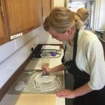
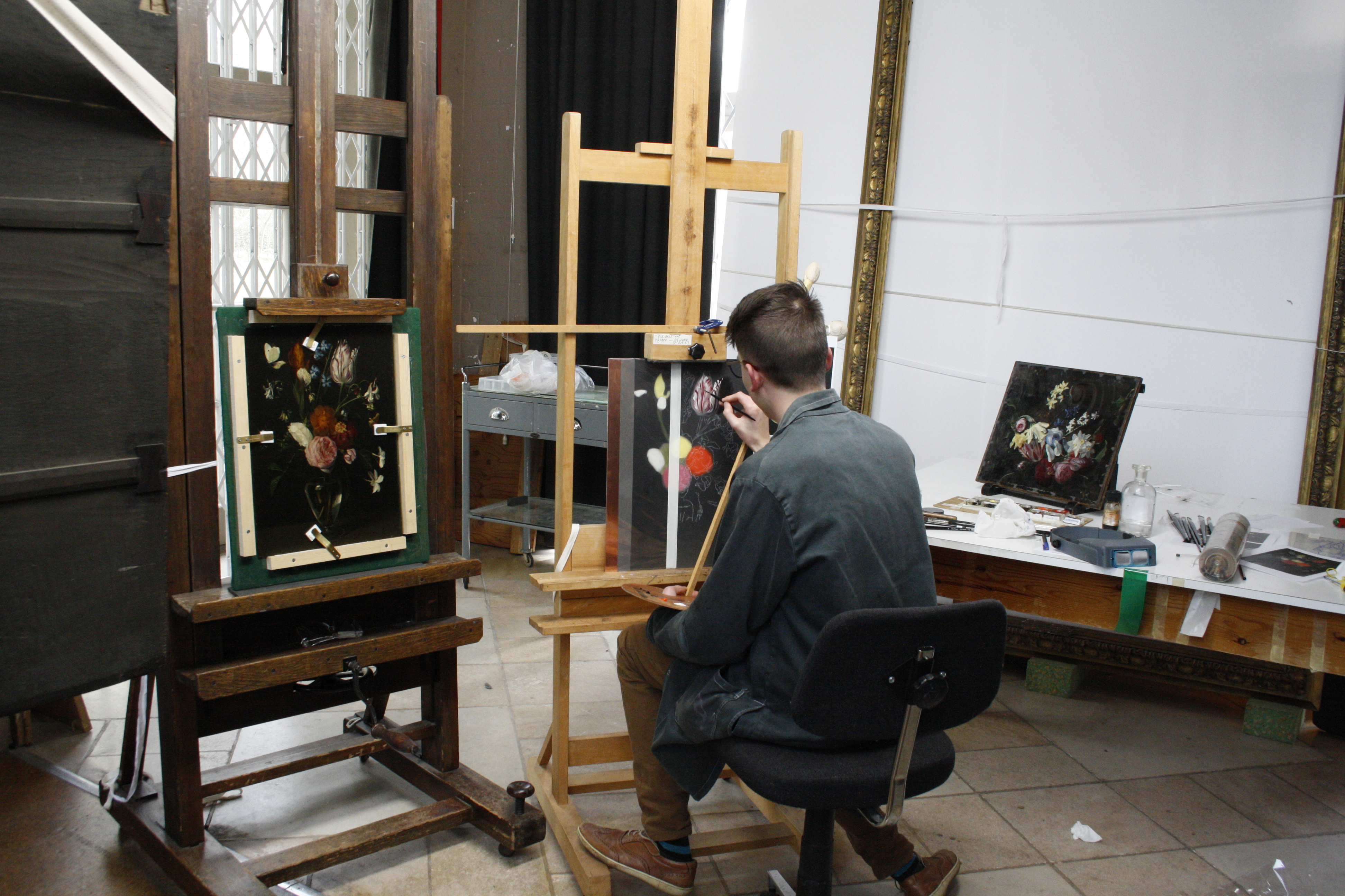
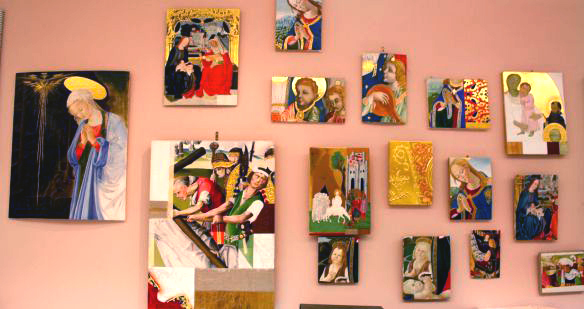
This was a distinct change from our early Italian copies as we were not only working from the same panel, but we also chose similar sections of the panel to replicate. As can be expected, this lead to a lot of dialogue between us as we came up against the various challenges of reconstructing this beautiful painting. We have decided therefore, to share with you some of that dialogue and present our reconstructions of Joos van Cleve’s Madonna and Child together and in our two voices, each paragraph is named at the start with the author.

hki-3075_img-55
Fig. 1. JOOS VAN CLEVE, VIRGIN AND CHILD, C.1525, FITZWILLIAM MUSEUM (©TITMUS)

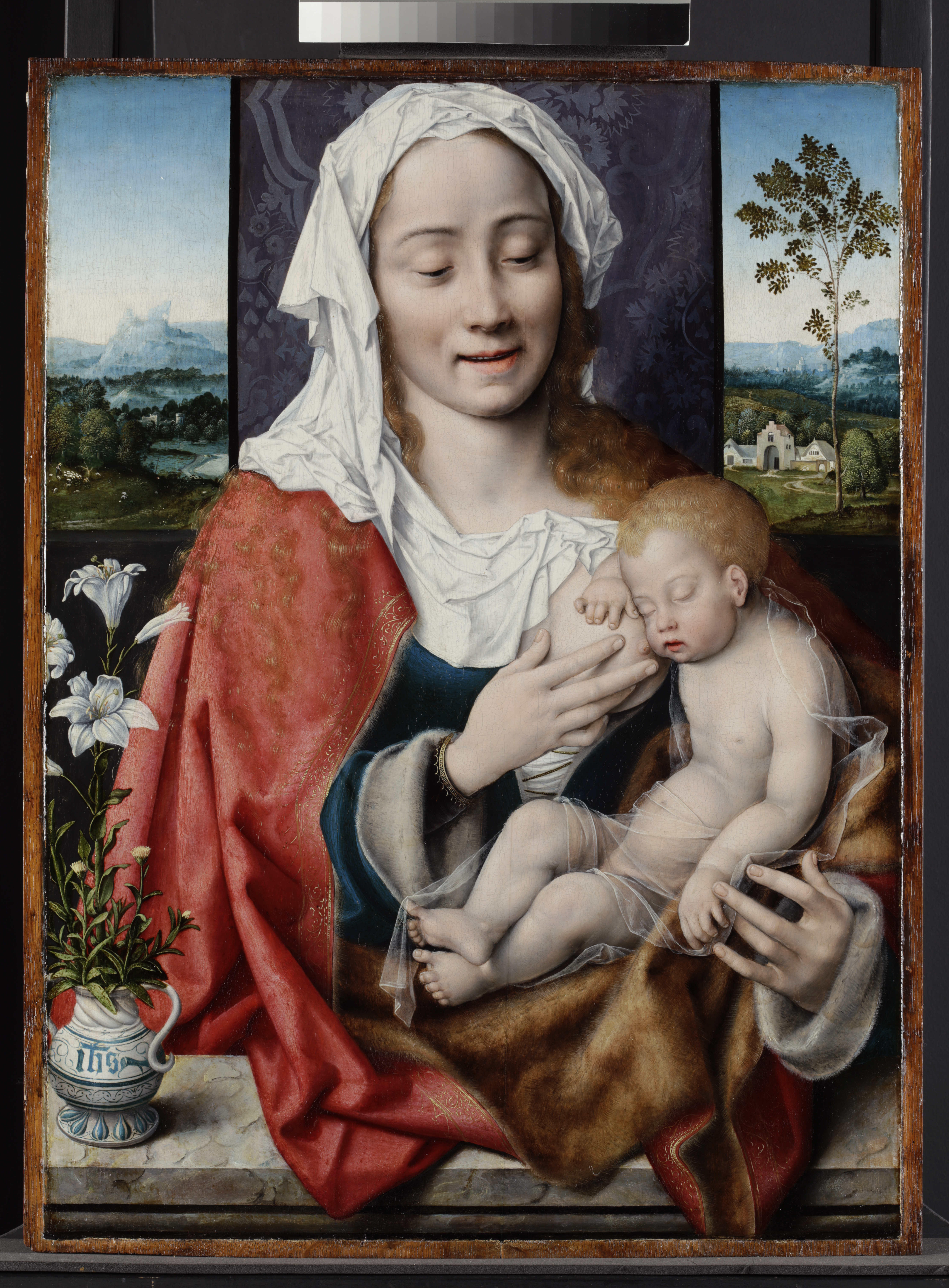
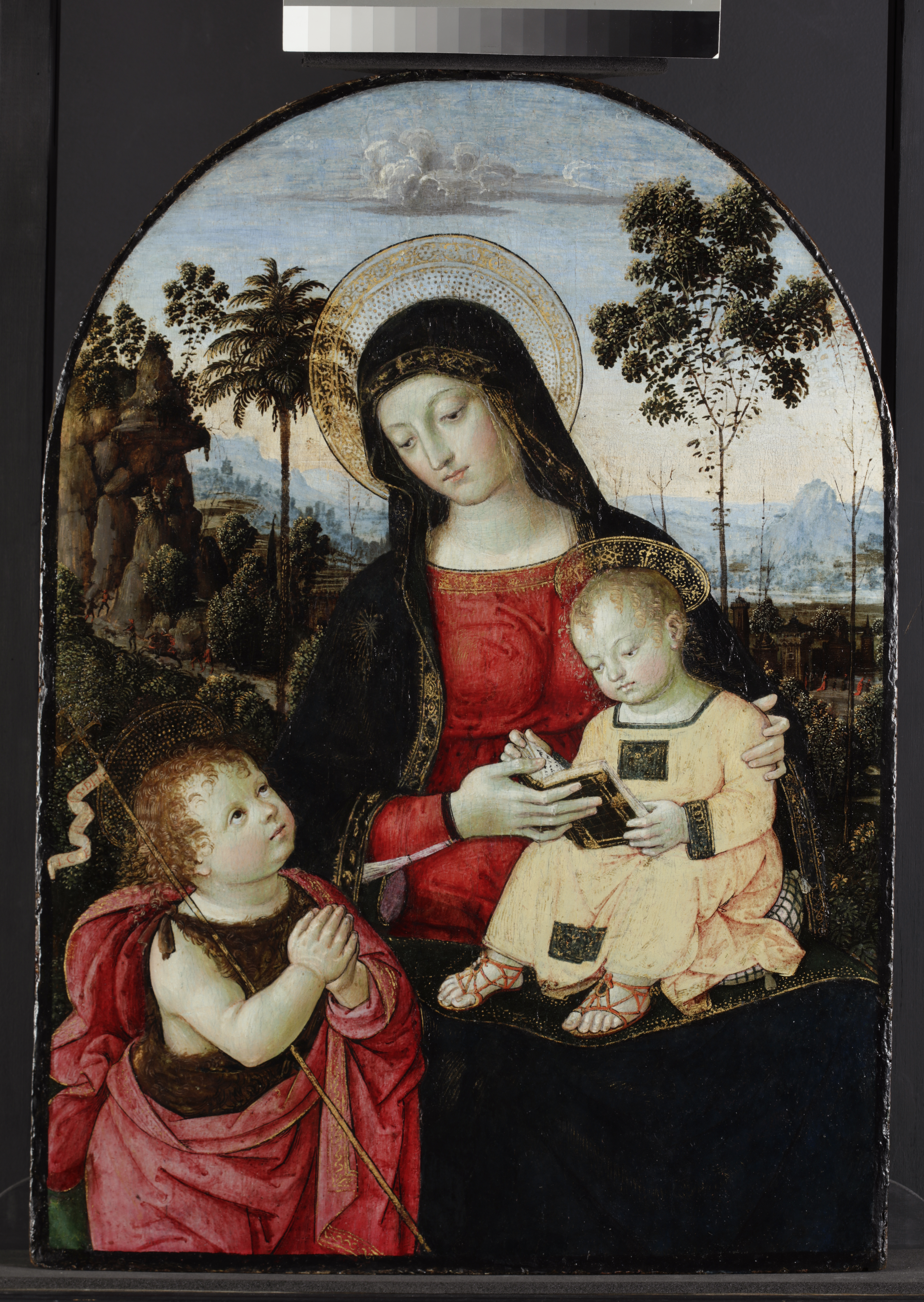
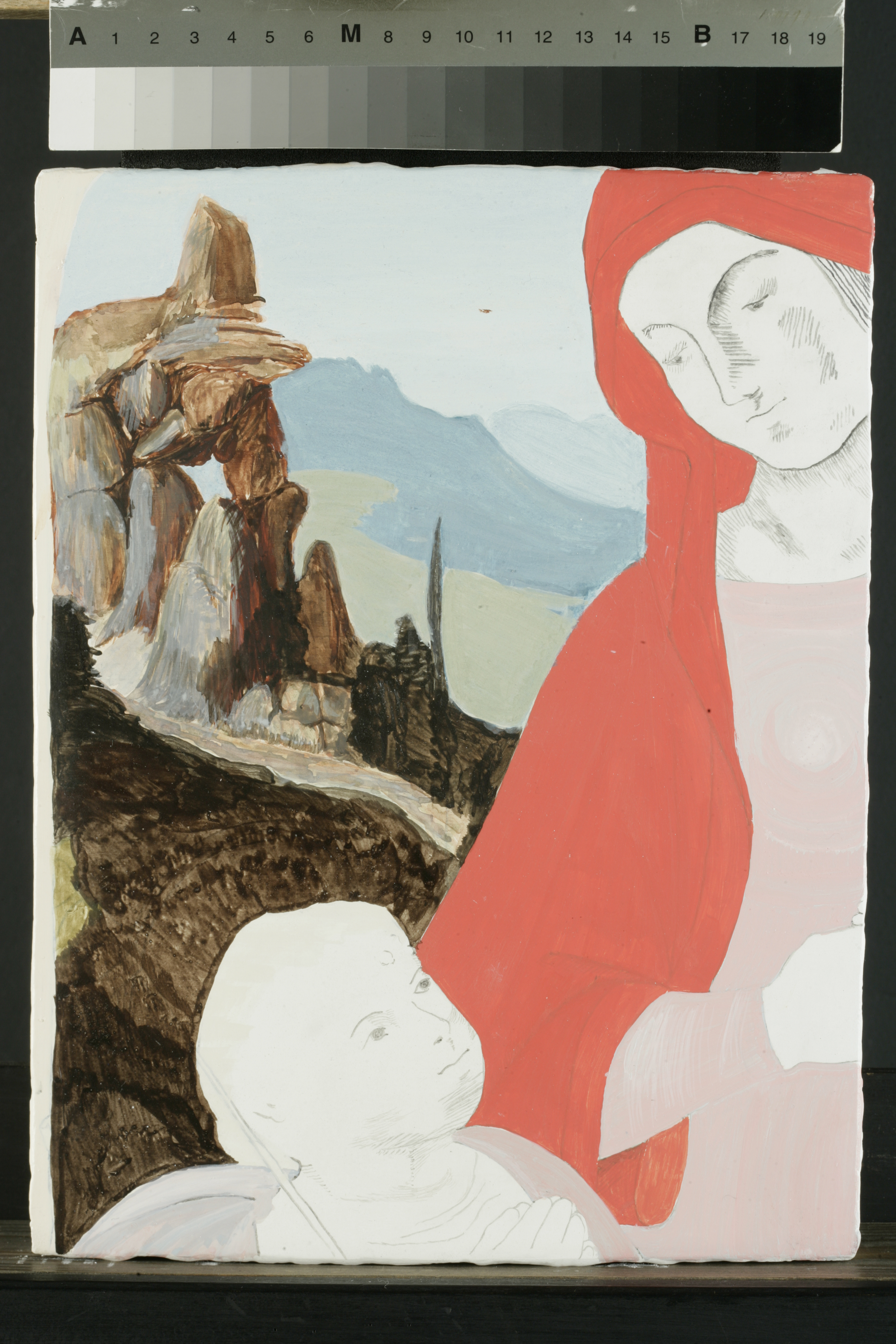
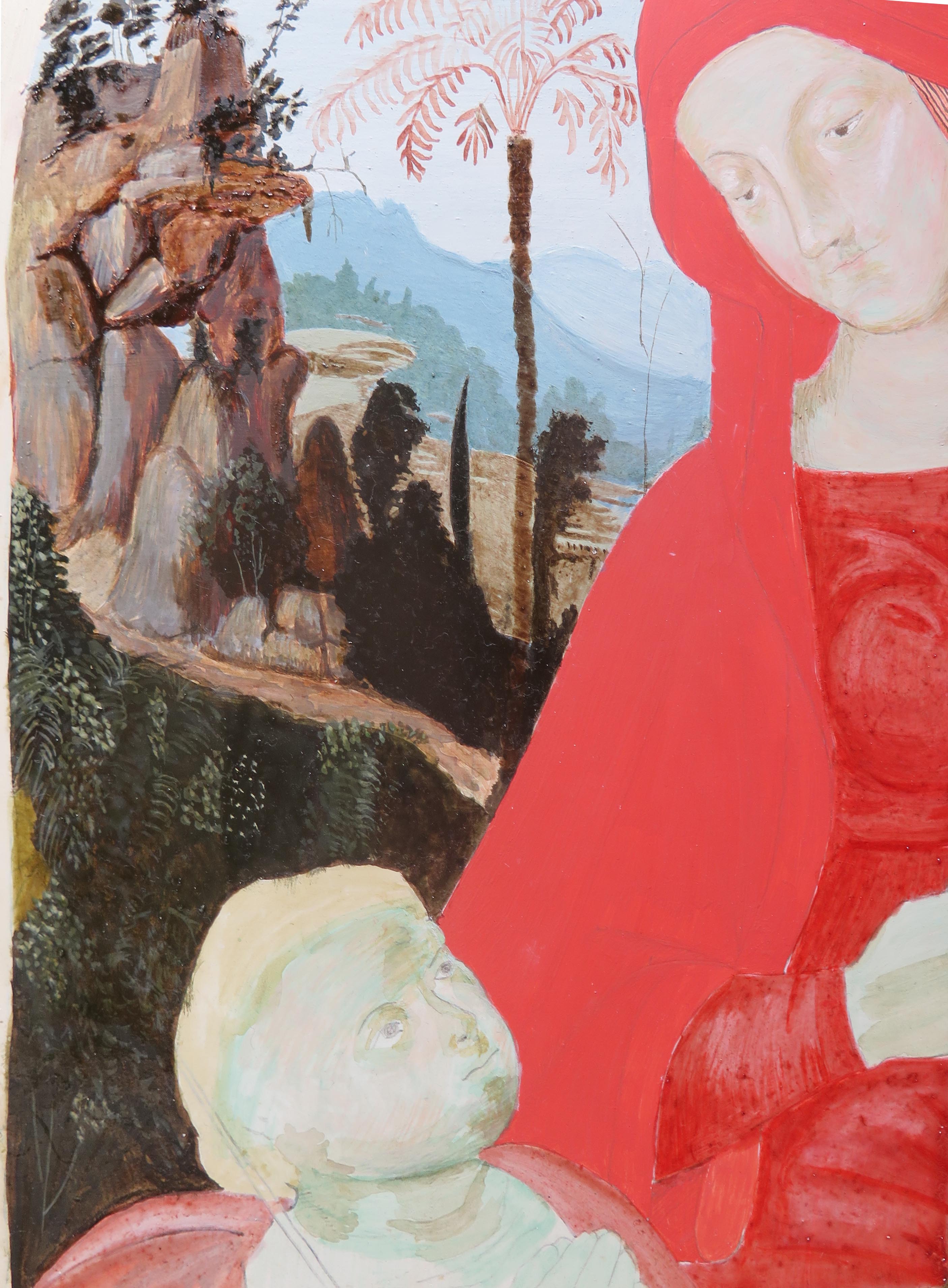
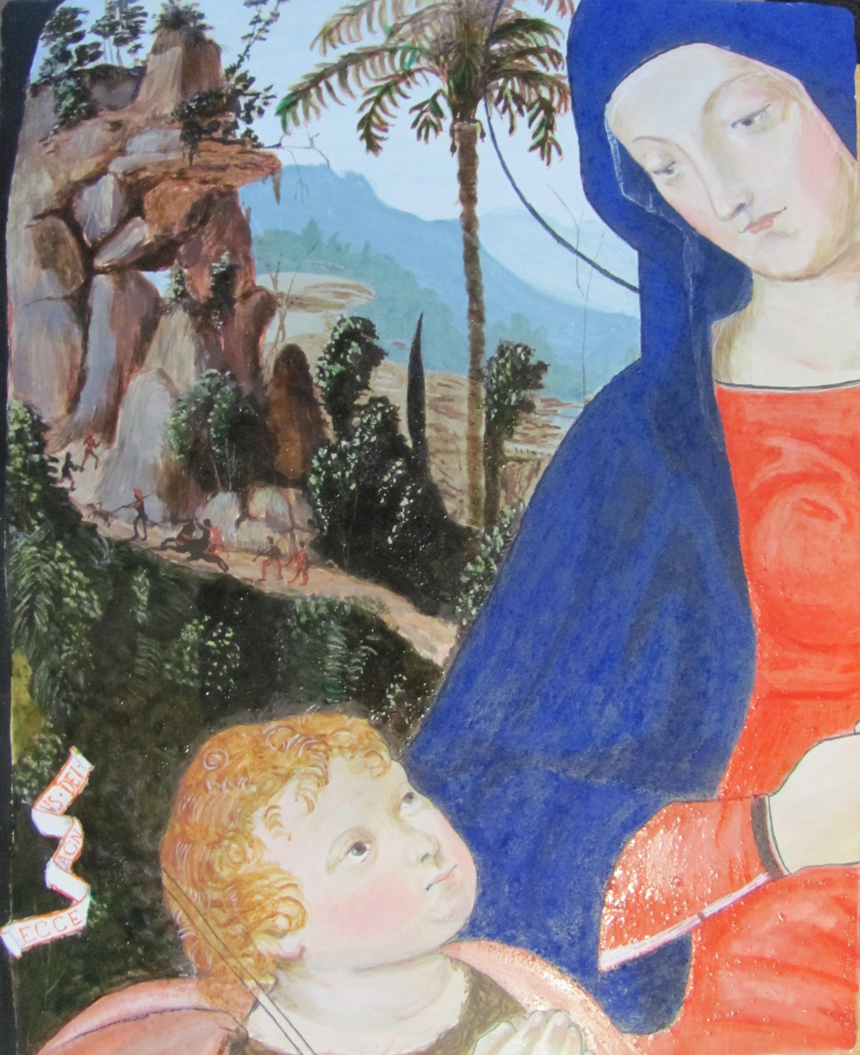
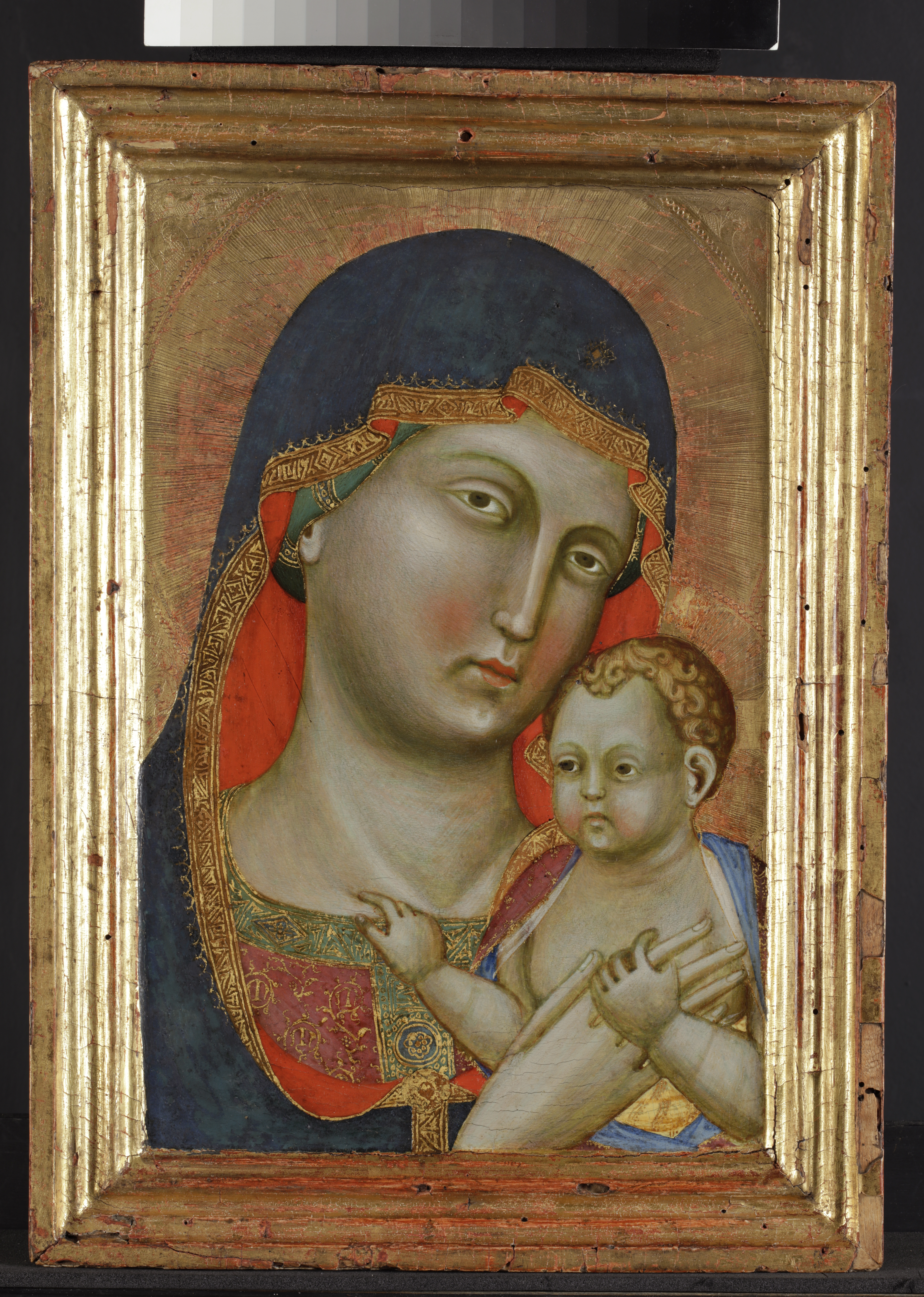
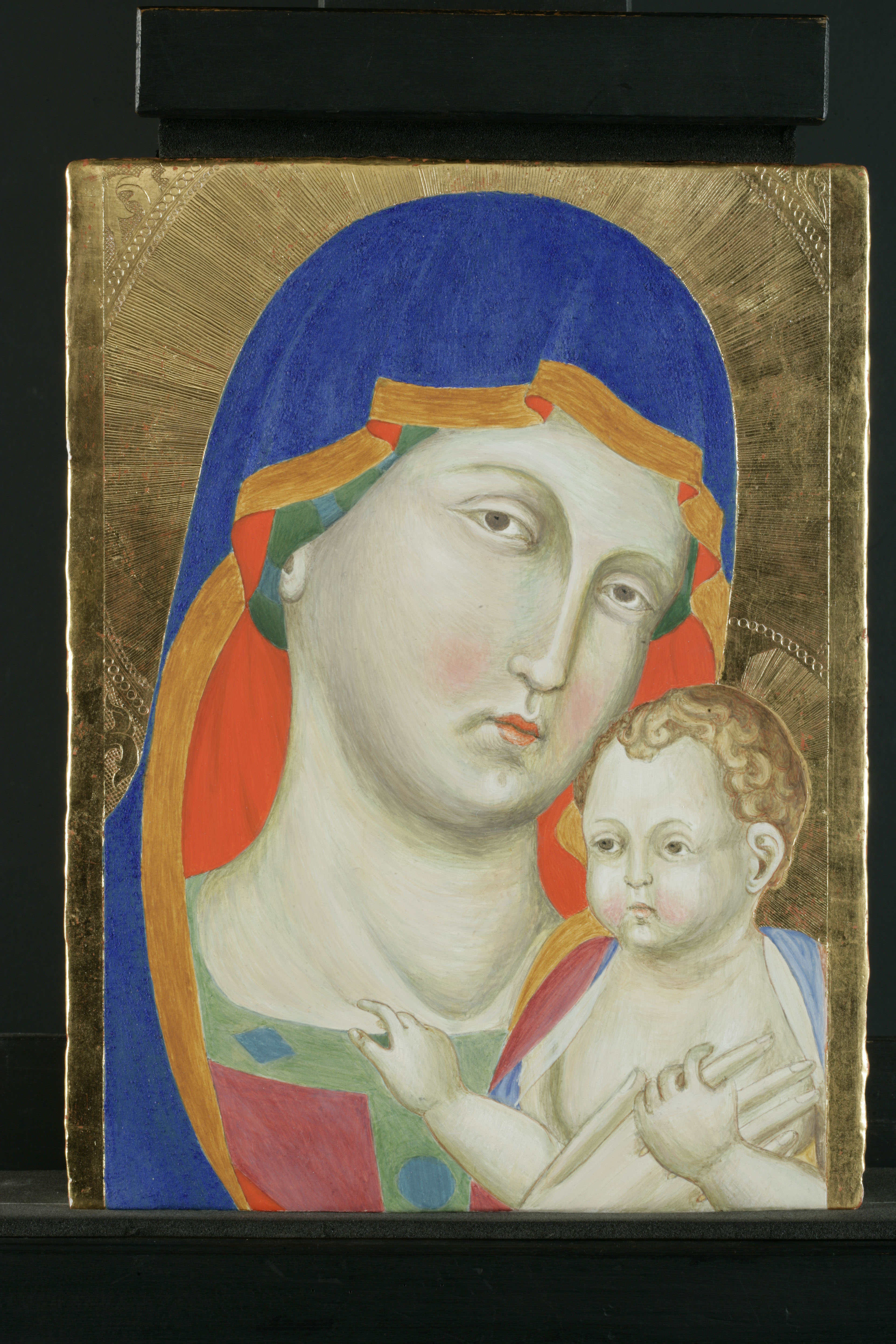
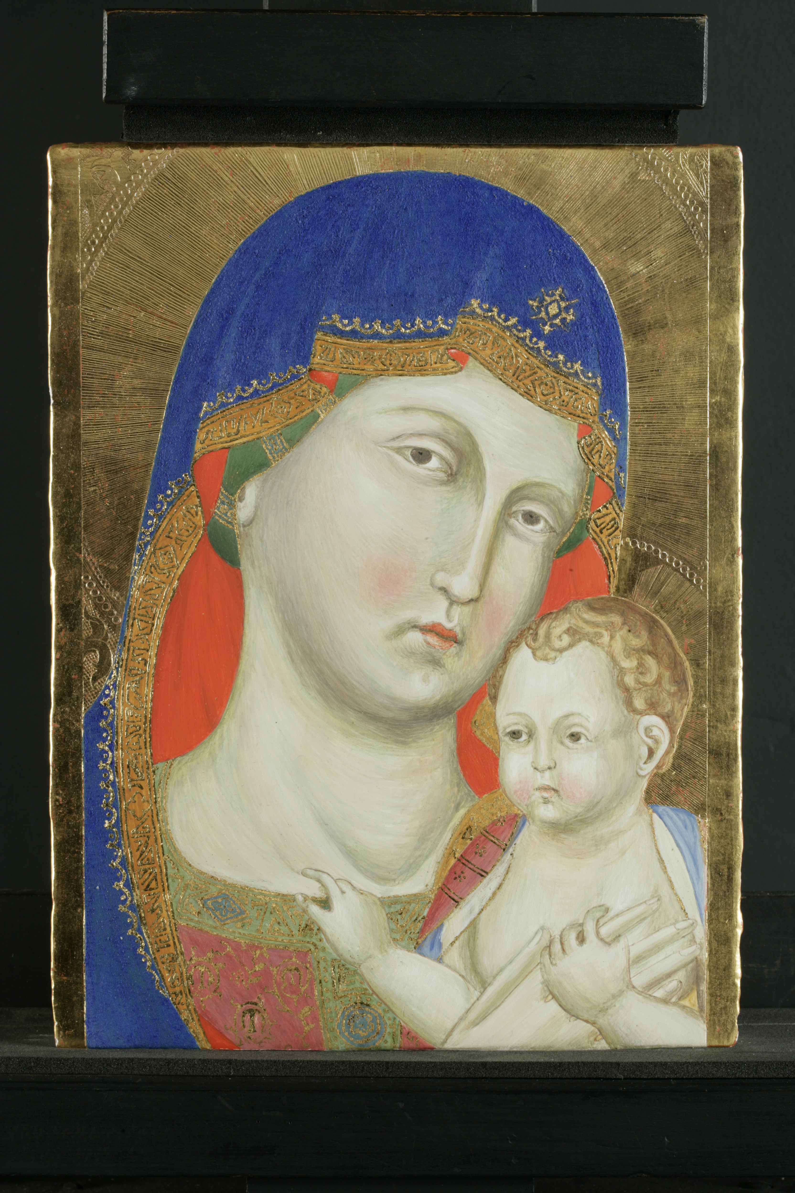
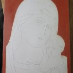
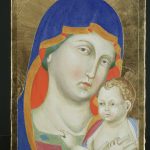
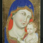
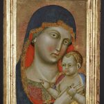
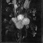
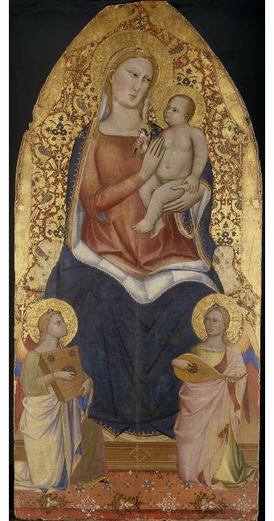
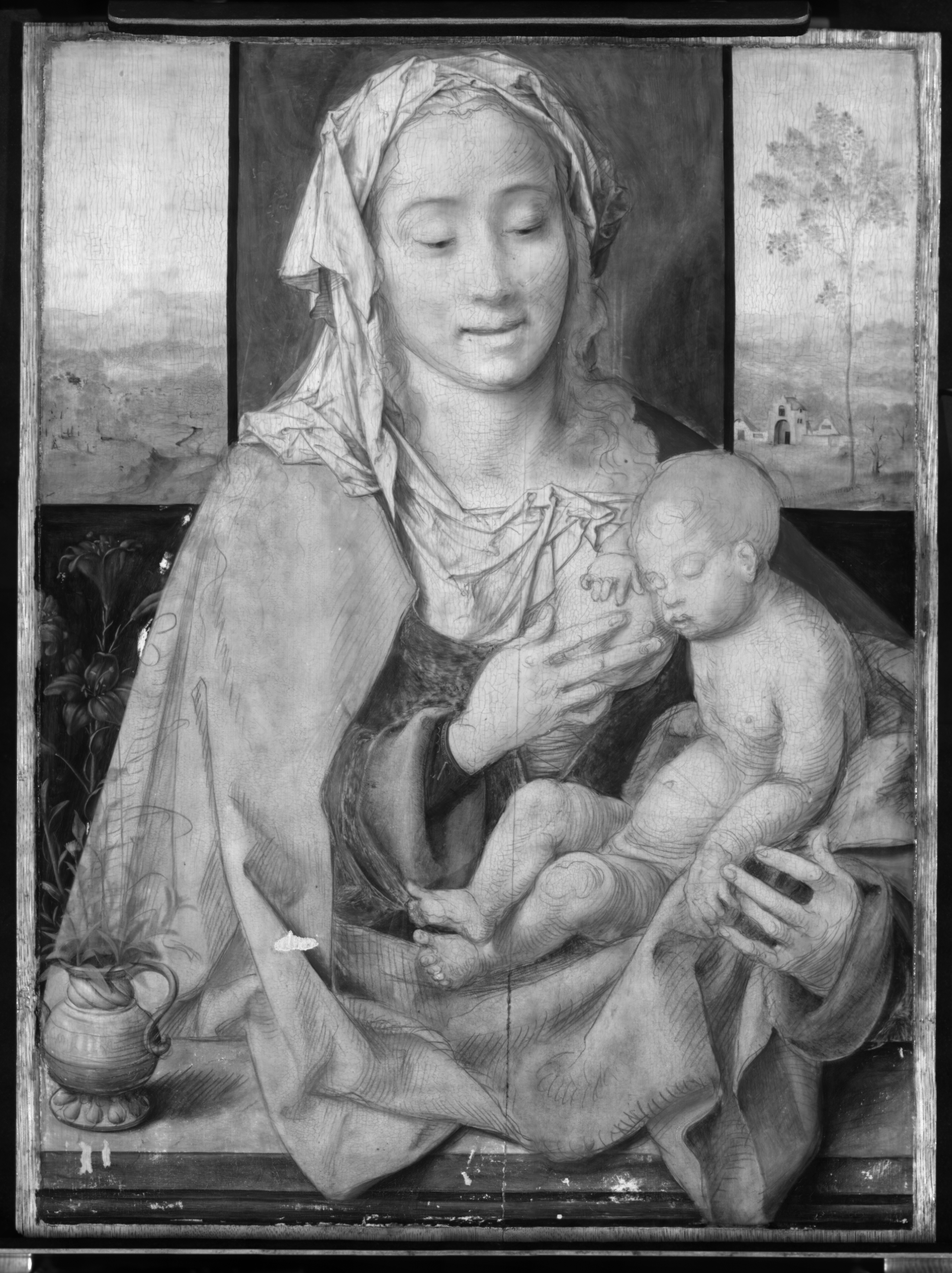
Anna: Joos van Cleve (1485-1541) was mainly active in Antwerp in the early part of the 16th century. He seems to be a very typical painter of this period, as he had a very large successful workshop that managed to weather a recession in Antwerp in 1525, by remaining incredibly adaptable to what the market wanted. Therefore, his style is quite representative of the tastes and culture of the time. For example, in the early part of his career he produced a lot of large altarpieces, but after Antwerp began to struggle he moved to producing a huge amount of small, almost mass-produced devotional pieces that could be purchased by individuals. The painting that we copied, Virgin and Child (1525-29) from the Fitzwilliam Museum, is on the cusp of this change (Fig. 1). Joos van Cleve held various important positions in the Guild of St Luke in Antwerp, so it is possible to assume that his standards and practices were demonstrative of the guild’s outlines. [1]

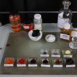
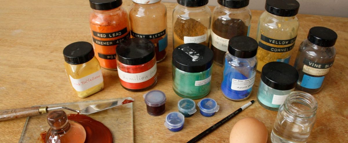
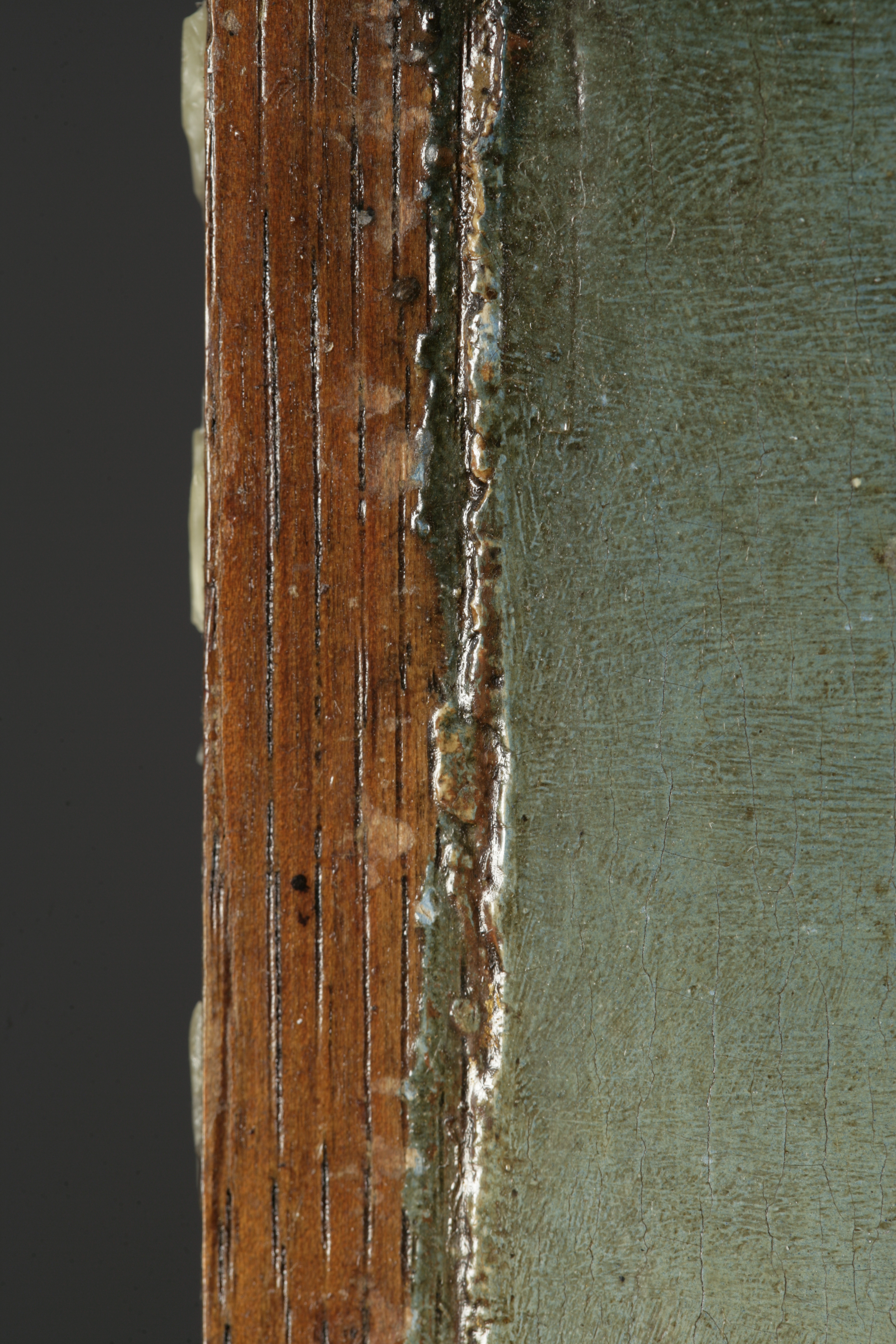
Anna: Panel makers were members of the Guild of St. Luke in Antwerp, where the first surviving regulations date from the late 15th century. The guilds stipulated that that wood should be seasoned for roughly 2-5 years, depending on its thickness. Earlier in the 15th century, when boards were thicker, boards could be seasoned for up to 10 years. In Flanders, panels were often hand-sawn (there were no sawmills in Antwerp until the early 17th century). Machine cut boards display straight and parallel marks, unlike hand-sawn. The panels were often butt-joined, possibly with some heartwood on the outer edges, and boards could be adhered with casein or animal glue, and then planed down.

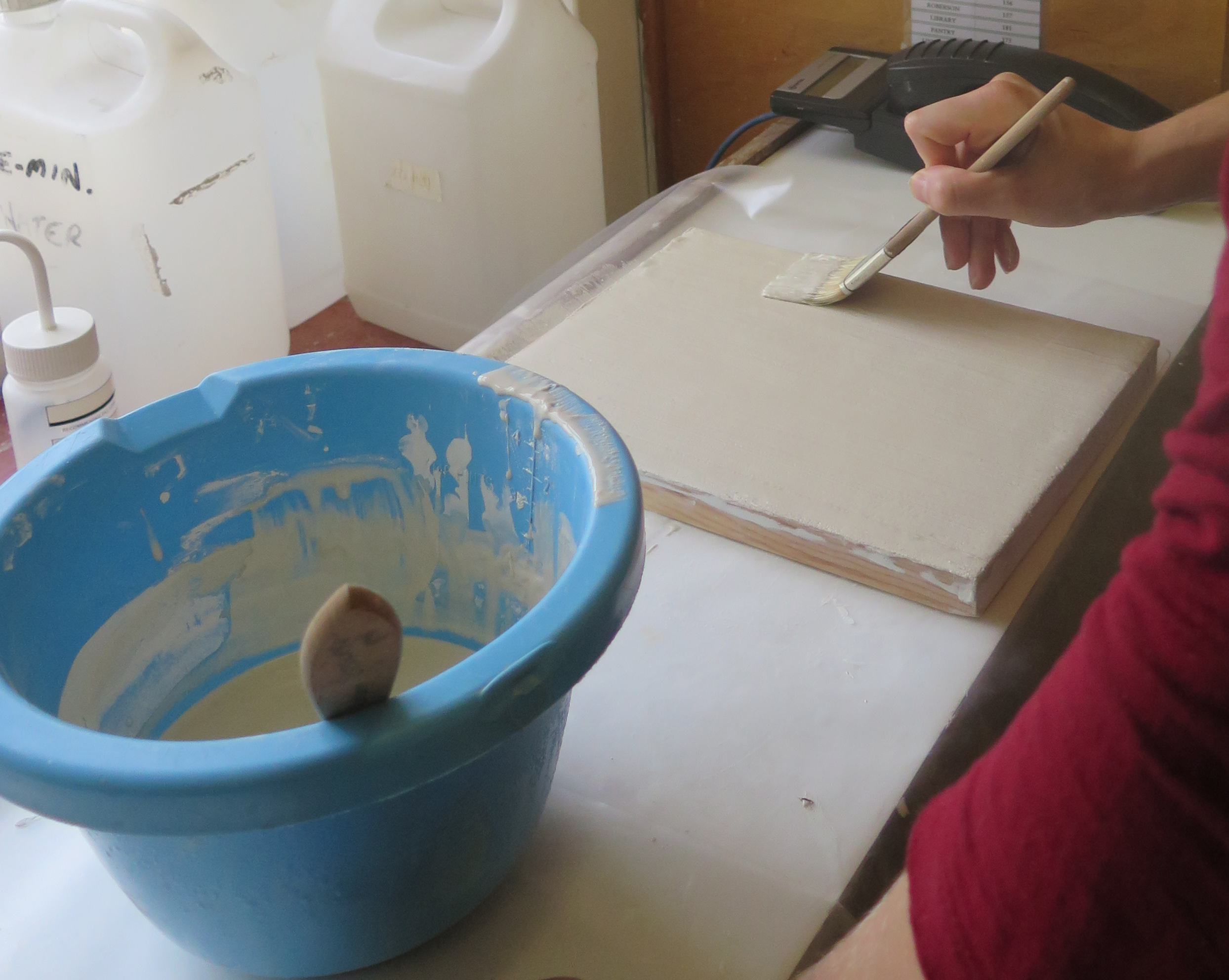
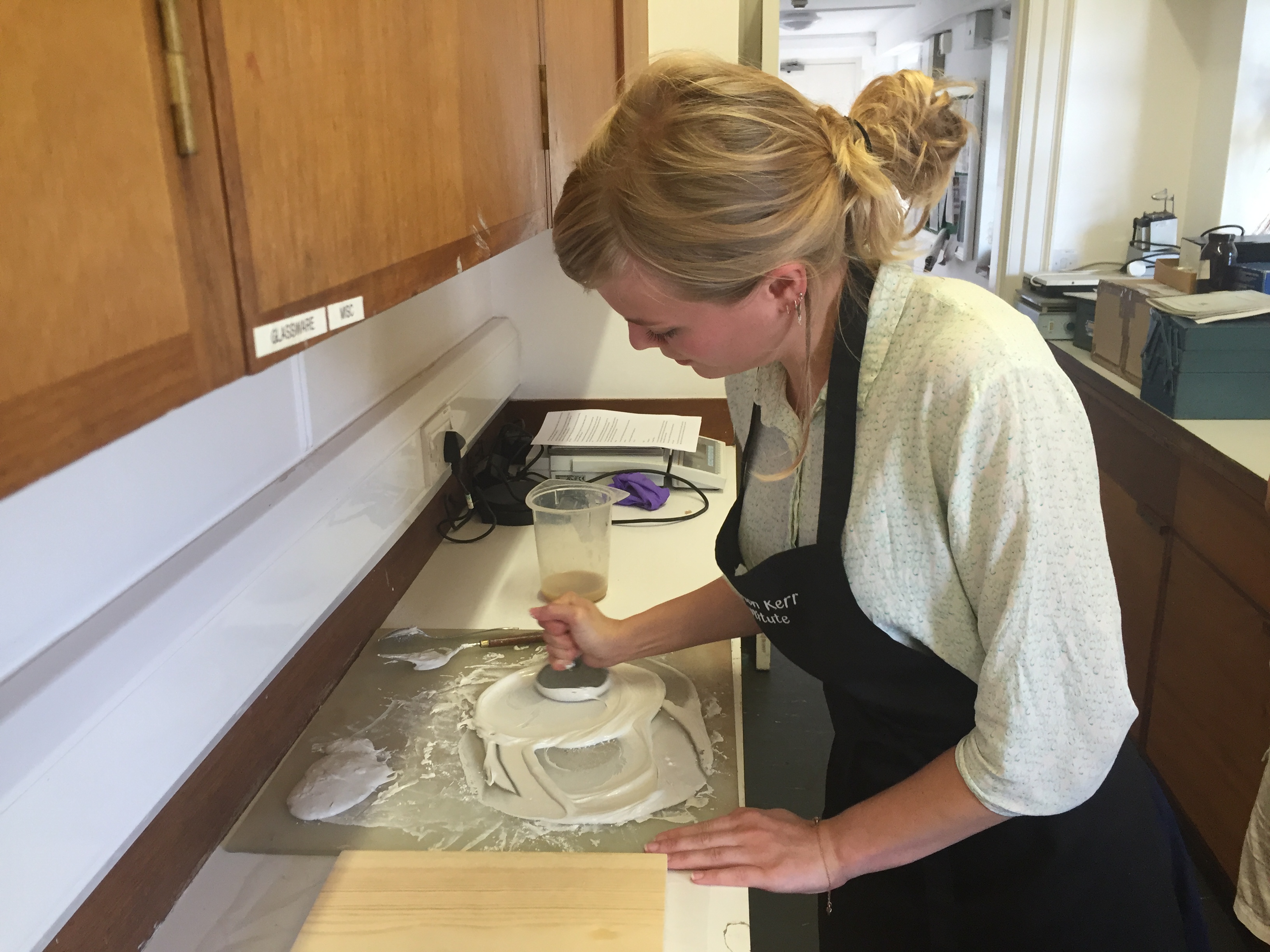
There was an unpainted border around the panel, and the edge of the paint is slightly raised, indicating that the ground and paint layers were applied within an engaged frame (Fig. 2). The back of the painting is bevelled, making it easier to insert into a frame. In our case the support for the reconstructions was pine, rather than oak. The calcium carbonate used for grounds in Northern Europe was simple to prepare, impurities would be removed with washing and then it would be mixed with animal skin glue. Sometimes this ground was applied quite thinly in Northern European panel paintings.

HKI-3075_img-29
Fig. 2. DETAIL OF UNPAINTED BORDER AND BARB OF PAINT ON ORIGINAL, BEFORE TREATMENT (©POLKOWNIK)

Elisabeth: After the multi-step complexity of gesso preparation, the chalk grounds favoured by artists in the Northern parts of Europe were a delight to apply.

Anna: One issue that I encountered, which Elisabeth didn’t, was small pinprick holes forming in the ground. I wondered if this was due to the fact that we had to apply the chalk ground over two days and so the initial layers had been allowed to dry, and though I wetted the ground before applying the next layers, perhaps it were still too dry. I ended up rubbing the chalk ground with my fingers, using quite a lot of force, filling the holes and as a result the pin-prick holes disappeared. This also got quite a smooth layer, but wouldn’t be very practical over a larger area.

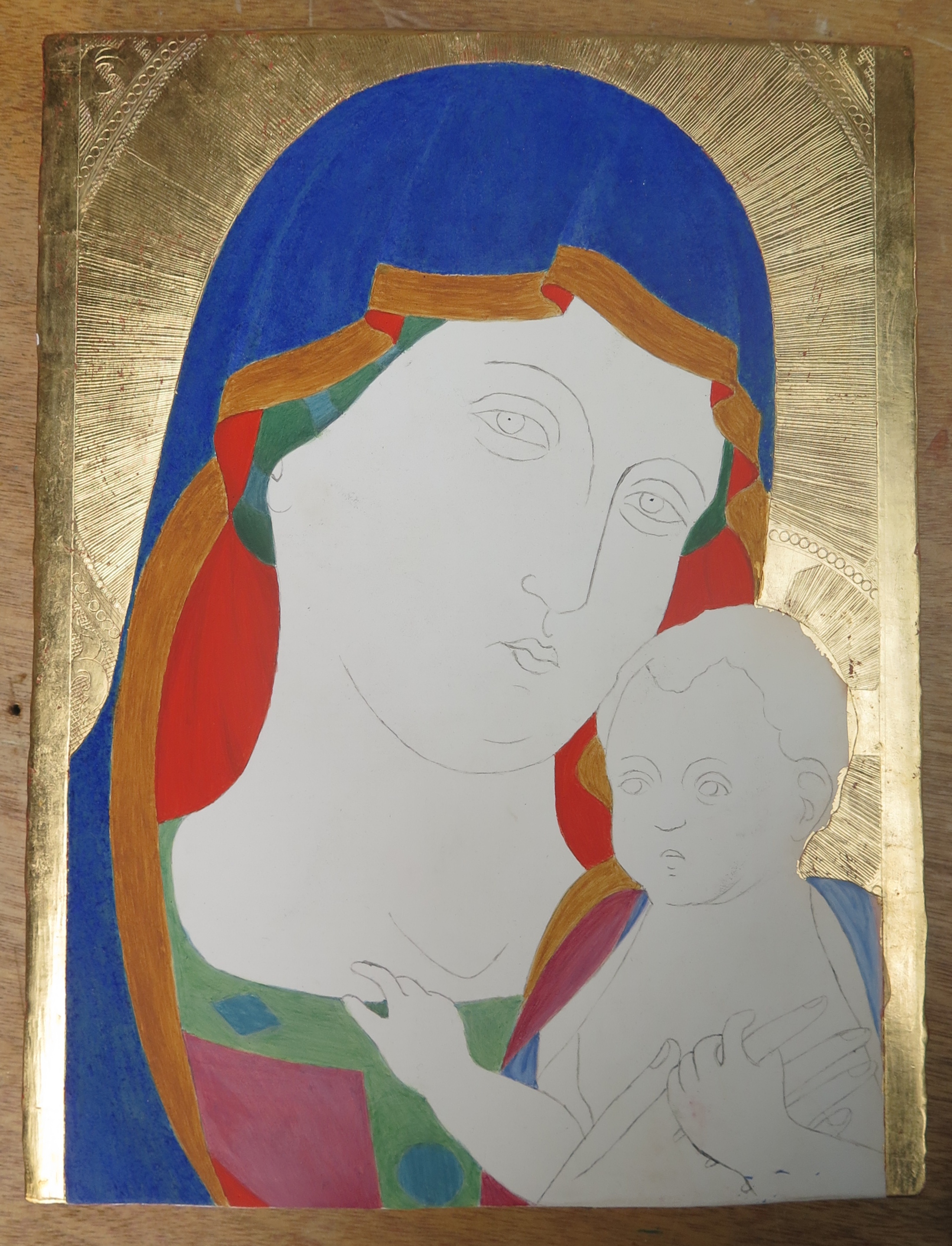
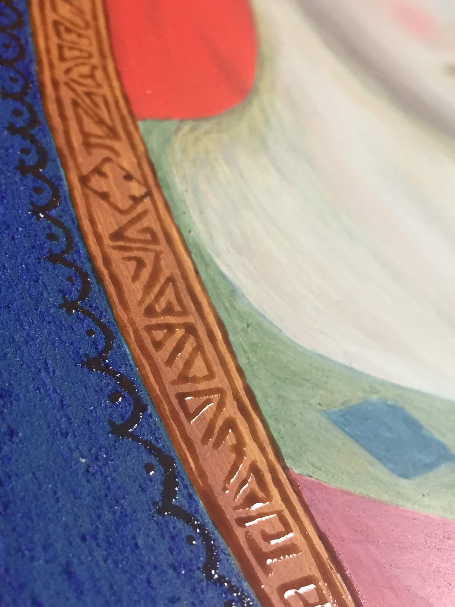
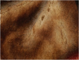
Anna: Most of the sources on early Northern painting discuss doing the underdrawing prior to an oil-priming layer, however the other way around was also possible. We did the latter, and applied an unpigmented layer of lead drying oil. Our reasoning for not pigmenting this layer is that there was no evidence of it in a cross-section taken from the painting. Accounts of early Northern technique mention the fact that these priming layers can be a thin layer of oil alone or possibly an oil layer often mixed with lead white pigment. Later a beige coloured priming layer, similar to the one Karel van Mander mentions in his early 17th century book Het Schilder-Boeck discussing the technique of early Netherlandish painters, was found to be helpful in providing a mid-tone. During the process of painting I realised there was a transparent beige tone coming through in some areas perhaps due to the oil layer making the ground more transparent, possibly more through ageing. This is especially visible in the fur worn by the Virgin (Fig. 3).

Elisabeth: Yes, a warmer priming layer would have helped bring life to the flesh tones. I felt we had to compensate a little with additional paint layers to try and achieve the same effect.

Untitled
Fig. 3. DETAIL SHOWING A WARM LAYER THROUGH PAINT LAYERS ON ORIGINAL PAINTING (©TITMUS)

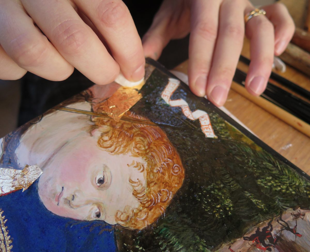
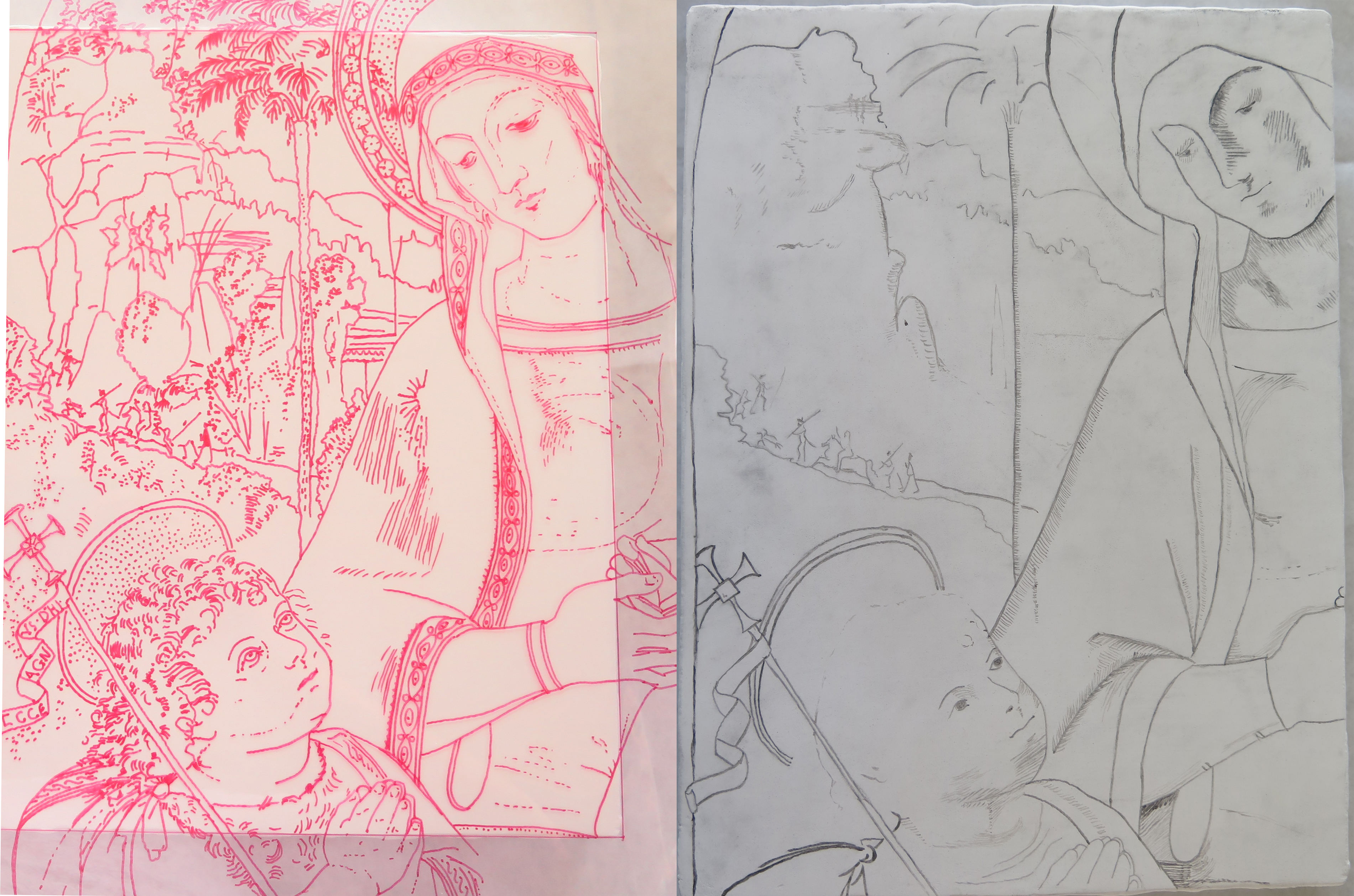
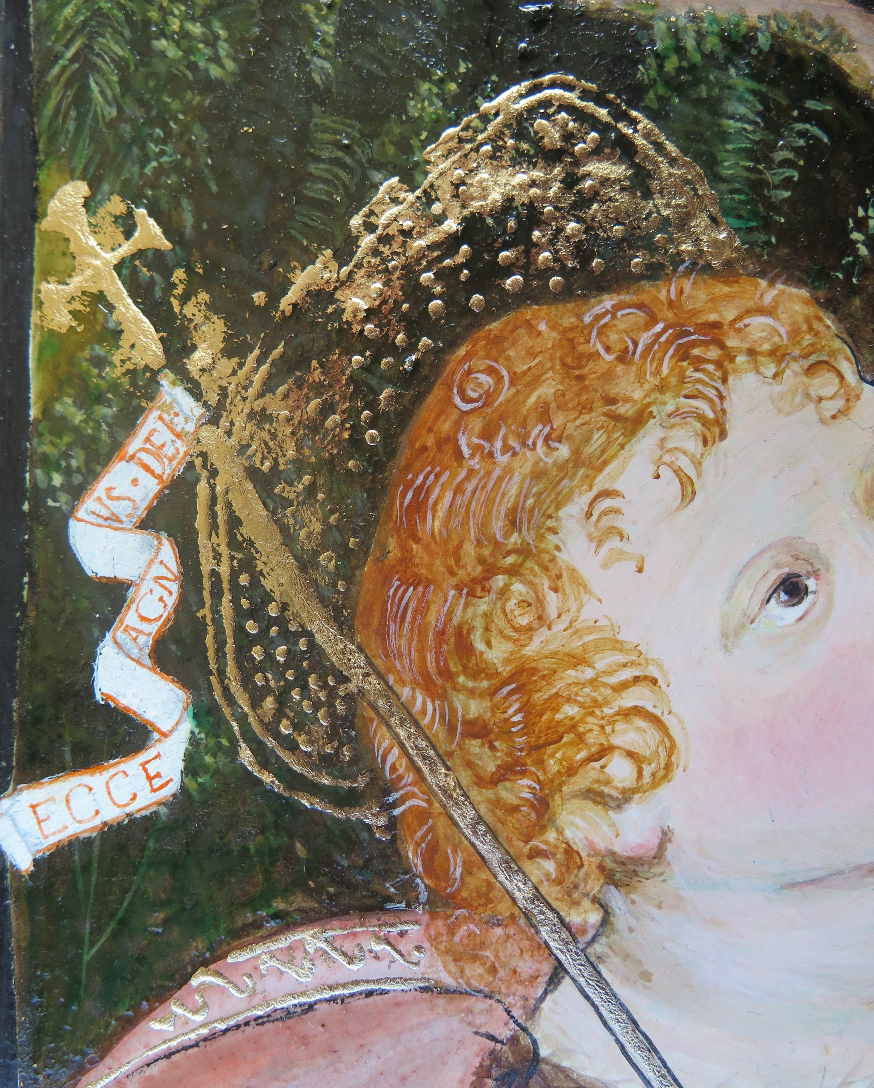
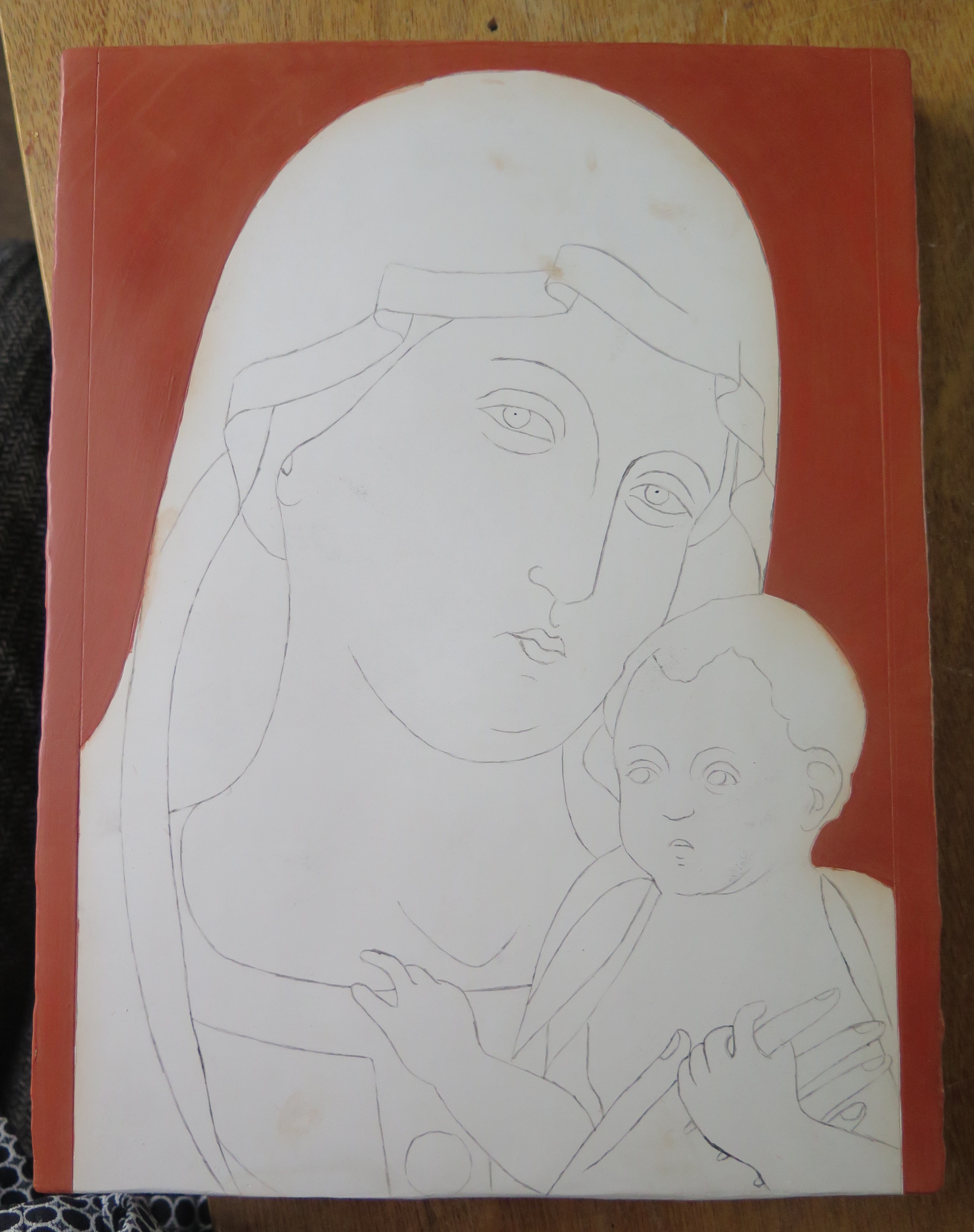
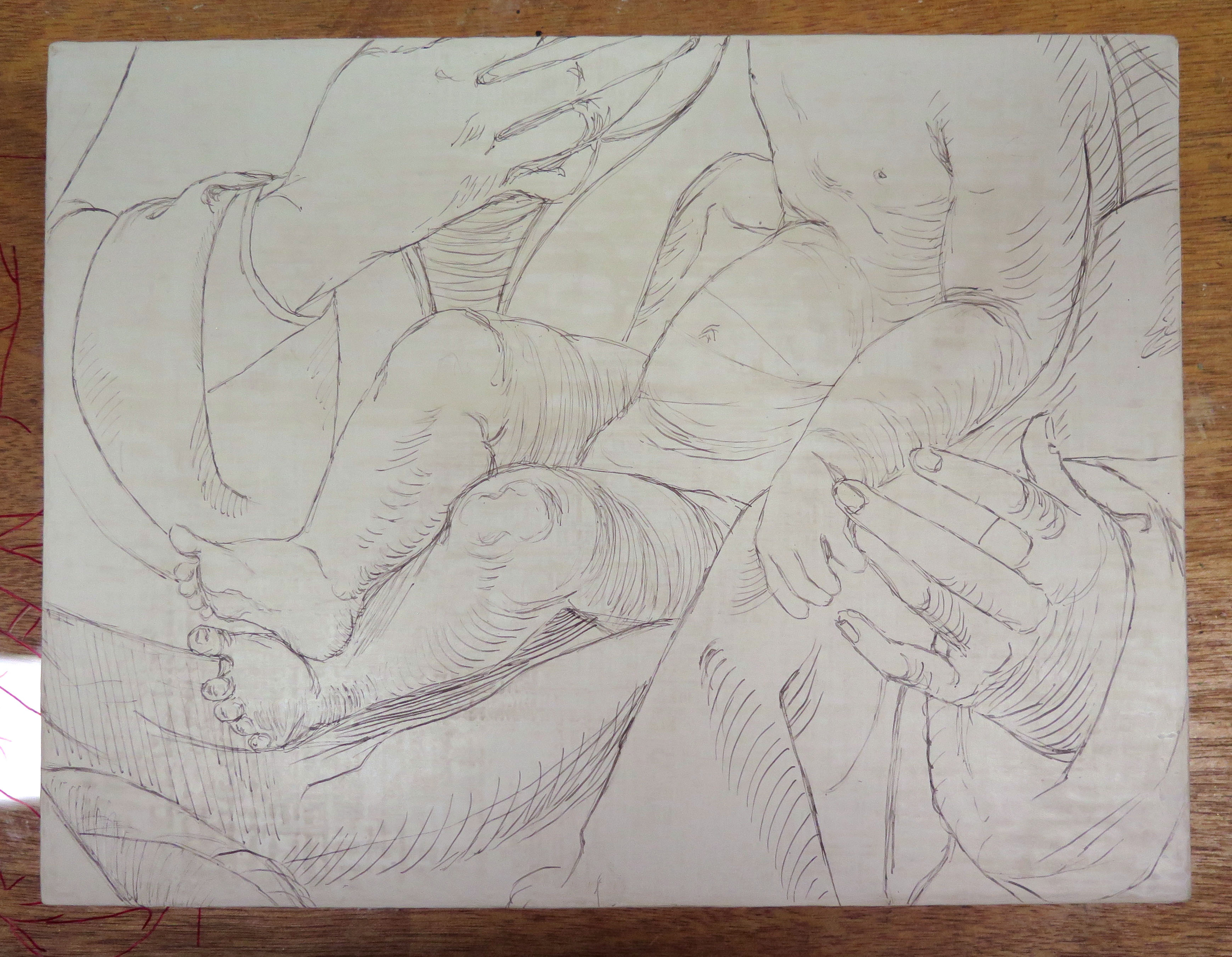
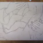
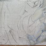
Anna: Underdrawings could be carried out in a range of materials, either wet or dry. Although underdrawings in dry materials, such as black chalk or charcoal, were less common, Joos van Cleve was known to work with these. Infrared images of his paintings reveal a distinctive style of underdrawing (Fig. 4); the drawing attributed to van Cleve’s hand is very free and sketchy, often carried out in a dry material, while the underdrawing style of his assistants is much more precise and contained, and executed in a wet material, for example a carbon-based black in a medium.

HKI-3075_img-43
Fig. 4. Infrared Reflectography (© Titmus)

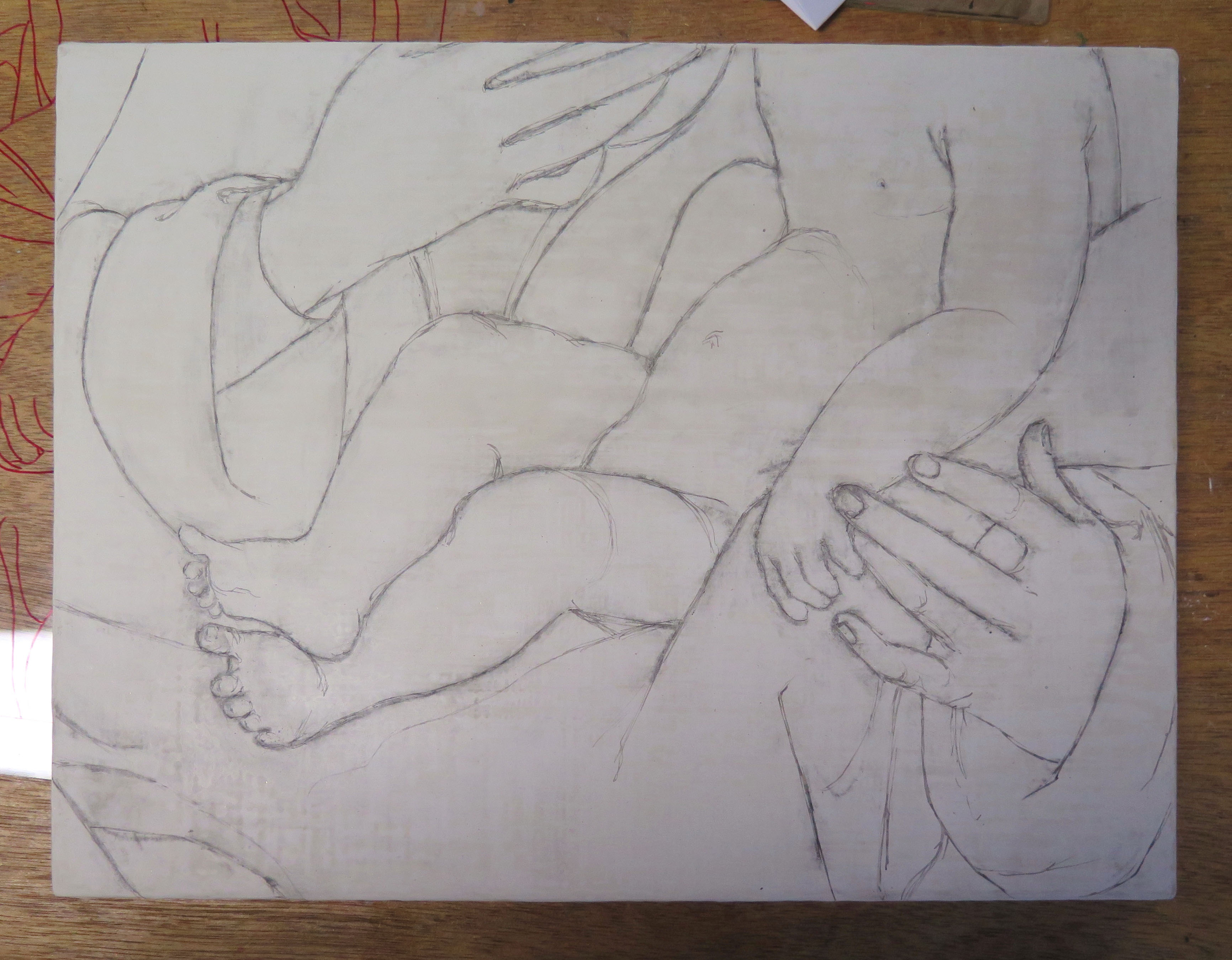
Elisabeth: This was a compromise for us when approaching the underdrawing. We did use a melinex transfer to get the proportions of features like the hands but this meant losing the fluidity of the original sketch. I decided to apply most of the underdrawing freehand directly with carbon black in gum arabic, applied with a brush, and although this was not applied dry to try and recreate the style of van Cleve’s composition.

IMG_1644
Fig. 5. OVERVIEW OF UNDERDRAWING STAGE OF RECONSTRUCTIONS – Anna’s reconstruction (©Don)

Anna: Another nuance of Joos van Cleve’s underdrawing is the absence of drawing in the landscape. Joos van Cleve frequently had a landscape specialist carry out these areas, for which a model drawing was used.

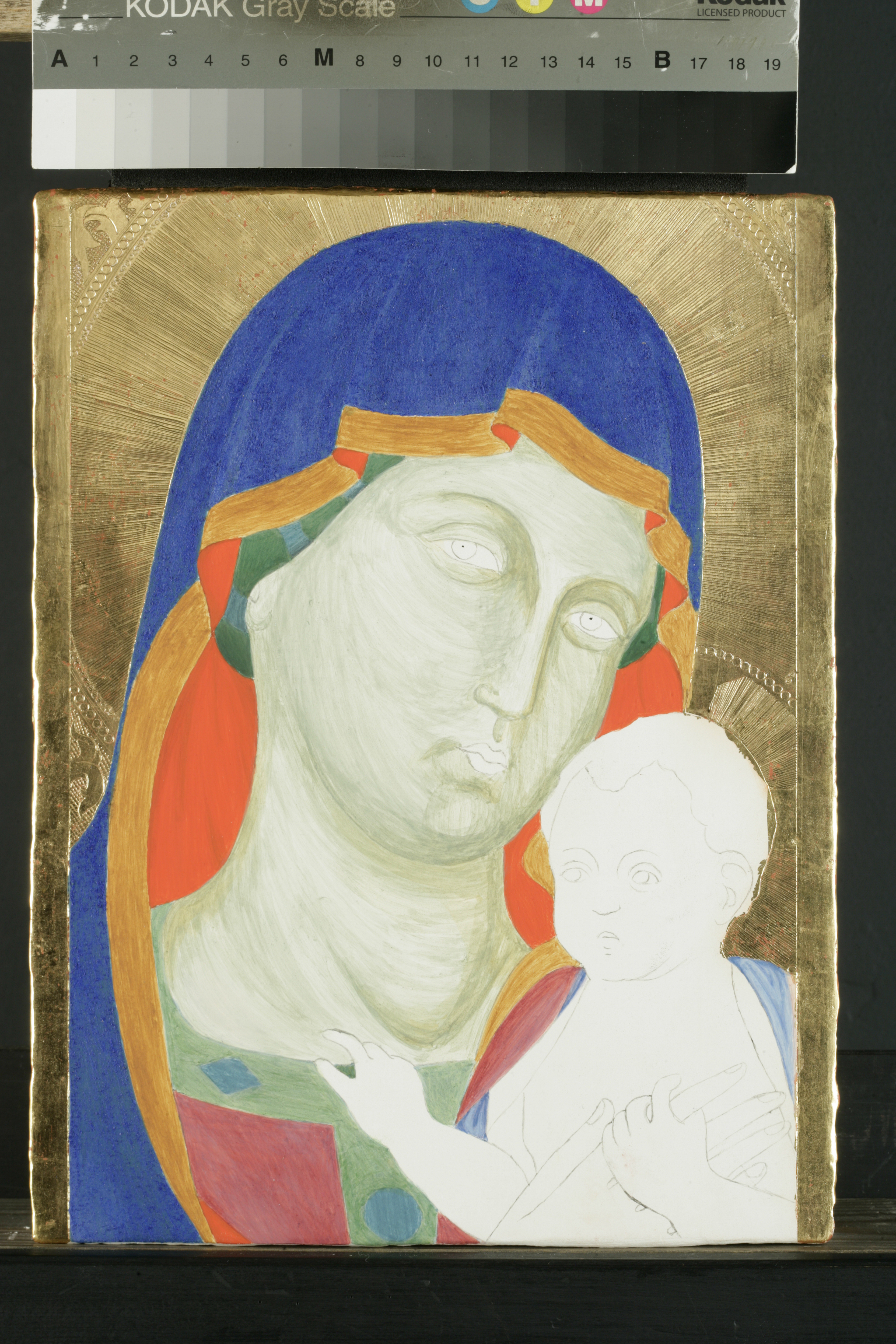
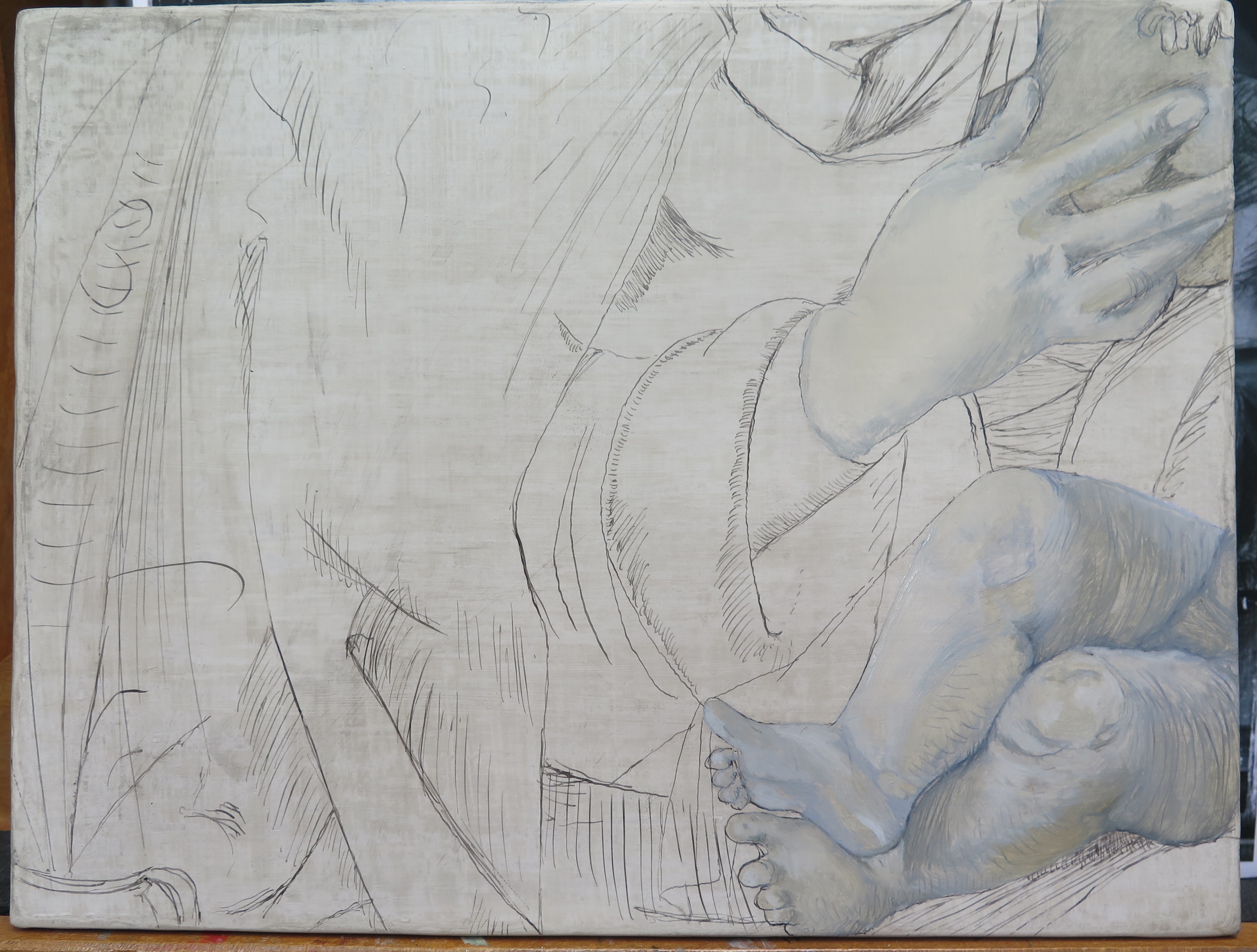
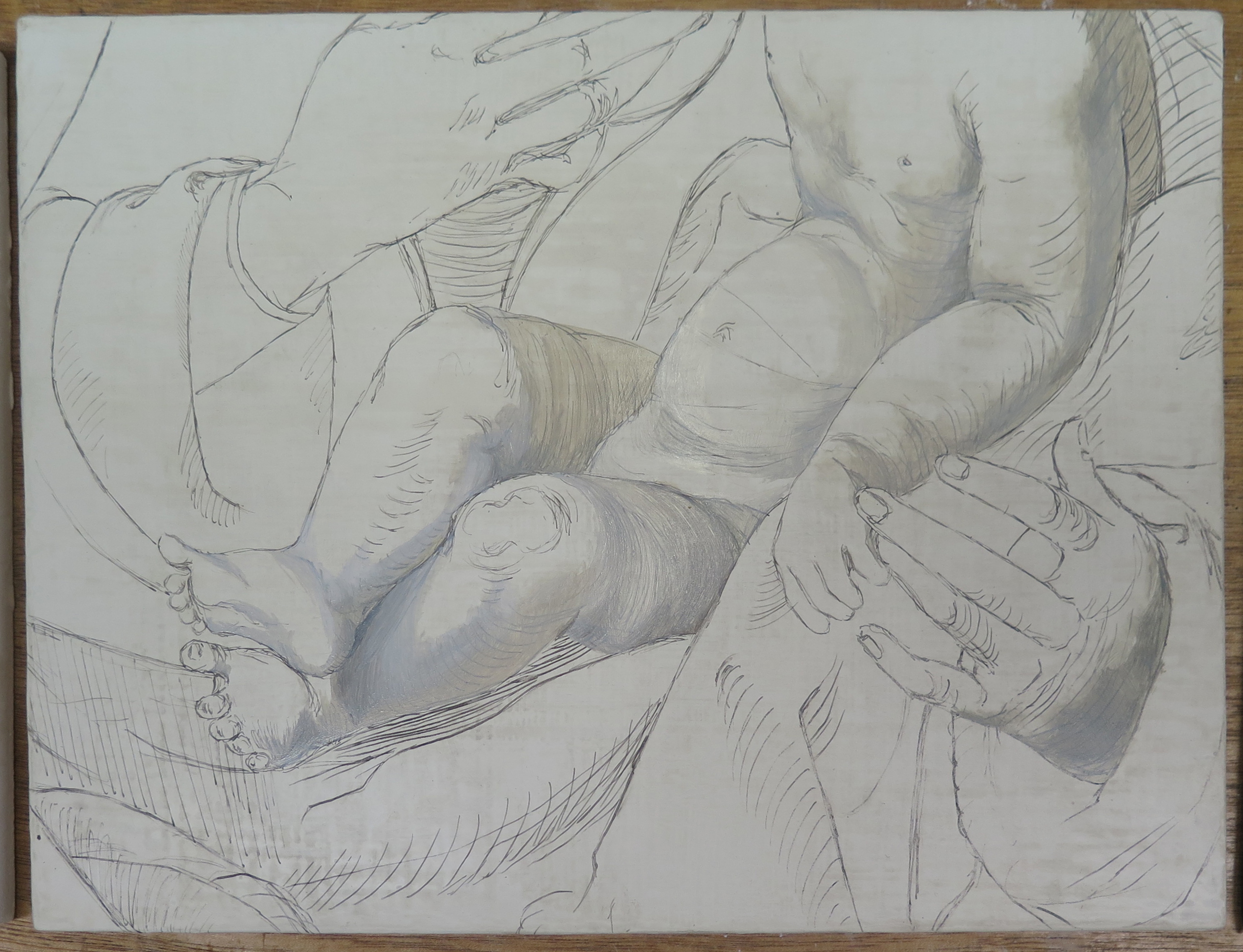
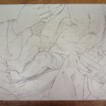
Although it is difficult to tell between wet and dry underdrawing materials in infrared, as the method of application can affect the result, the underdrawing of Virgin and Child has an appearance closer to that of a dry material. The outlines of the strokes are indistinct and rounded, and look distinctly not liquid (Fig. 4). This observation is stated with the benefit of hindsight, as after placing the image on the panel using willow charcoal (Fig. 5), I reinforced the lines using carbon black in gum arabic, and couldn’t achieve the thick, even, dry-looking lines that are visible in the underdrawing (Fig. 6).

IMG_1653
Fig. 6. OVERVIEW OF UNDERDRAWING STAGE OF RECONSTRUCTIONS – Anna’s reconstruction (©DON)

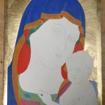
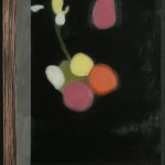
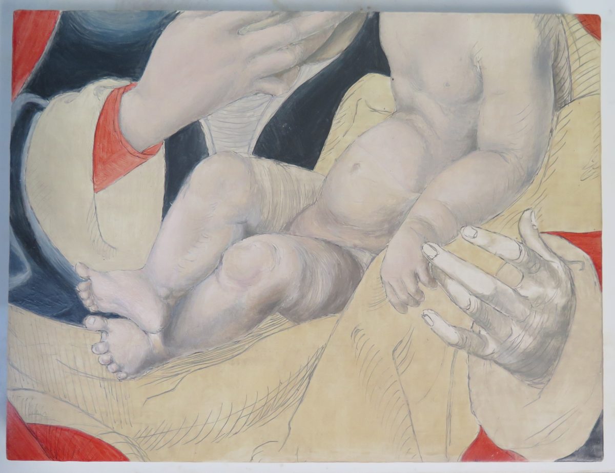
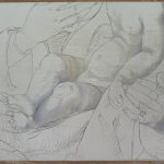
Anna: After applying the priming layer and the underdrawing, we started to model the flesh in monochromatic hues (Fig. 7 & 8). This stage is referred to in some sources of Early Northern painting technique, and serves to create the impression of volume. This exploits the properties of oil, by approaching the painting as a layered system. The transparency of oil allows these underlayers to contribute to the final image.

IMG_1660
Fig. 7. OVERVIEW OF UNDERLAYER STAGE OF RECONSTRUCTIONS – Elisabeth’s reconstruction (©Petrina)

Anna: Although we only applied this on the flesh, it perhaps would have been beneficial to use this technique on the drapery as well, to help create form. In the flesh, this monochromatic underlayer shone through the layers above, creating a blue-ish, turbid medium effect for the shadows. For the highlights, the luminosity of the white ground plays a role, so the paint is built up from light to dark.

IMG_1661 copy
Fig. 8. OVERVIEW OF UNDERLAYER STAGE OF RECONSTRUCTIONS – Anna’s reconstruction (©DON)

Elisabeth: I agree that a monochromatic underlayer in the drapery would have been very beneficial.

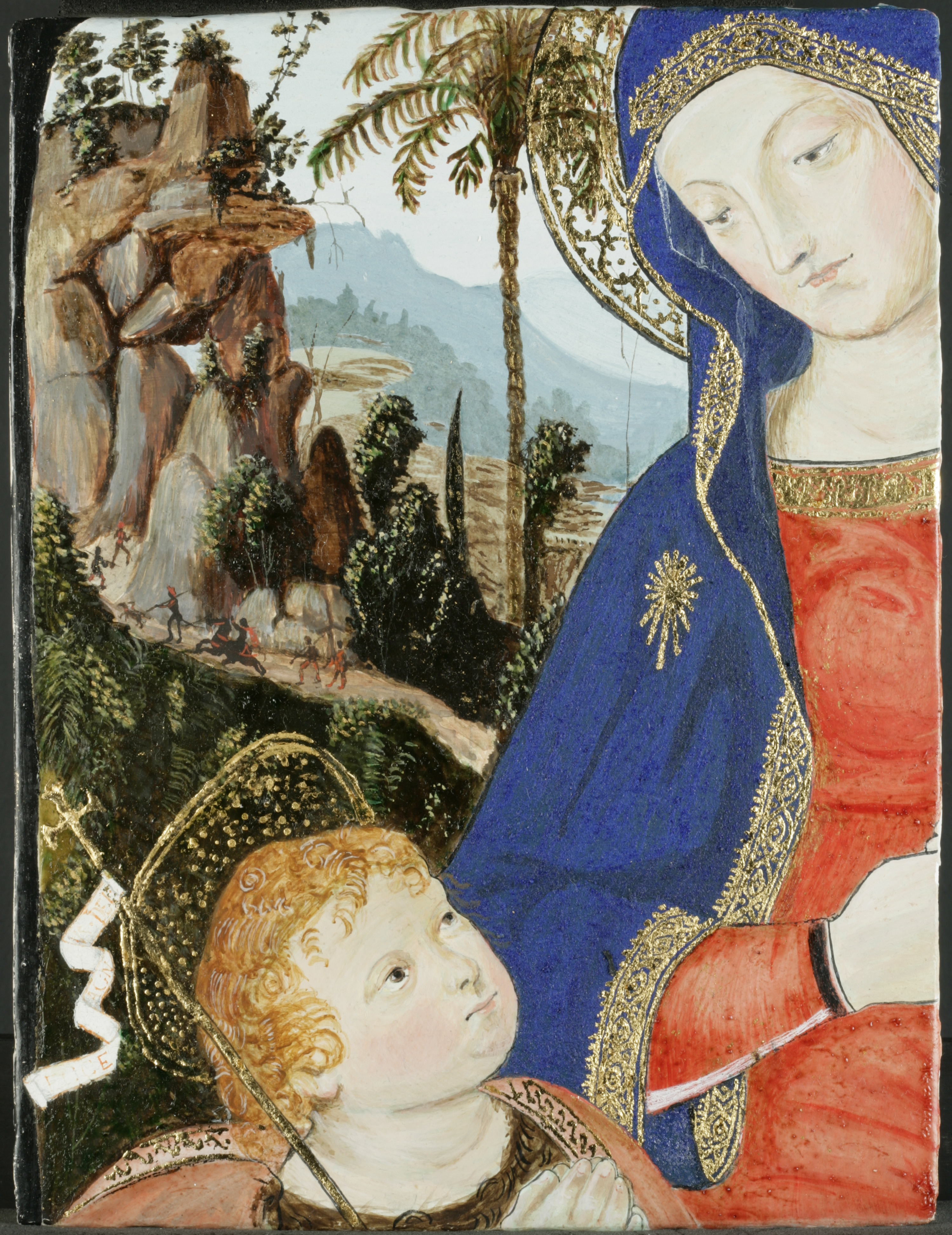
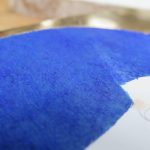
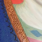
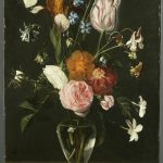
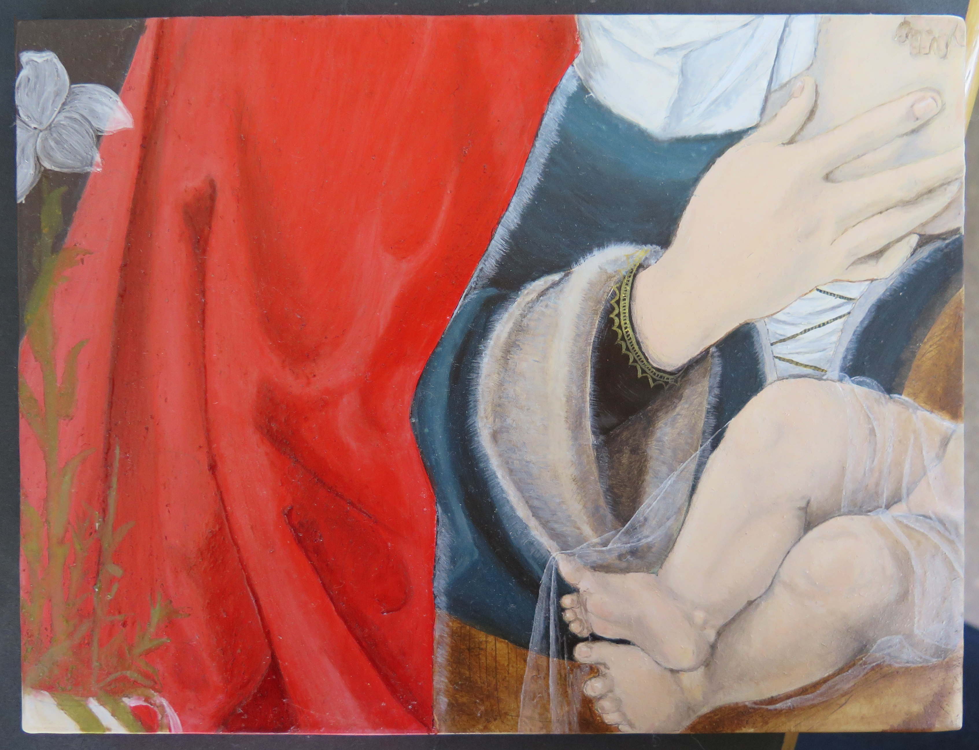
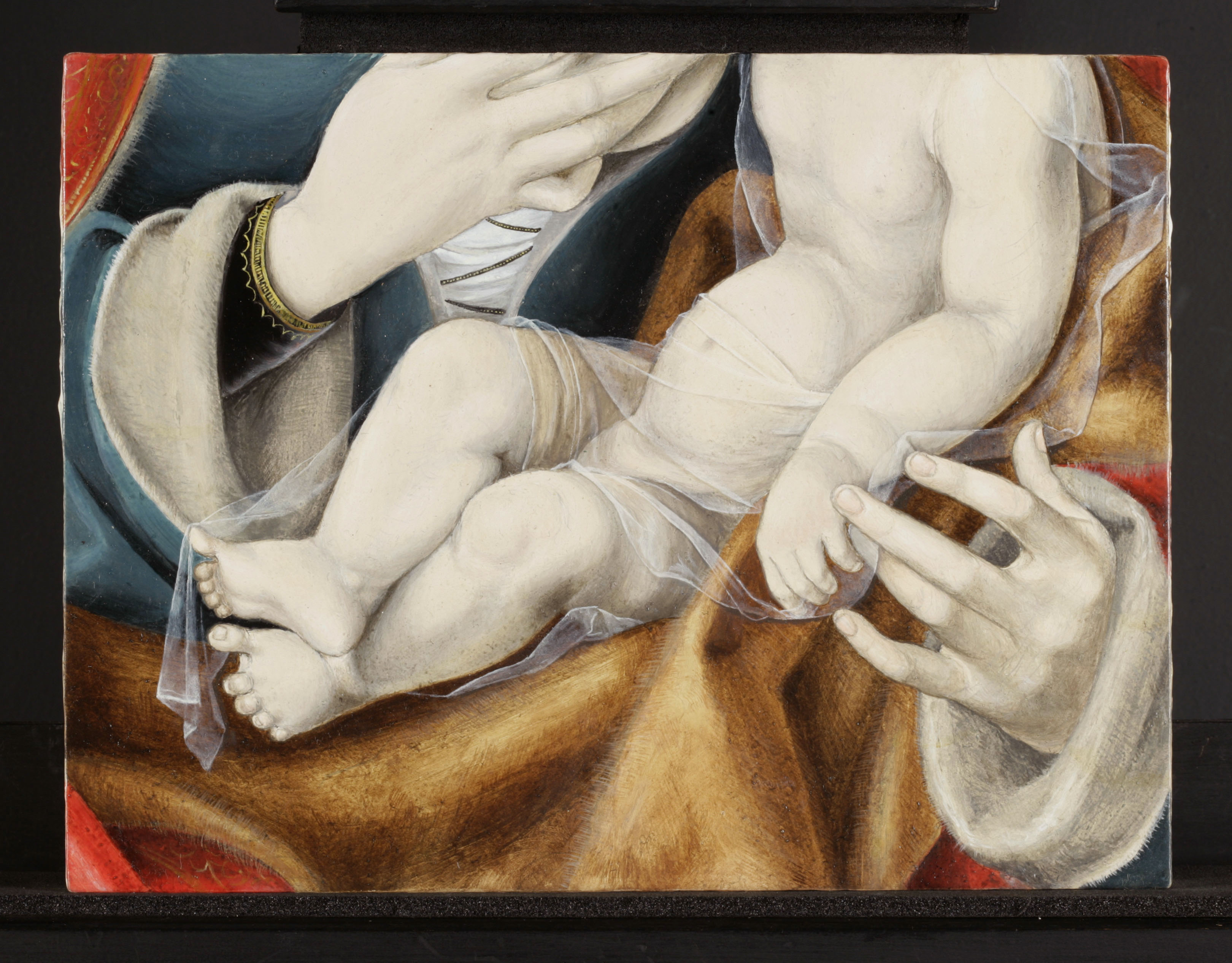
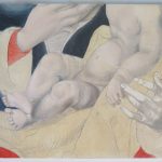
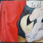
There are a lot of different types of fabric in Joos van Cleve’s painting, and both Anna and I chose areas of the painting that allowed us to explore this lush variety. As well as the heavy richness of the Virgin’s cloak, and the sumptuous dark blue/black of her dress, we could also experiment with the crisp whiteness of her head dress and the wispy, delicate translucency of her veil. While this variety of fabrics does add a depth and realism to the painting, it was also likely to showcase the skill of van Cleve’s workshop. This made it ideal to try and reconstruct as we got to really explore a variety of techniques used by Northern artists at the time. Our approach to these techniques often varied which made for some interesting comparisons.

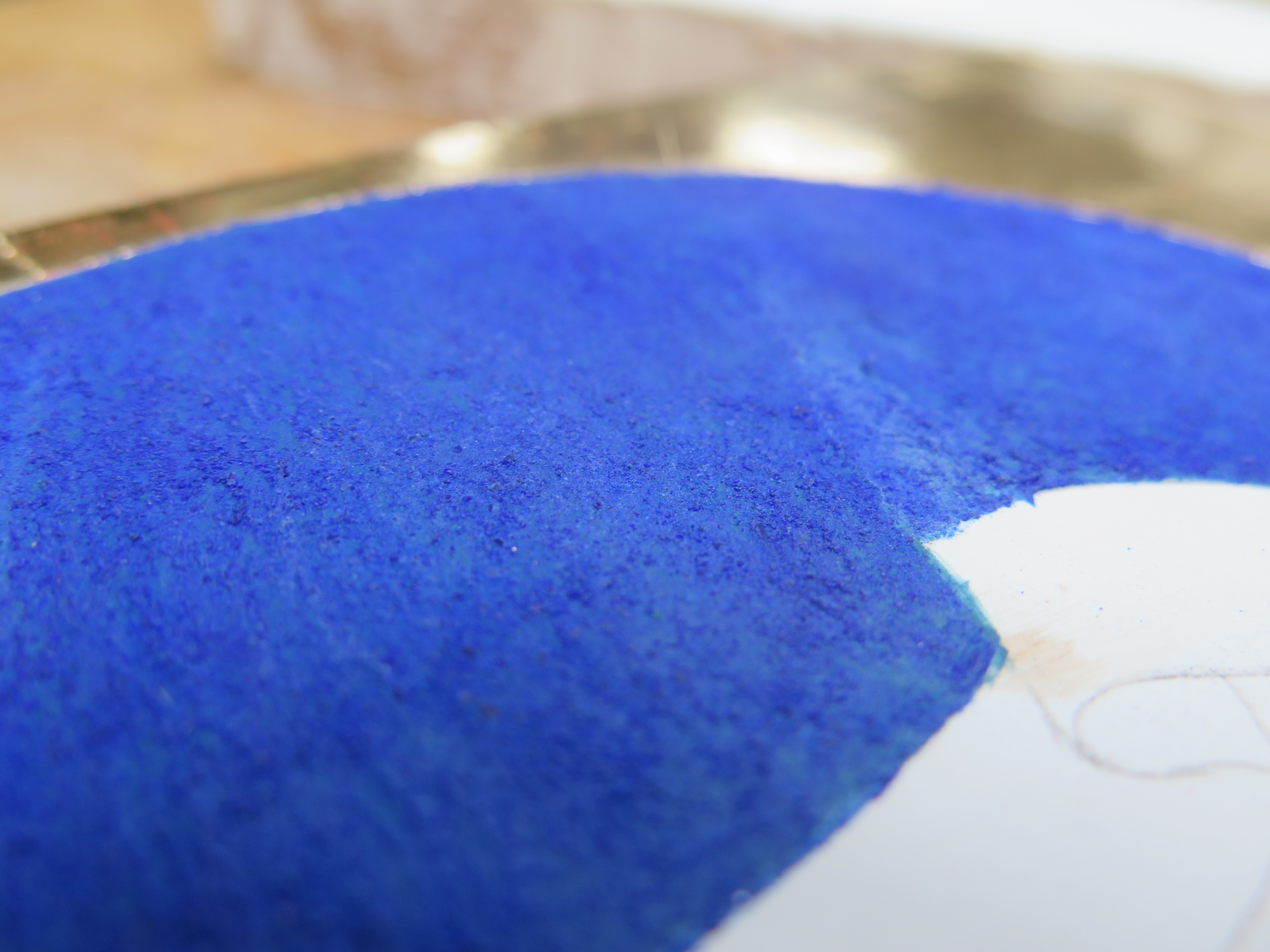
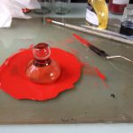
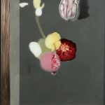
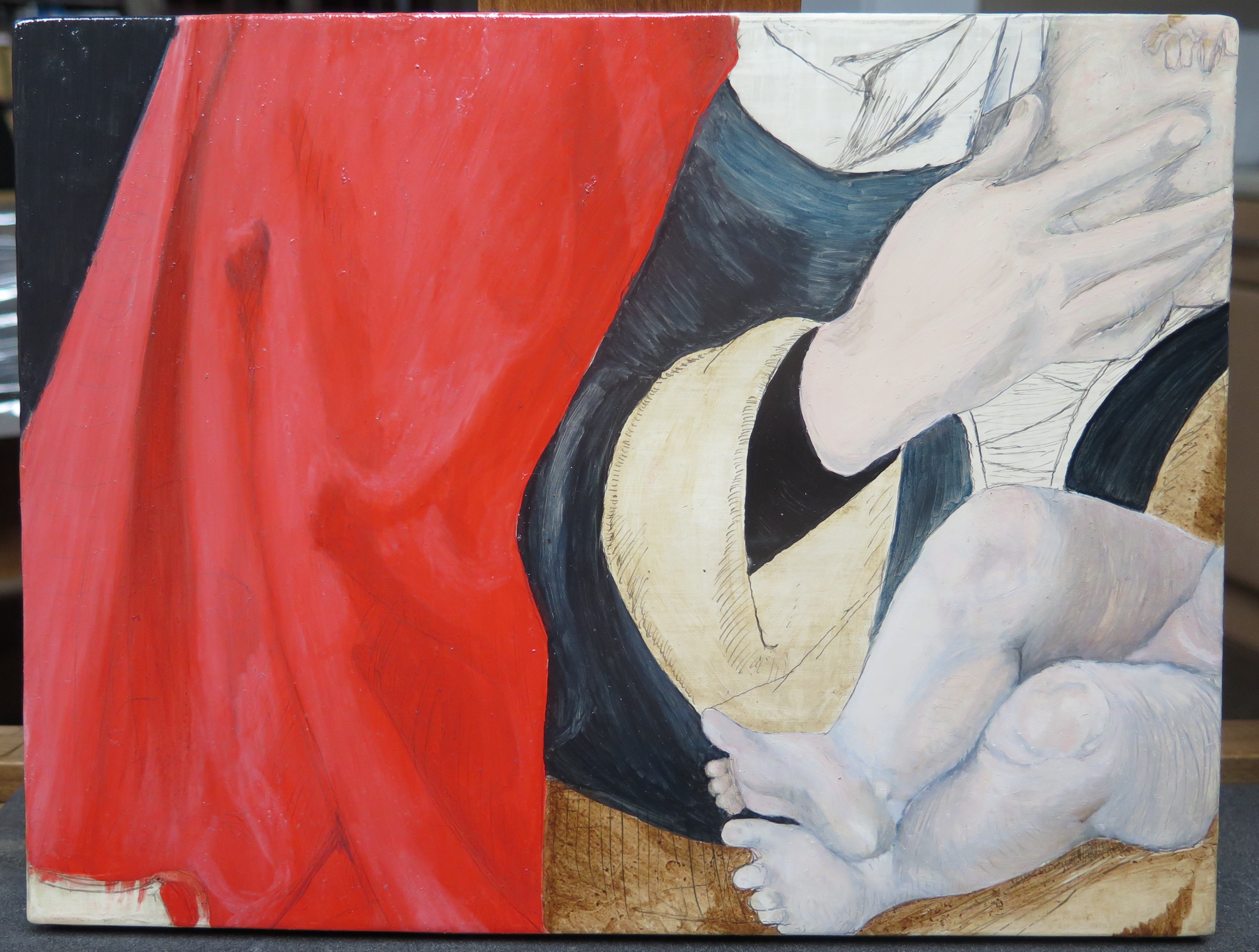
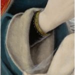
Elisabeth: To try and recreate the very intense red of the Virgin’s cloak I used a layer of pure vermilion and then added modeling by working into the wet layer with lead white for the highlights and dark earth pigments with a little finely ground azurite for the shadows. During application it became apparent how much vermillion, which was not the cheapest pigment, was being used. The red underlayer may have been more modelled and a more economic approach to applying the upper layers would make sense in a commercial workshop environment (Fig. 9).

Elisabeth: Joos van Cleve’s paint layer overall appears to be quite thin, this is consistent with a workshop piece of the time that would have needed the optimum of economy in materials and a high speed of production. The paint layer also appears very smooth and it took quite a large and very soft brush to try and recreate a similar effect. The only noticeable brush strokes are in details in the foliage and golden decorations.

IMG_1669
Fig. 9. OVERVIEW OF INTERMEDIATE PAINT LAYERS OF RECONSTRUCTIONS – Elisabeth’s reconstruction (©PETRINA)

Anna: The layer structure of early Northern paintings began to be simplified in the 16th century, and after this point the flesh could be built up in very few layers. Artists could exploit the reflectance of the white ground, and sometimes would apply only a layer of lead white on top and then scumble over vermilion and earth pigments for the flesh tones, working into the wet paint. Although Joos van Cleve’s assistants in his workshop have been found to use a similar technique, applying minimal layers, the pieces painted by Joos van Cleve himself seem to have been built up with more layers.

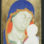
Anna: In terms of building up the flesh tones on the reconstruction, there are two factors that in retrospect I would like to have approached differently. Firstly, I would have not started with using titanium white (which was used for health and safety reasons) as a substitute for lead white, as even at this early stage I found this pigment gave the flesh quite a sickly pallor that was difficult to rectify, and secondly, I would have mixed up a paint that had a much higher pigment to medium ratio for these initial layers, as from the outset these layers were quite transparent.  I ended up carrying out the flesh in many layers, not only in order to cover the carbon black underdrawing, which even after multiple layers was still visible, but for the possibly more significant reason that I just could not achieve sufficient depth and life in the flesh tones with such minimal paint. I find it amazing the results that artists could create while working so economically. I found it was difficult to get any subtlety with titanium white; when mixed with other pigments it was either very cool and slightly grey, or made a very un-naturalistic pink or yellow. When I switched to lead white, this greatly improved the handling properties (it brushed out more smoothly), the colour and the vibrancy (Fig. 10).

IMG_1664
Fig. 10. OVERVIEW OF INTERMEDIATE PAINT LAYERS OF RECONSTRUCTIONS – Anna’s reconstruction (©DON)

Elisabeth: When it came to the short fur on which the Christ Child is sitting, Anna and I once again differed in our approach. Anna, carefully and meticulously applied each hair in the fur individually, in much the same style as you could work with tempera. I was keen to exploit the long drying time of the oils and used a large, coarse bristled brush, nearly dry, to very quickly apply a facsimile of a very fuzzy fur.

Anna: I think this was a really valuable aspect of doing our reconstructions from similar areas. It was great to see the effects Elisabeth produced by experimenting with different tools, and comparing our approaches (Figs. 11 & 12 & 13).

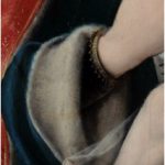
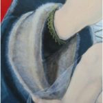
Elisabeth: The other main deviation in our approach to this reconstruction was in the velvety black of the Virgin’s sleeve. Anna and I disagreed on whether a warm red was visible through the black. For my reconstruction I just used two layers of lamp black to create a rich, opaque black (Fig. 14).

IMG_1788
Fig. 14. OVERVIEW OF FINAL STAGES OF RECONSTRUCTIONS – Elisabeth’s reconstruction (©PETRINA)

Anna: It took a long time to become sensitive to the nuances of working with oil, from the initial stages of mixing up our pigments with the right amount of linseed oil, to manipulating the paint on the surface to achieve certain surface effects. Early on, Elisabeth and I both experienced working with layers that were too medium rich; we propped our panels upright to dry (to avoid dust settling in the wet paint) and found the next day that the paint layer had deformed and slightly dribbled down. But it was a lovely and very forgiving material to work with. Carrying out this reconstruction has left me in awe of the effects these artists can produce in this medium (Fig. 15).

Early northern reconstruction copy
Fig. 15. OVERVIEW OF FINAL STAGES OF RECONSTRUCTIONS – Anna’s reconstruction (©DON)

Anna Don and Elisabeth Petrina, 1st Year Students


About the Authors:

Anna Don is a first-year student at the Hamilton Kerr Institute, studying for a Postgraduate Diploma in the Conservation of Easel Paintings. She previously attended City & Guilds of London Art School, graduating with a First Class BA (Hons) in Conservation Studies. She has undertaken an internship in painting conservation at Restauratie Atelier Marjan de Visser in the Netherlands, and has been involved in projects conserving frames, objects and historic interiors. Most recently, Anna took part in a four-month internship researching George Stubbs’s wax painting techniques at the National Maritime Museum, London, the results of which were presented at the George Stubbs and Wax Painting symposium in 2016 in London.

To contact Anna: ad838@cam.ac.uk

Elisabeth Petrina is a first year student at the Hamilton Kerr Institute. She received a Fine Art Foundation Diploma from Exeter College and BSc (Hons) in Chemistry from the University of Liverpool before disappearing to Croatia for several years to set up a forensic ornithology unit and grow vegetables. She has undertaken a project to establish a pigment garden at the Hamilton Kerr Institute that can be used as a research aid in future years.

To contact Elisabeth: ep497@cam.ac.uk


References:

[1] Leeflang, Micha. 2015. Joos van Cleve: A Sixteenth Century Antwerp Artist and his Workshop. Brepols, N. V. pp. 29

Reconstruction of a 15th century panel by Pinturicchio

This blog post is about the reconstruction of a painting by the Italian artist Pinturicchio, which depicts the Madonna and Child with Saint John the Baptist. The painting dates to c. 1495 and is currently in the Fitzwilliam Museum Collection in Cambridge.

Bernardino di Betto di Biagio, who went by the name Pinturicchio, is considered one of the more traditional Italian painters of the early Renaissance and is best known for his frescoes rather than his easel paintings. This is in part because of a crushing condemnation of his work by Giorgio Vasari in the 16th century: “Often Fortune ignores the worthy and helps the unworthy, because it flatters her that by her favours there should be exalted those who would never reach distinction on their own.”(Journal of the Warburg and Courtauld Institutes, Vol. 25, No. 1/2 (Jan. – Jun., 1962), pp. 35-55)

I chose this painting because it came from a different period of early Italian art to the painting that was reconstructed by my co-student, Anna Don. I felt it would be good to be able to compare the two different styles of painting through first-hand experience of their preparation and technique. The lush green landscape and miniature figures in the background also appealed to me.

hki-2229_img-37
Virgin and child with St John the Baptist, by Pinturicchio (© Titmus)

For first-year reconstructions at the Hamilton Kerr Institute, we have the fantastic opportunity of having the paintings we are replicating in the studio with us. This is a huge advantage when trying to reconstruct  artists’ processes, as we can constantly refer to the original. Kari Rayner, 1st year intern, treated the painting in preparation for the “Madonnas and Miracles” exhibition.

Having now spent the better part of a few months with Pinturicchio’s Madonna and Child, trying to recreate how it would have originally been painted, I have been led to disagree with Vasari’s assessment of Pinturicchio’s work, and I wholly encourage you to go and admire the painting at the Fitzwilliam Museum where it is part of the new “Madonnas and Miracles” exhibition.

Support

Unlike most panels made in Italy from this period, Pinturicchio’s painting was not executed on a poplar panel. Poplar was used more out of lack of options than a preference for the wood itself and artists would use other available woods such as walnut if they could. Adopting this view of accessible materials, the reconstructions were made on pine wood, which warped during the making of the reconstructions.

I primed two panels, one with canvas beneath the gesso ground and one without. Canvas on panels became less popular during the 15th century. However, the theory behind its use was to help cover knots and cracks in the wood and to provide a uniform surface for the gesso. The second panel was used as a test panel, which was invaluable throughout the reconstruction process.

Ground

The ground itself is made up of two parts. The first layer is Gesso Grosso, a form of calcium sulphate (for our reconstructions I used hemihydrate, better known as Plaster of Paris), mulled with warm rabbit skin glue which provides the bulk of the ground.

The gesso grosso was applied with a spatula. Taking some advice from a plasterer, I found it easiest to use a large spatula and apply the layers quickly. For my panel primed with canvas, I had problems with air bubbles in the gesso disrupting the surface. They were such an issue that after several applications I decided to wash the gesso off entirely and apply with a cloth and start again. The second time I applied the first few layers with my fingers to ensure that the canvas was fully saturated with gesso and this worked quite well.

The second part of the ground is Gesso Sottile, slaked calcium sulphate mulled with warm rabbit skin glue, that forms a silky smooth surface for the paint layer. To be more historically accurate, the sottile would have been scraped down until smooth and then rubbed smoother with the plant Mare’s Tail. However, as achieving this level of historical accuracy would also have required, according to Cennino Cennini’s Il Libro dell’Arte, several years of apprenticeship to perfect, I opted for fine sandpaper.

gesso sottile
Application of the gesso sottile (© Don)

Underdrawing

The underdrawing was done by tracing the original painting onto a sheet of melinex (a process that is harmless for the painting but disconcerting for the tracer). Next, a  sheet of paper covered in charcoal was placed charcoal down on the primed panel and the melinex tracing placed on top. The image could then be transferred by re-tracing the tracing with a sharpened point. I finally went over the charcoal transfer with ink and brushed away the excess charcoal. This part of the reconstruction process was easy enough to do, but I was surprised by how much my tracing of the painting could still be identified as mine. I had managed to lose something of the character of the original and replace it with something of my own. It was a very visual reminder for me that this process, though historically informed, was not entirely objective.

melenex-underdrawing
Tracing and underdrawing (© Petrina)

Painting

Egg tempera, consisting of egg yolk and water, is a painting method that is often associated exclusively with early Italian work. It is incredibly quick drying, thus the diverse palette that Pinturicchio appears to have used for his Virgin and Child meant that a frustrating amount of time was spent grinding pigments into new paints.

The pigment that presented the most challenges to mix was lead white. Initially , it was suggested that lead white be avoided because of the associated health risks. However, I found that the titanium white I had substituted dulled down the colours and did not provide adequate coverage, which made me try out lead white under controlled conditions. I found that the flake white I was using was not mixing well with my egg yolk medium. This was resolved by adding a few drops of alcohol which acted as a wetting agent before mulling it with the egg yolk. Alcohol is not a part of any historic recipe I could find, but it is possible that the modern pigment particles that I was using were too small, causing bad dispersion behaviour. The lead white certainly acted like cocoa powder that stubbornly refuses to wet into the milk no matter how much you mash it with a spoon. The preparation of lead white was well worth the trouble as it was one of the nicest pigments to handle.

For the painting proper, I followed the advice of Cennini and began with a vermilion, white and ochre underpainting for the Virgin’s blue robe. This underpainting was visible as a discoloured red through some previous losses in the blue azurite of the robe. The purpose of this layer was to create a warm underlayer for the coarse azurite and prevent it from appearing greenish.

preparatory-painting
Underpainting stage (© Petrina)

I then started on the background, the next step suggested by Cennini, and the area that had first attracted me to the painting. On other early Italian paintings, there appears to be a very formulaic approach to applying colours, but no matter how much I looked at the landscape in Pinturicchio’s painting, I could not work out any order to his colour application. I concluded in the end that Pinturicchio was possibly a bit more experimental and might have reworked passages, overlaying different hues.

reconstruction midway
Second stage of the painting (© Petrina)

The faces followed the traditional approach to tempera painting, starting with a green earth layer and verdaccio that sits underneath the flesh tones of the faces and now, several hundred years later, is clearly visible through the upper layers of paint. This was followed by a build up of fine-hatched tempera. At first I found it very easy to overwork passages and on the face of the Virgin there are sections that have too many layers as I kept returning to tweak colours.

Early Italian pre gilding
Painting completed, pre-gilding (© Petrina)

Glazes

Like many of the later Italian tempera painters, Pinturicchio also made use of oil glazes in his paintings. Red lake and copper resinate glazes were often used on red and green fabrics and draperies to create an illusion of richness and depth. It appears Pinturicchio used a copper resinate glaze in the background to create the lush, three-dimensional landscape, and red lake on the draperies to increase the illusion of depth. Despite having several shades of hand-made red lake,  I found it was the most difficult pigment to match.  It was too pale, leading me to believe I had done far too little modeling in the underlayers. I even tried to apply the madder in thicker layers to see if I could achieve a darker effect. However, this caused wrinkling of the glaze upon drying. I did eventually find a madder that was a much deeper colour and I managed to achieve something closer to the original intensity. The result was much better but proved that I could still have done more under modeling of the draperies.

Glazing the areas of foliage with copper resinate (verdigris dissolved in a oil and resin medium) was an exercise in working out how much modeling was needed in the tempera underlayers. My conclusion was  that maximum modeling should be done in the tempera layers and minimal modeling in the glazes, which I applied in thin layers to try and achieve the textured, almost impasto effect of Pinturicchio’s surface.

glaze texture
Detail of the impasto-like effect in the glazes (© Petrina)

Mordant Gilding

The mordant gilding presented a completely new set of challenges for this reconstruction. This was because the gilding had adhered over very coarse pigment, (high grade azurite) and/or over oil glazes. I noticed that in a small trial area, these painted layers had acted as a mordant in their own right and prevented the brushing off of excess gold leaf.

gilding-on-oil-glaze-detail
Mordant gilding (© Petrina)

Several treatises recommend glare (an egg white-based temporary varnish) as an isolating layer between oil and mordant. I tried a recipe which included some sugar in the hope that it would be easier to remove, and was fairly successful but there were still issues with removing excess gold. Many treatises recommend that certain processes should be carried out at certain times of year to allow for favourable weather conditions. For example, the gesso application should not be done when it is too hot to prevent cracking. I suspect mordant gilding over the glaze during drier atmospheric conditions might make a difference.

The other issue I faced was entirely my fault and could have been prevented. When applying the mordant for John the Baptist’s halo, I realised that it was indistinguishable in colour from the green background, which resulted in a halo that was not as perfectly rounded as the original and gave John the Baptist’s halo the illusion of trying to turn itself into a wizard’s hat.

excess-gold-leaf-on-oil-glaze-detail
Detail of St John the Baptist, gilding stuck in the glazes (© Petrina)

The final touch was shell gold added as a multitude of highlights to the landscape to create what Cennini refers to as, “a Garden of Eden”. It was unclear from the original how much of the gold was original and how much was from subsequent campaigns of restoration as some appeared very shiny. I therefore decided to add shell gold until a point I felt the image looked complete. This was influenced by working under the knowledge that the early Italians were rather fond of their bling.

reconstruction-final-photo
Finished reconstruction (© Petrina)

It seems that in some ways, this reconstruction has been an exercise in exploring how Pintoricchio probably did not paint his Madonna and Child. This was one of the most useful outcomes of the reconstruction process, where discovering that a preconceived idea has not worked in practical terms, which allowed us to go back to the painting with fresh eyes.

The main result of this reconstruction for me was two-fold. Using (most of the time) historically accurate materials gave a practical framework to apply the theory we learn as part of the course. The other was less tangible but more profound. I gained a deep respect for Pinturicchio and other artists of the age. Throughout the process, the way I looked at the painting changed, and understanding a bit more about the framework within which early Italian artists worked only made me appreciate the achievements of their success more.

Now that you have seen the behind-the-layers of this artwork, aren’t you curious to see what it looks like on the wall? Come admire the painting at the (free) exhibition “Madonnas and Miracles” at the Fitzwilliam Museum!

mm-poster-small

Elisabeth Petrina, 1st year student at the Hamilton Kerr Institute


Elisabeth Petrina is the second of the new students. She received a fine art foundation diploma from Exeter College and BSc (Hons) in Chemistry from the University of Liverpool before disappearing to Croatia for several years to set up a forensic ornithology unit and grow vegetables. She has undertaken a project to establish a pigment garden at the Hamilton Kerr Institute that can be used as a research aid in future years.

To contact Elisabeth: ep497@cam.ac.uk

Reconstructing a 14th-century Italian tempera painting

As part of our first year on the Post-Graduate Diploma at the Hamilton Kerr Institute, Elisabeth and I were given the task of reconstructing an early Italian egg tempera painting. This year, there happened to be multiple, wonderful examples of these paintings in the store of the institute, which had just been treated ready for the Madonna and Miracles exhibition at the Fitzwilliam Museum; therefore we were extremely lucky to be given a choice of what we would like to reconstruct. I chose an early fourteenth century painting of the Madonna and Child with an unknown attribution from the Fitzwilliam Museum, while Elisabeth went for a much later piece by Pinturicchio (1454-1513), dated 1495, also from the Fitzwilliam Museum. By choosing these two diverse examples, we were able to compare stylistic differences, as well as changes in materials and technique over the course of the period within which these works were painted.

The Madonna and Child exhibits a range of beautiful techniques that I was keen to attempt, particularly the use of both water and mordant gilding and the fine hatching and punch work on the former. It is also a clear example of the brushwork used in egg tempera painting, with the short, hatched lines creating the impression of blended paint.

hki-3059_img-43
Madonna and Child, Fitzwilliam Museum (© Titmus)

Gesso Ground

The first stage in this project was preparing the support. It started with the making and application of the gesso ground layer, which appeared straightforward in theory but produced many challenges along the way. In preparation for the ground, the panel is first sized with rabbit skin glue to seal the wood and prevent it from absorbing the ground layer. The early Italian method of applying gesso ground is carried out using two different mixtures, applied in different ways.

The first of these is a coarser, thicker gesso (gesso grosso), made by mulling calcium sulphate (CaSO4) on a slab with warm rabbit skin glue. This is applied in a very thick, single layer. As the rabbit skin glue begins to cool, the gesso grosso becomes sticky and difficult to work with, so we discovered through practice that it should not be manipulated for too long. Once this layer was scraped back and smoothed, the second mixture was applied.

img_5990
Making the gesso grosso (© Petrina)

This second mixture results in a much finer gesso (gesso sottile), and requires the calcium sulphate, soaked in water, to be stirred over the course of a month, followed by straining and setting into cakes. These can then be rehydrated and heated with rabbit skin glue to apply in multiple thin layers on the panel, which are then subsequently sanded to a smooth finish. The traced image was then transferred onto the ground using charcoal, and the lines strengthened using carbon black in gum arabic. To distinguish between the areas to be painted and areas to be gilded, lines were incised into the ground.

Water Gilding

In order to prepare for the water gilt background, bole clay mixed with rabbit skin glue was applied. It was difficult to apply in that some areas were continuously solubilised and picked up on the application of each thin layer.

img_1582
Panel after application of the bole (© Don)

The bole was wetted and the gold leaf laid on top using a gilder’s tip. Due to the incredible delicacy of the gold, it often tore or crumpled in the process, so it required multiple goes to get the background covered. The gold was then burnished with an agate burnisher to achieve the rich sheen of the water gilding on the Madonna and Child.  After gilding, the hatched lines and rays of the Virgin and Christ’s haloes were incised with a pointed bamboo stick, as metal points broke through the gold. The punchwork was carried out by tapping the points of different shaped tools into the surface of the gold to create an imprint.

In retrospect, it was considered that the hatched lines could have been applied prior to gilding, however the application of layers on top of this hatching may have reduced the definition. Also, that two layers of gilding (time permitting) would have been beneficial given that medieval gold leaf was somewhat thicker than the gold leaf of today.

Painting

It became clear that the most important part of this process was to closely and carefully examine Madonna and Child, in an attempt to understand how the artist achieved certain effects, which pigments and tools he may have used, and in what order he carried it out. Reading appropriate treatises, particularly Cennino Cennini’s Il Libro dell’Arte, gave us a framework to work within, however there was much more to be gleaned from the surface of the painting.

To mix the paint, pigment particles were ground in water and then left to dry. This pigment could then be ground with an equal amount of egg yolk to bind it. However, this paint has an incredibly fast drying time, so it was made up as and when we needed it. I began with the drapery, building each section up in layers. During this process, a problem that I encountered was the inability to achieve colours with the same degree of vibrancy as on the original. This may have been due to some of the modern, safer equivalents of pigments I was using for this section. For the drapery I was using titanium white as a replacement for lead white, which had a dulling effect.

img_1607
Detail of the azurite (© Don)

On the other hand, one particular pigment, azurite, was very satisfying to work with. The process of preparing azurite pigment results in different grades, where the coarser particles are more vibrant and blue, and the finer particles are duller and have a greener hue. For the Virgin’s mantle, an underlayer of fine azurite particles was applied. On top of this, the mantle was modelled using the very coarse azurite to give it the distinct blue colour. What I wasn’t expecting was how coarse these particles appeared on the surface. Due to the fragility of these particles they are often easily abraded and so this effect isn’t so extreme in many original examples, however seeing it freshly applied made it clear how this pigment can shimmer in the light.

img_1630
After painting the drapery (© Don)

The next stage involved working on the flesh tones. A distinct characteristic of early Italian painting is the washy green earth undertone employed for the flesh, along with verdaccio (a specific blend of black, white and earth pigments) for the shadows. On top of this, the flesh is modelled, using short, singular lines to apply the gradations of the flesh tones. It was at this stage that I began to incorporate lead white as my white pigment, rather than titanium white, as I found the latter gave the flesh a blue-ish, dull look that the lead white did not.

_j8w0412
After applying the verdaccio (© Don)
italian-tempera-reconstruction
After finishing the painting stage, before the mordant gilding (© Don)

Mordant gilding

The final stage was the application of the mordant gilding over the painted areas, which turned out to be perhaps the most unpredictable and challenging phase in the process of producing the reconstruction. Mordant gilding uses the adhesive properties of an oil-based mixture to fix the gold leaf onto the surface. For this, my test panel was invaluable, as I needed to attempt many different ratios of lead oil, drying pigments and an oil-resin mixture (composed of linseed oil, mastic resin and colophony rosin), before reaching a combination with good working properties and drying times.

img_6812
Mordant straight after application, it is considerably wet (© Don)

After painting out the mordant, it needs to be left for some time to reach the right level of tack (somewhere between one and three days depending on the materials in the mordant and the thickness of the application). I experienced the issues of both gilding on mordant that was far too wet, when the mordant itself smudges and the gold sticks to the surrounding areas as well; and far too dry, when the gold sticks to nothing at all. After multiple failed attempts, I began to form a better understanding of the drying time of the mordant. Laying the gold at the right stage was a distinctly gratifying experience, and resulted in a much better appearance.

_j8w1917
The finished reconstruction (© Don)

Anna Don, 1st Year Student

mm-poster-small

Madonnas and Miracles Exhibition (video)


Anna Don is one of two first years at the Hamilton Kerr Institute, studying for a Postgraduate Diploma in the Conservation of Easel Paintings. She previously attended City & Guilds of London Art School, graduating with a First Class BA (Hons) in Conservation Studies. She has undertaken an internship in painting conservation at Restauratie Atelier Marjan de Visser in the Netherlands, and has been involved in projects conserving frames, objects and historic interiors. Most recently, Anna took part in a four-month internship researching George Stubbs’s wax painting techniques at the National Maritime Museum, London, the results of which were presented at the George Stubbs and Wax Painting symposium in 2016 in London.

To contact Anna: ad838@cam.ac.uk

Reconstructing a 17th century Flemish flower painting

In 2014, I started a research project at the Hamilton Kerr Institute, studying the painting technique of the seventeenth century flower painter Daniël Seghers (Antwerp 1590-1661).[1] One of the master’s flower pieces kept at the Fitzwilliam Museum was studied in depth using modern imaging techniques and paint analysis. These findings were used to paint a reconstruction of the painting, emulating the original materials and techniques as faithfully as possible. When painting the reconstruction, the ageing that has affected the paint and varnish on the original painting was disregarded. The result of this step-by-step reconstruction shows how the painting was created and how it would have looked when it left the artist’s studio. The reconstruction will be on show at the Fitzwilliam Museum in June as part of the Hamilton Kerr Institute’s 40th anniversary display.

1
Painting the reconstruction in the HKI studio’s (© van Dorst)

The original

The Vase of Flowers, kept at the Fitzwilliam Museum, is a beautiful example of Seghers’ colourful flower arrangements. When the painting was examined, an unfinished flower piece was discovered on the reverse of the copper support. This is possibly the only surviving flower painting of the period that is left in the dead-colouring stage, it is therefore an invaluable source for the study of the genre. The dead-colouring is the first step of the painting process, when the artist defines the composition. These abstract looking shapes are also present underneath the finished flower piece, and can be seen with the naked eye to a certain extent, or more clearly with the use of infrared imaging techniques.

(Click on photos to enlarge)

Palette

The range of pigments Seghers employed fall firmly into the mainstream of painting practices in the Low Countries during the seventeenth century.[2] The artist’s pallet contains natural earth pigments, manufactured colours like lead white, and a few precious pigments like ultramarine blue, made from the semi-precious stone lapis lazuli. In preparation for painting the reconstruction, a range of historic pigments were ground in oil; the dry pigment powder was placed on a glass slab and the required amount of drying oil was added. This was mixed into a paste and ground with a glass muller to form a homogeneous paint. The consistency of the paint could be altered by adding some chalk or boiled linseed oil. The paint was kept in glass containers and used throughout the whole process of painting.

(Click on photos to enlarge)

Support and ground layer

Like the Fitzwilliam painting, the reconstruction is executed on a thin copper panel. The smooth surface of the copper support allows fine detailing, characteristic of seventeenth century Flemish and Dutch flower pieces. Following historic practices, the surface of the copper plate was roughened and rubbed with garlic thus achieving better adhesion between the smooth support and the paint layers. The support was covered with a ‘ground’ or preparatory surface; the grey colour was applied quite thickly, with brushstrokes running in different directions. The preparatory layer consists of a mixture of lead white, charcoal black, raw umber and some chalk.

The dead-colouring

After the ground layer had dried the most important flowers were positioned using coloured plains, this stage is called dead-colouring. IR images of the Vase of Flowers made it possible to look through the paintlayers and see the shapes the artist laid in during the dead-colouring stage. The unfinished composition on the reverse of the painting helped to interpreting the IR images. First the flowers were positioned in bright colours; pink, red, white and yellow. Then a thin green scumble was applied in the centre and finally the dark background and tabletop were painted in. Whilst the paint was still wet, the edges of the different elements were blended in with a brush to create soft transitions. The paint mixtures are not complex, the reds consists mainly of red lead and vermillion, whilst the yellow is made up of lead-tin-yellow and some lead white. The pink colour was achieved by mixing lead white, madder (red lake) and a small amount of red lead.

(Click on photos to enlarge)

Final painting

Seghers only needed a single paintlayer on top of the dead-colouring to model his flowers. The large flowers were painted on top of the bright underlayer, while the small flowers were painted directly on top of the dark background. The bright underlayer plays a key role in the final result. The vibrant colour of the red rose, for example, was achieved by applying a semi-transparant red lake on top of the red dead-colouring. The egg shape underneath the tulip is still visible in the final result, it is placed on the lighter side of the flower, whilst the shadow side was painted on top of the dark background. This way it was possible to create astonishing pictorial effects in a limited amount of time. Because the painting was executed in only one layer, on top of the dead-colouring, the brushwork and paint handling had to be executed with great care. The brushstrokes follow the shape of the flowers, giving a feeling of three dimensions. This aspect of the painting was especially difficult to imitate during the reconstruction because the consistency of the paint had to be adjusted to improve the paint handling.

(Click on photos to enlarge)

Finishing touches  

In the last stage the artist added the insects to his flower arrangement. The confidence with which the butterflies were executed is astonishing. Some of the details on the wings were achieved by scratching into the wet paint, uncovering the dark colour of the background. I could only achieve a similar level of detail by using loups. Once the paint had dried a varnish was applied on top of the painting to saturate the colours.

(Click on photos to enlarge)

Reflecting on the effects of ageing

Comparing the original with the reconstruction makes it clear we look at Old Master paintings through a window of distorted glass, often without being aware of it.[3] The layers of fragile material that make up a work of art are all subject to change and decay. By painting this reconstruction I want to show how this work would have looked when it left the artist’s studio almost 400 years ago.

Sven van Dorst – 2nd year Post Graduate Intern at the Hamilton Kerr Institute

15
The finished reconstruction and original side by side (© van Dorst)

About the author

Sven Van Dorst graduated magna cum laude at the Artesis University College Antwerp (Belgium) in 2012, majoring in painting conservation and restoration. The following two years he worked on several projects at the Royal Museum of Fine Arts Antwerp and as a freelance conservator and painter. Sven commenced a two-year postgraduate internship at the Hamilton Kerr Institute in 2014. Working on several Dutch and Flemish paintings by Rubens, de Fromantiou and van de Cappelle, as well as an Italian cassone and a quattrocento panel painting.

Recently Sven published an article on the technique of Antwerp flower painters for the catalogue of the exhibition Power Flower: Foral still lifes in the Netherlands at the Antwerp Rockoxhuis Museum. The author has previously contributed articles to Openbaar Kunstbezit Vlaanderen (OKV), CeROArt and the BRK/APROA –bulletin.

To contact Sven: svd30@cam.ac.uk


[1] van Dorst, S., “Daniël Seghers: Phenix of Flowerpainters”, in Hamilton Kerr Institute Bulletin, 2016. (Upcoming)

[2] The artists’ palette and materials were studied using several analytical techniques. Chemical elements were identified using X-ray Fluorescence spectroscopy (XRF) and Ma-XRF scanning to indicate the presence of certain (mainly inorganic) pigments. The layer structure of the paint was studied using cross section analysis. Small paint samples reveal the sequence of paint layers and made it possible to see the individual pigment-particles that make up the various strata. The cross sections were analysed with scanning electron microscopy with energy-dispersive X-ray spectroscopy (SEM-EDX) to enable more detailed identification of individual pigment particles in the paint mixture.

[3] For more information on the ageing of paintings consult Paul Taylor’s Condition: The Ageing of Art , 2015.

More painting reconstructions: gilding and punching

In the previous post, I shared my experiences of making a reconstruction from a detail of Virgin Adoring the Child by Jacopo del Sellaio (dated c. 1473). While creating the copy, I learned about the materials and methods utilized for painting with egg tempera. The use of egg tempera is characteristic of early Italian paintings. Similarly, decorative gilding goes hand-in-hand with early Italian artworks. Halos of saints, fabrics, and even entire backgrounds can all be depicted in gold. A range of gilding techniques could be employed, depending on the visual effect the artist wanted to achieve.

Virgin and Child by Niccola di Pietro Gerini – Fitzwilliam Museum

Continue reading “More painting reconstructions: gilding and punching”

Reconstructing a 15th-century panel painting

Pia and I are currently first-year students at the Hamilton Kerr Institute (HKI). During the three-year training program, we will receive theoretical and practical instruction in the conservation treatments of easel paintings. We work in the studio alongside two third-year students, six interns, and staff members.The best way to learn about the materials and techniques used by past artists is to make reconstructions of paintings. Any visitor only needs to look at the walls of the HKI office to realize how big a role reconstructions play in the work of the Institute. They are covered with copies of paintings – from 15th-century Italian to Impressionist! Many of them are extensive research projects completed by previous third-year students and interns. Practical research can provide unique insights into the working practices of different artists. Some answers can only be obtained by getting your hands dirty!

_MG_3578
Reconstructions hanging in the Hamilton Kerr Institute

Continue reading “Reconstructing a 15th-century panel painting”