The grass is always greener on the other side: conservation of the Portrait of Elisabeth de Valois

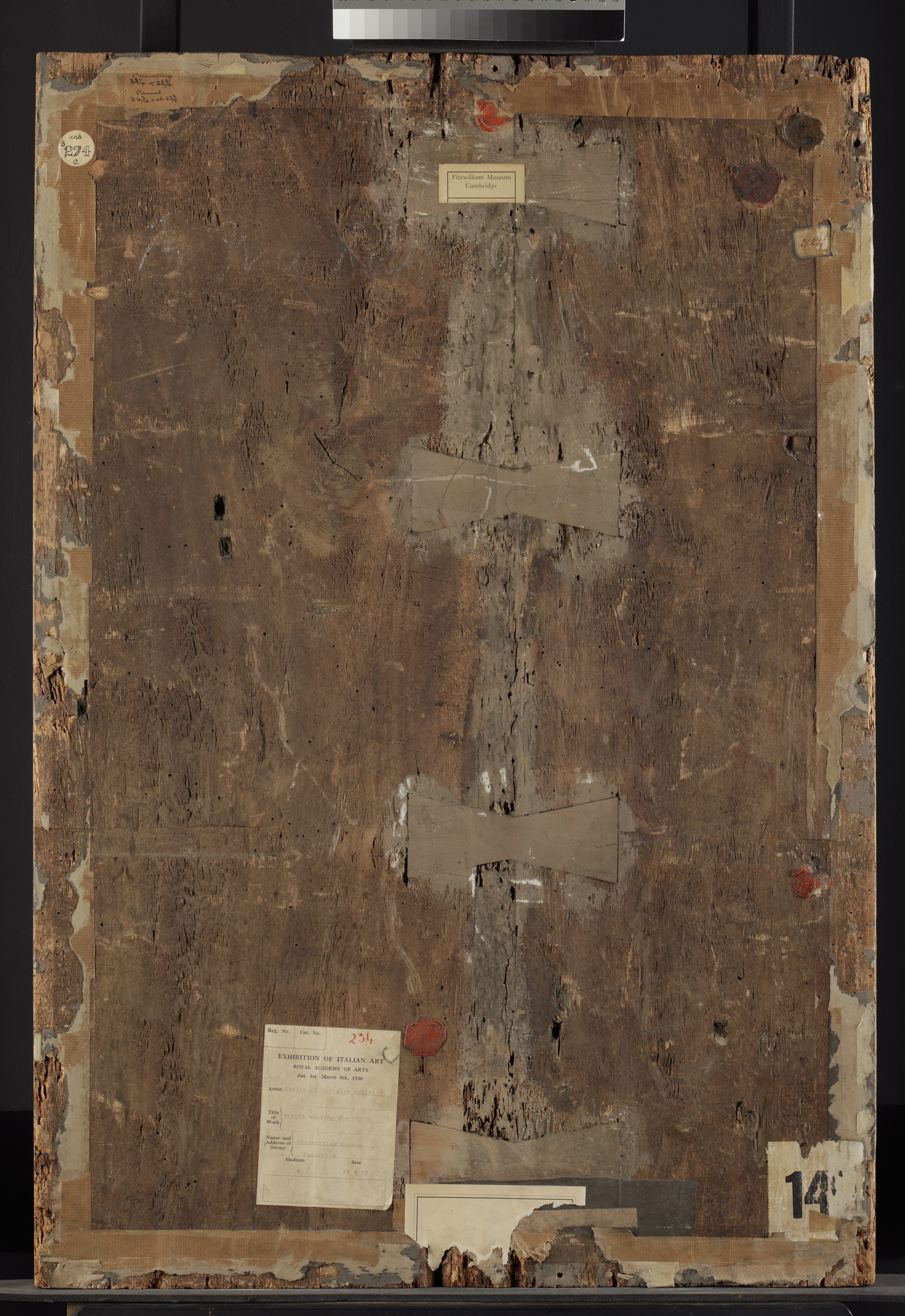
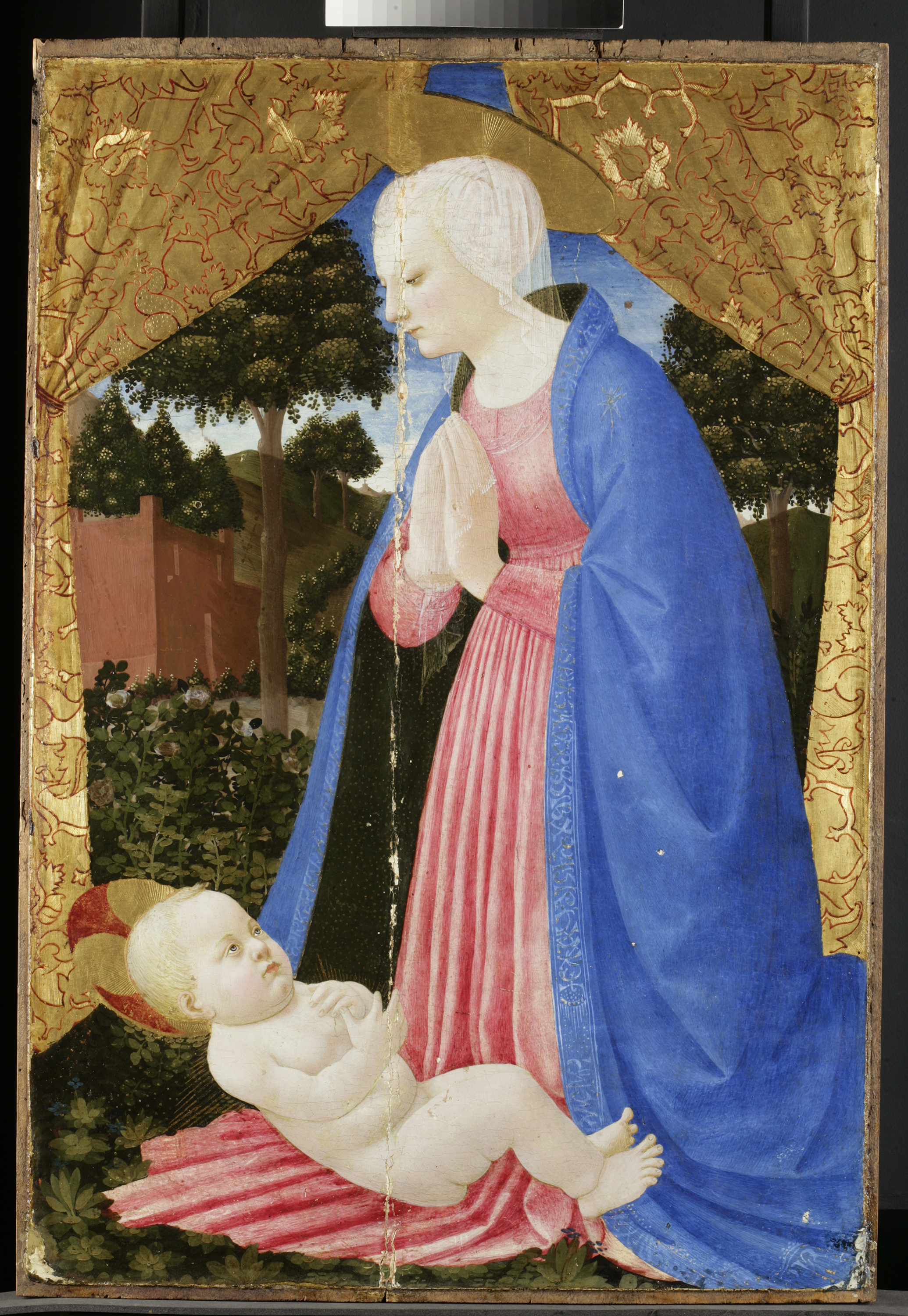
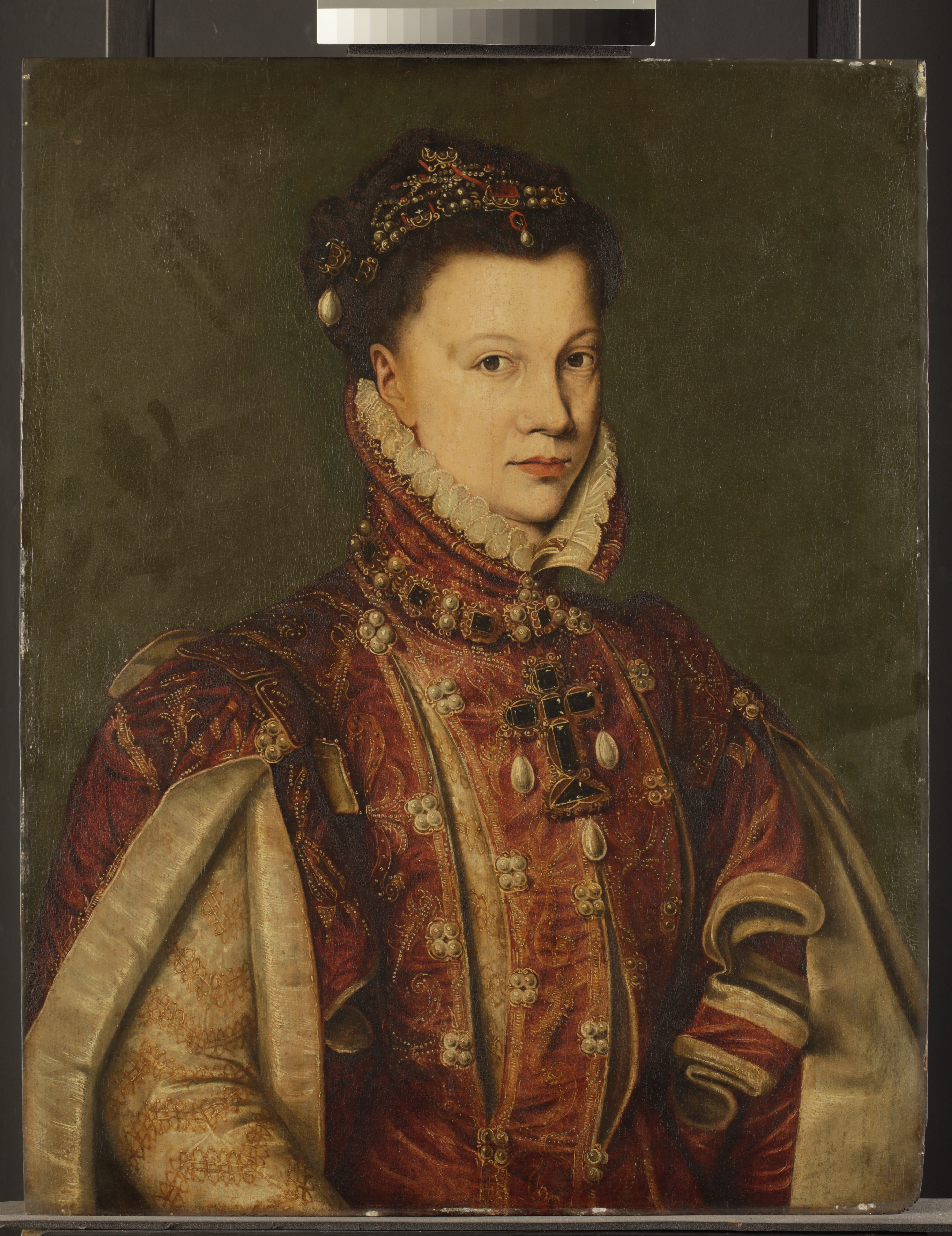
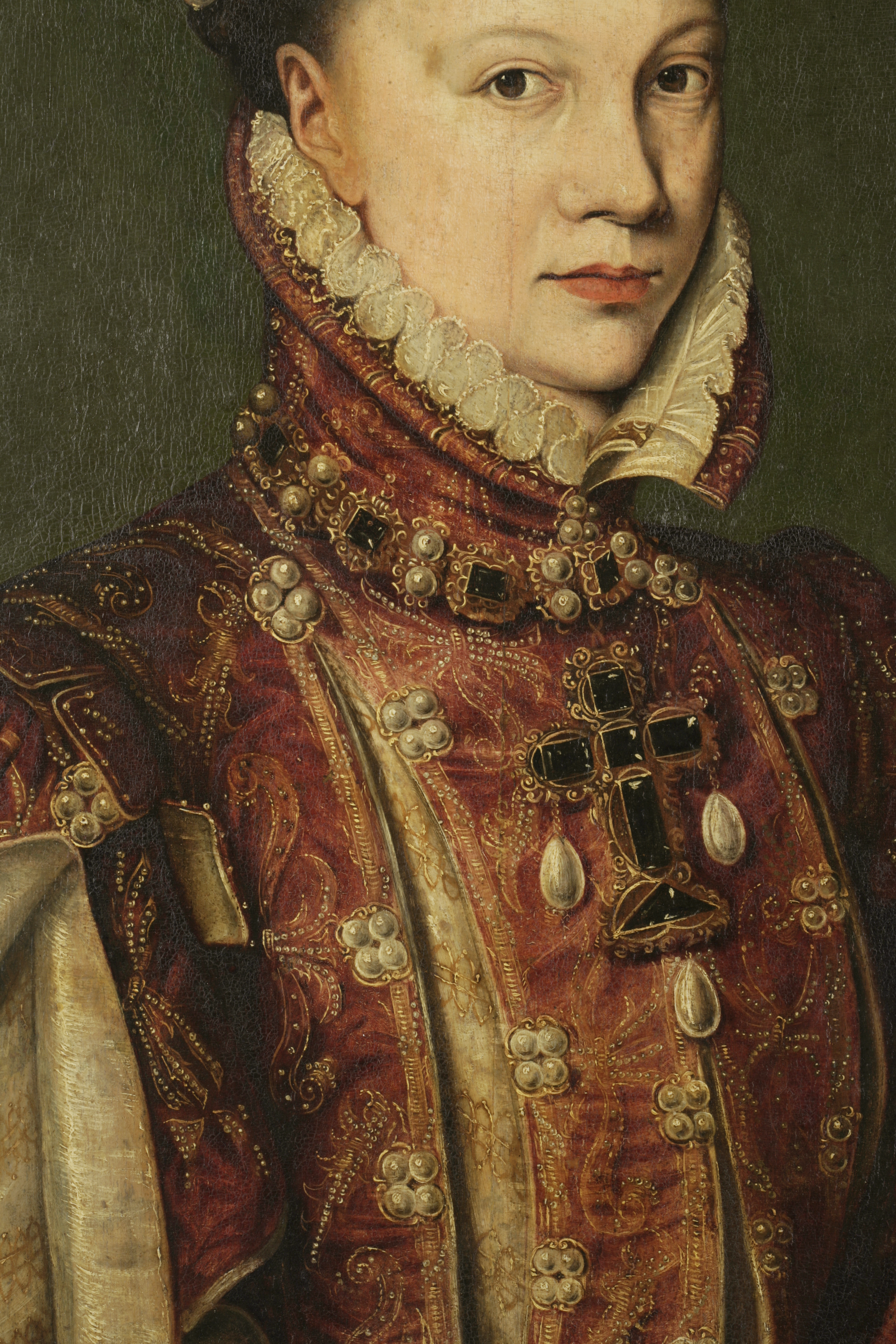
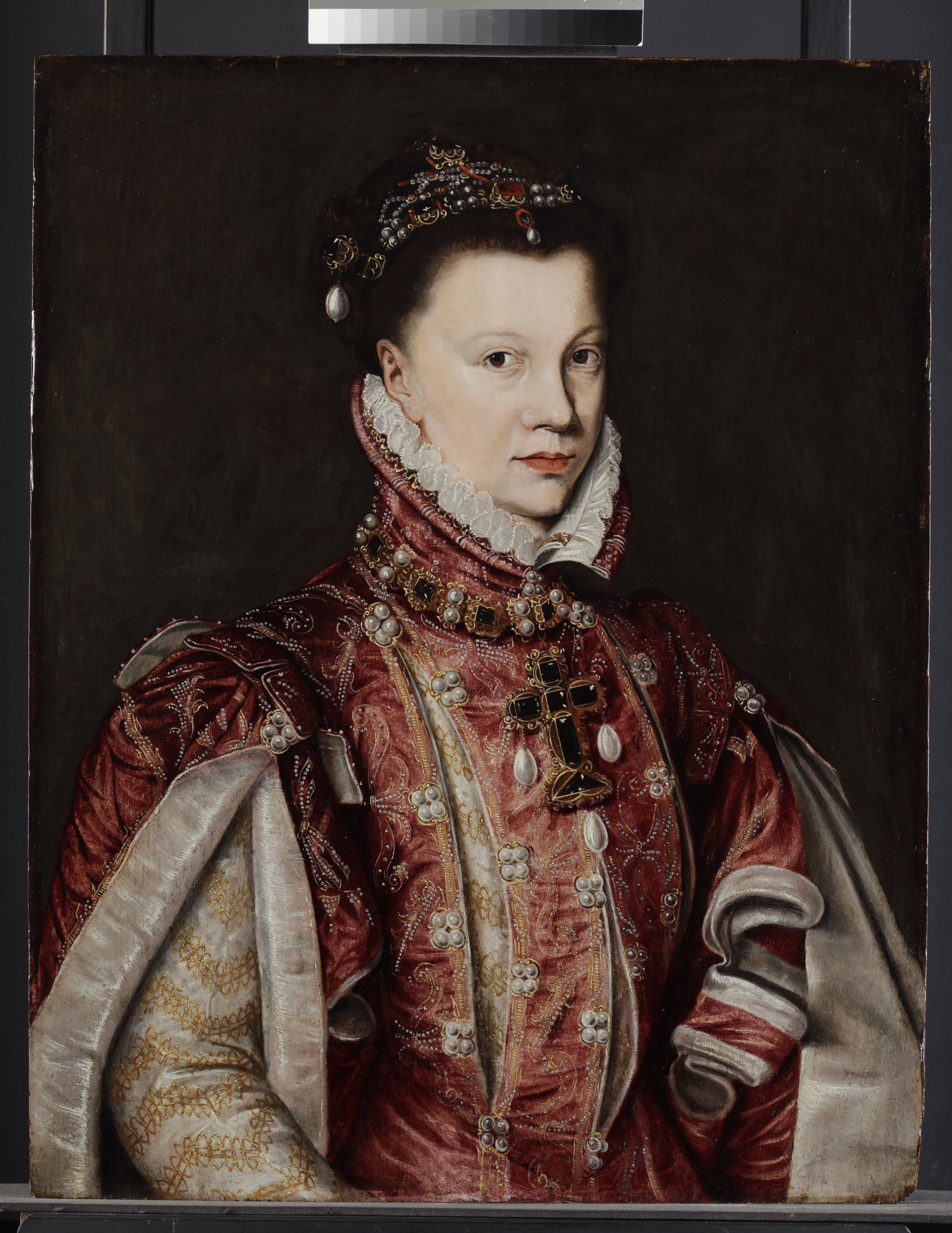
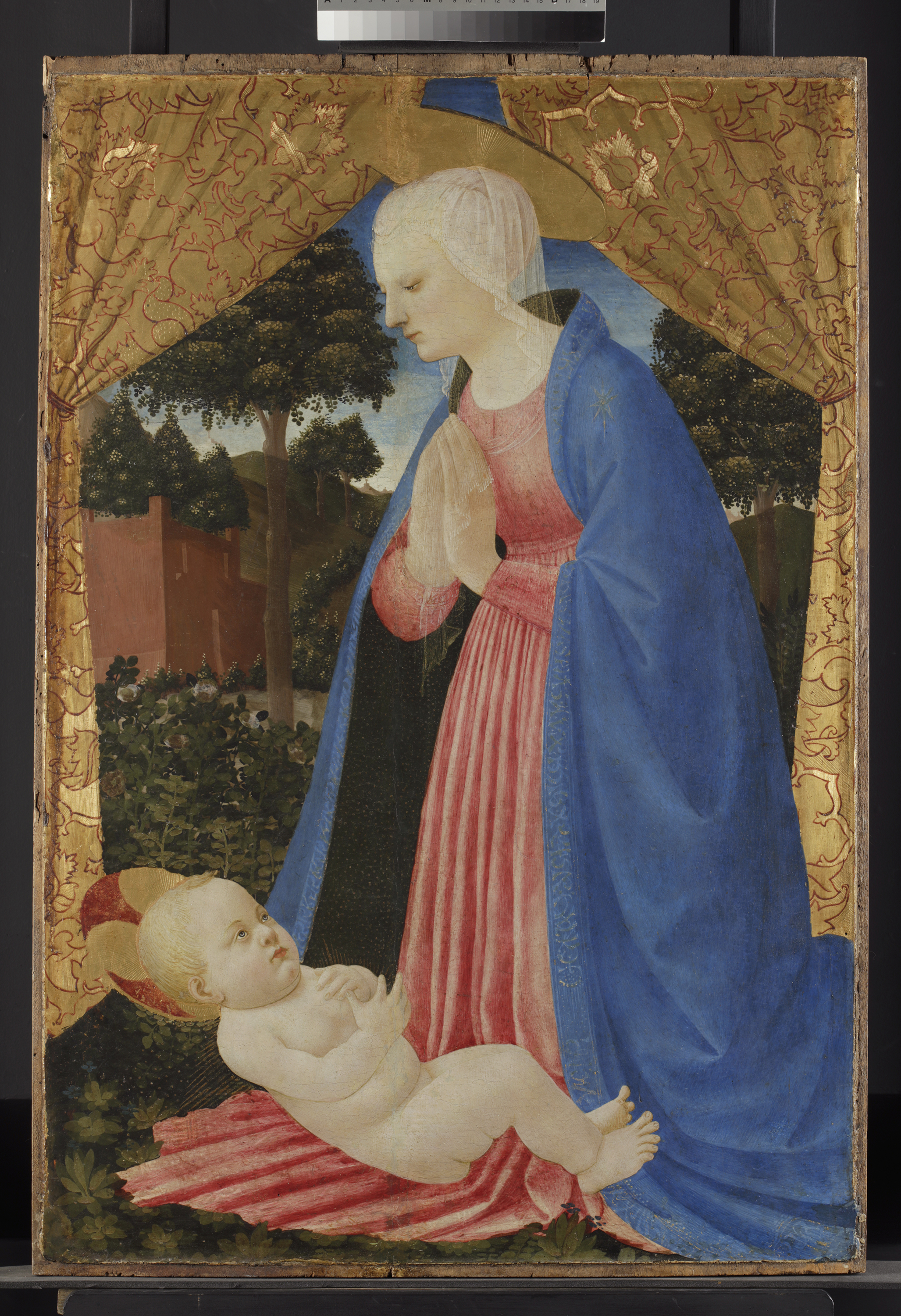
This oil painting on oak panel representing Elisabeth de Valois is a copy of the famous portrait originally painted by Anthonis Mor (c. 1517-1577), a Netherlandish portrait painter active mid-16th century (Fig. 1). The painting belongs to the Fitzwilliam Museum, and came to the Institute for assessment before the exhibition: Degas: A Passion for Perfection (3 October 2017 – 14 January 2018).

Fig. 1. Portrait of Elisabeth de Valois, copy after Anthonis Mor by unknown artist, late 16th century, Fitzwilliam Museum. (© Titmus)

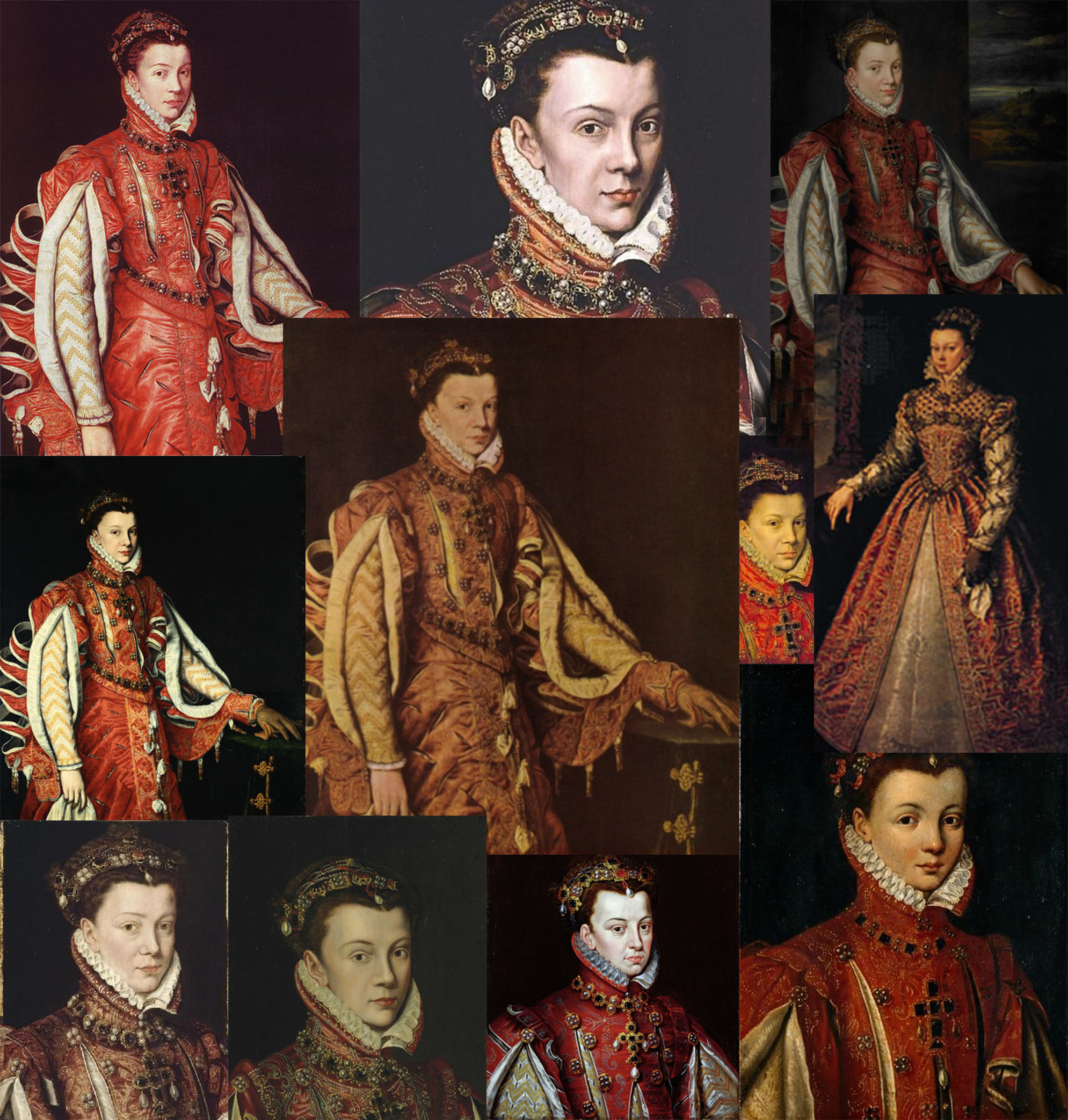
Elisabeth de Valois (1545-1568) was the eldest daughter of Henry II of France and Catherine de Medici and married Philip II of Spain as his third wife when she turned 14. The original portrait was painted by Mor in 1565, when she was 20. Elisabeth died at 23, after miscarrying for the second time in 1568.

The Fitzwilliam portrait, although not by Anthonis Mor, is a faithful copy in a style extremely close to that of Mor. The original portrait has been copied many times by different artists with varying degrees of accuracy. The copies highlight her importance and maybe her popularity, and were likely made to be sent around Europe to the various Royal Courts. The copies of the original portrait (Fig. 2) show her in this exact costume, but the formats vary: portraits only, full length, half length… you name it! The Fitzwilliam version was acquired in 1909, along with a full length portrait of her husband on canvas.

Fig. 2. Collage of all the portraits 
Fig. 2. Collage of all the portraits of Elisabeth de Valois

Dendrochronology

Dendrochronology analysis was done to find out an approximate date of usage for the panel. Dendrochronology (or tree-ring dating) is the dating technique that utilises the pattern of rings widths within a timber to determine the calendar period during which the tree grew. This is then matched to an existing database. The date of a tree-ring sequence must not be confused with the date of usage of a tree, as sapwood (which has the latest growth rings) is usually removed by panel markers. The analysis provides either a felling date range (when sapwood is present) or a terminus post-quem (when the sapwood is not present).  Between the felling of the tree and the start of a painting, a fair amount of time can go by, as the wood travels and is often seasoned. The results of the analysis indicates a usage date for the wood after 1552 [1].

Condition of the painting

Although the portrait had a number of areas where the paint was flaking and vulnerable (Fig. 3), which were consolidated with sturgeon’s glue, it was in good overall condition.

HKI-3097_img-5
Fig. 3. Detail of lifting and flaking of the paint layer in raking light. (© Polkownik)

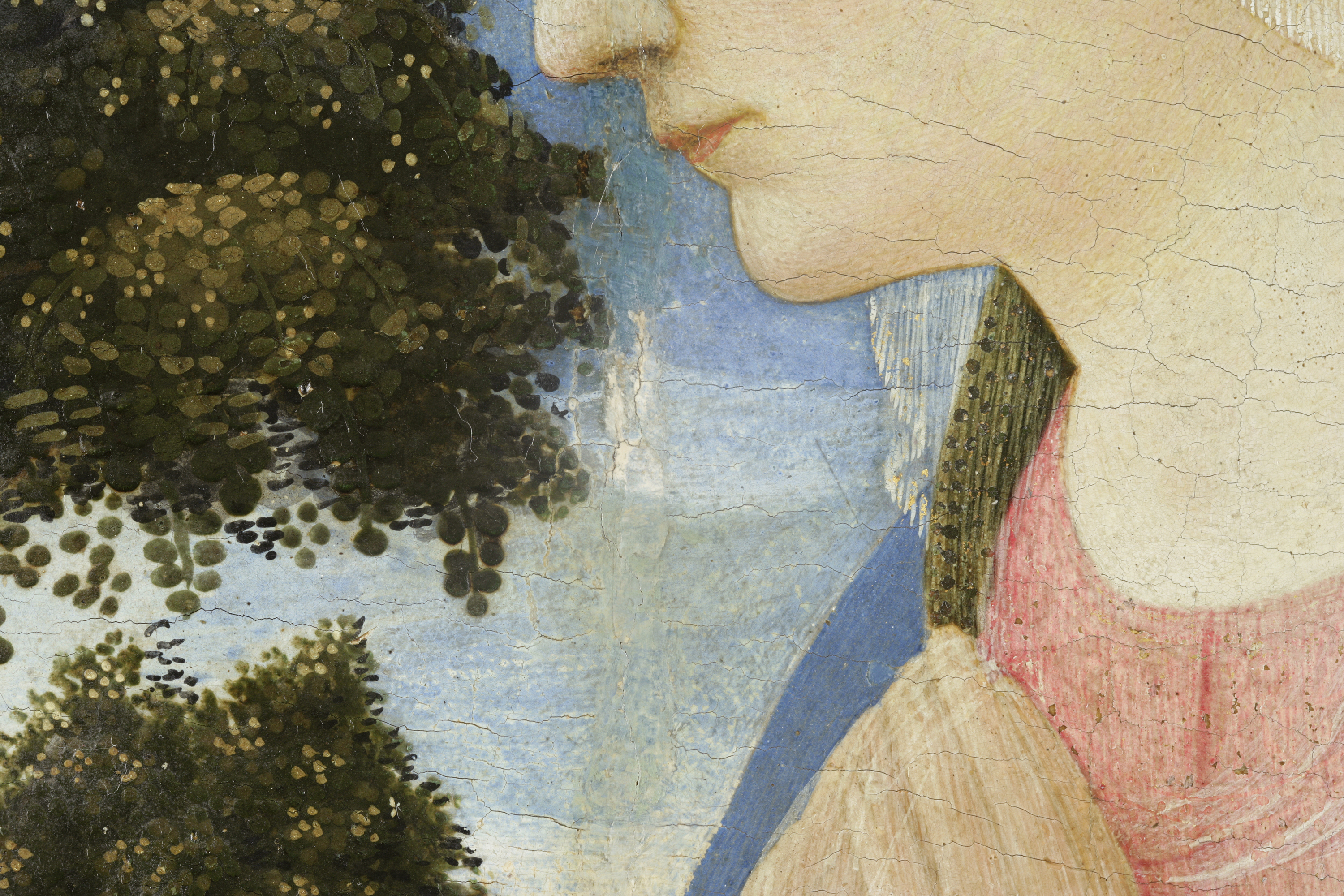
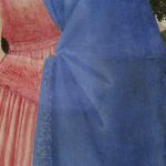
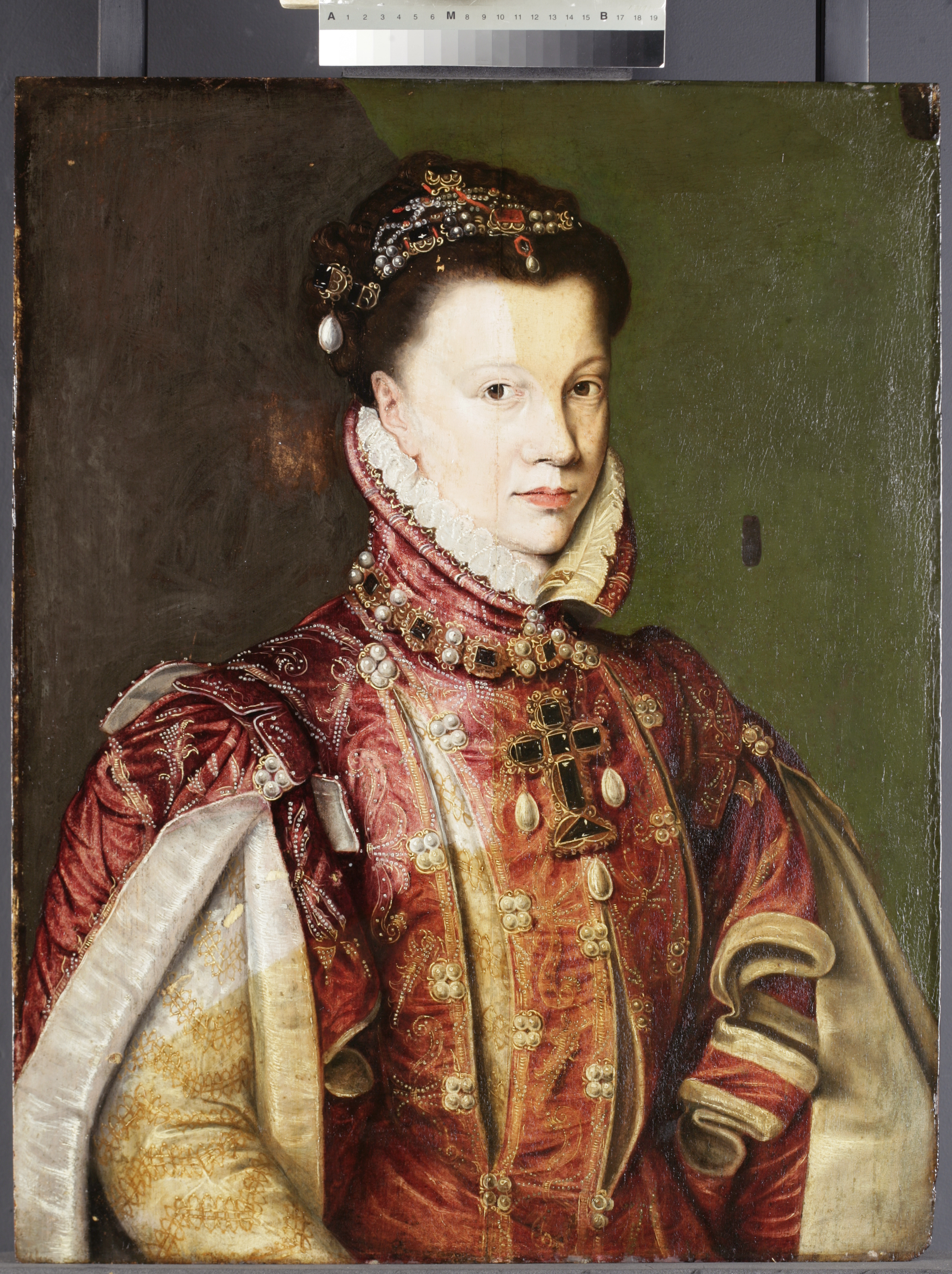
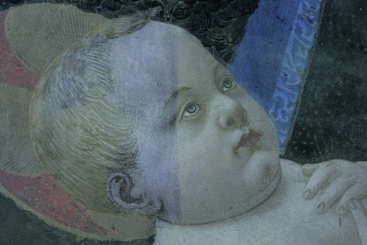
The varnish that covered the surface had slightly yellowed, dulling the colours and flattening the fabulous dress full of jewellery worn by the sitter (Fig. 4).

Fig. 4. Detail of the yellow varnish on the jewels (© Polkownik)
Fig. 4. Detail of the jewelled costume covered by yellowed varnish (© Polkownik)

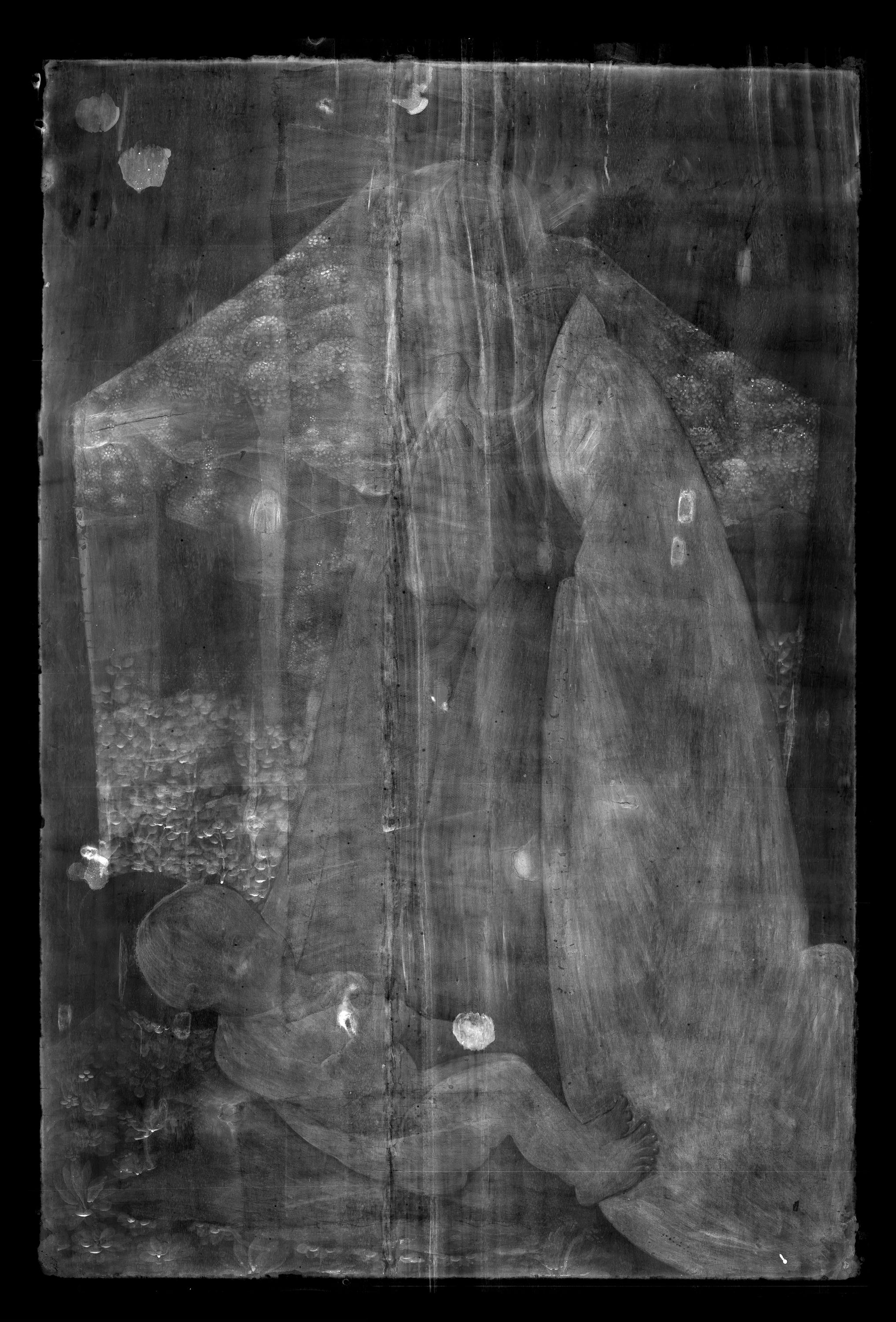
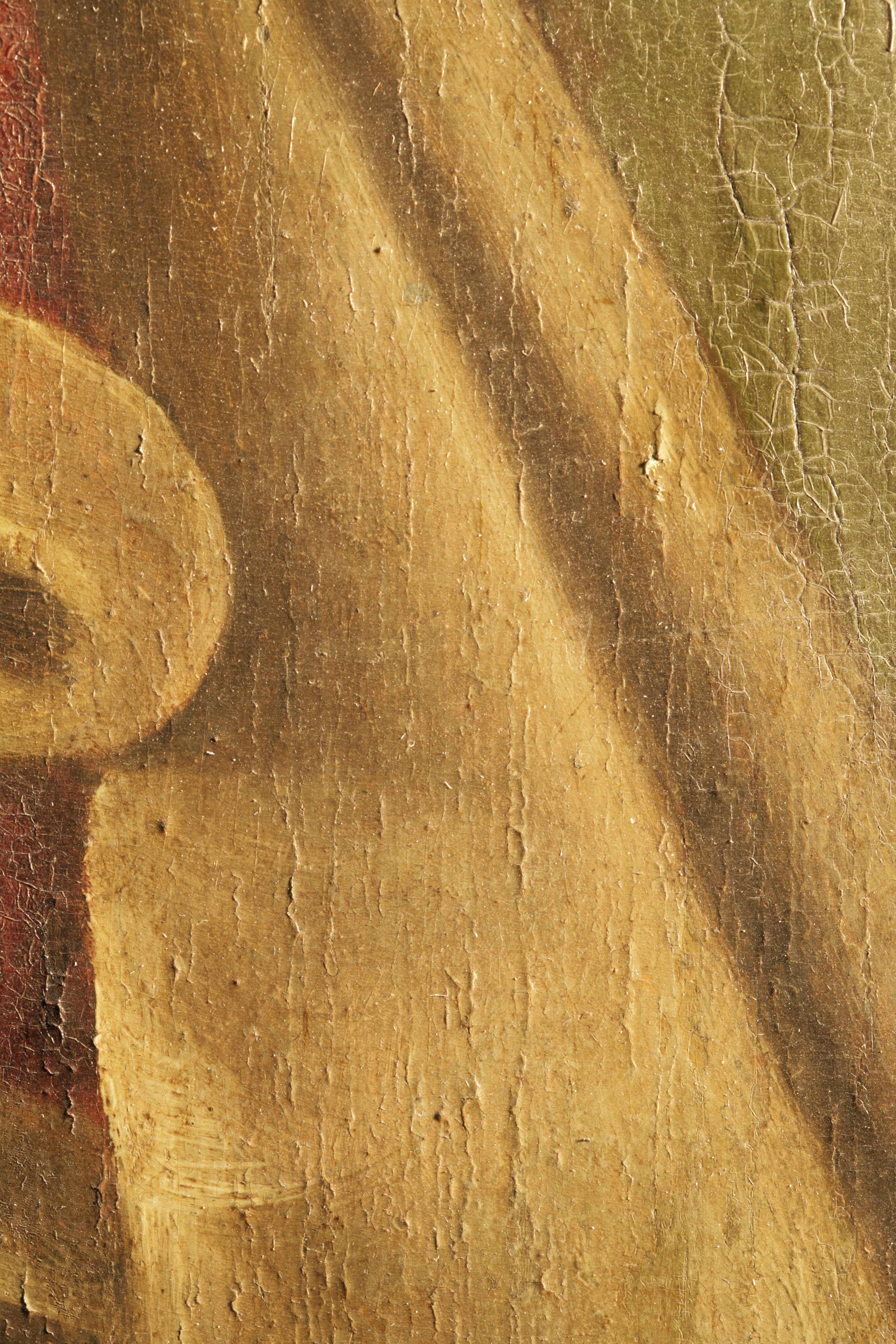
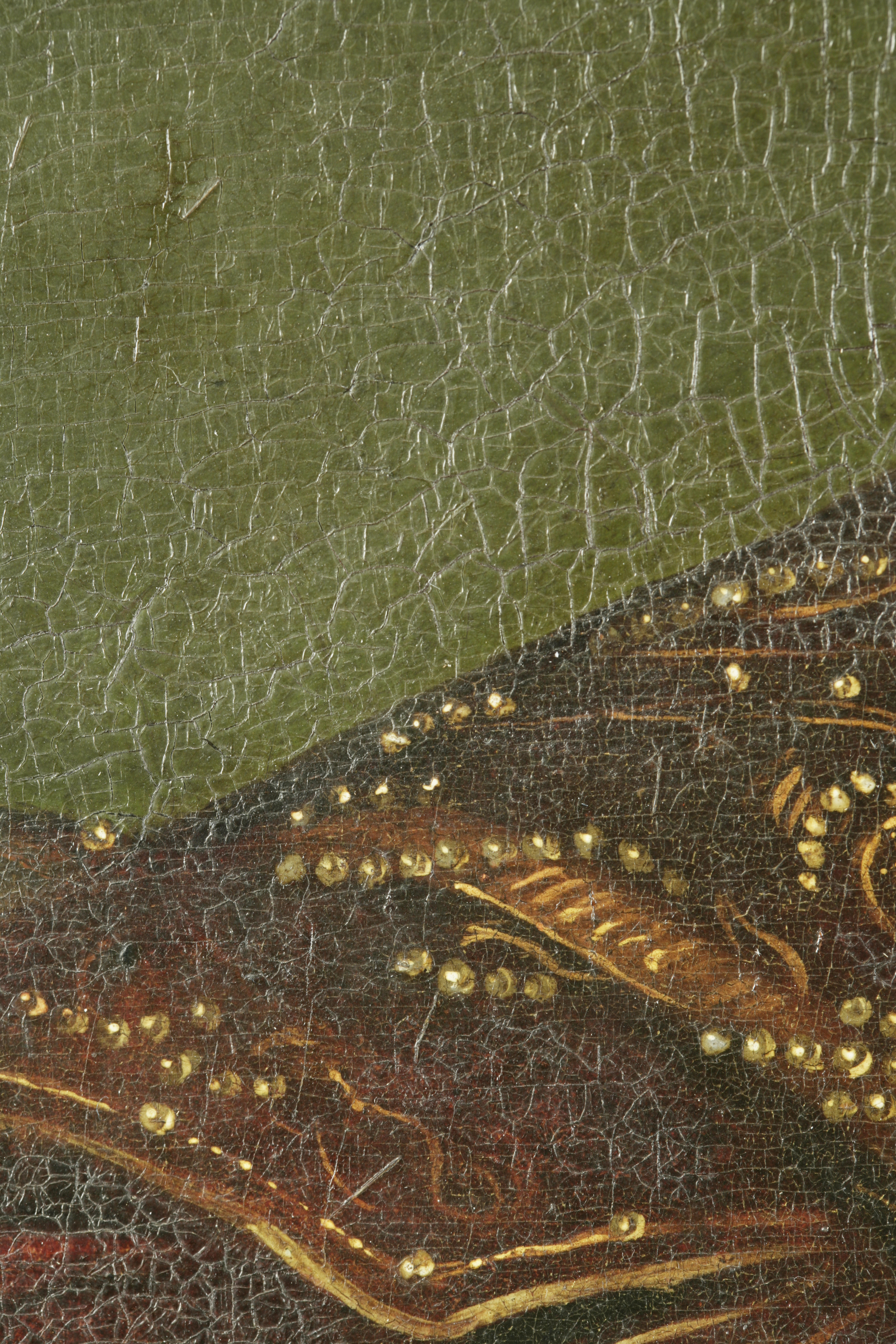
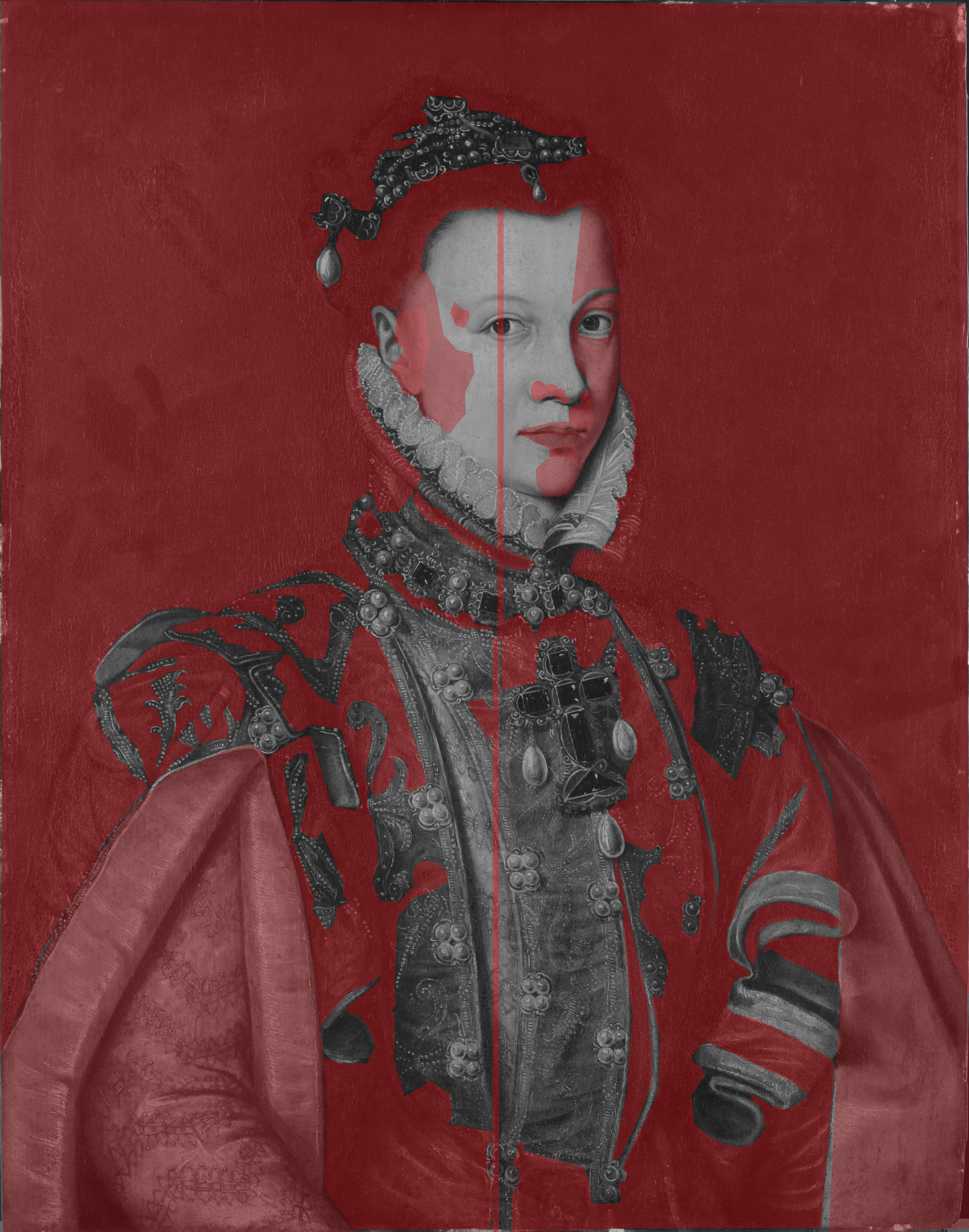
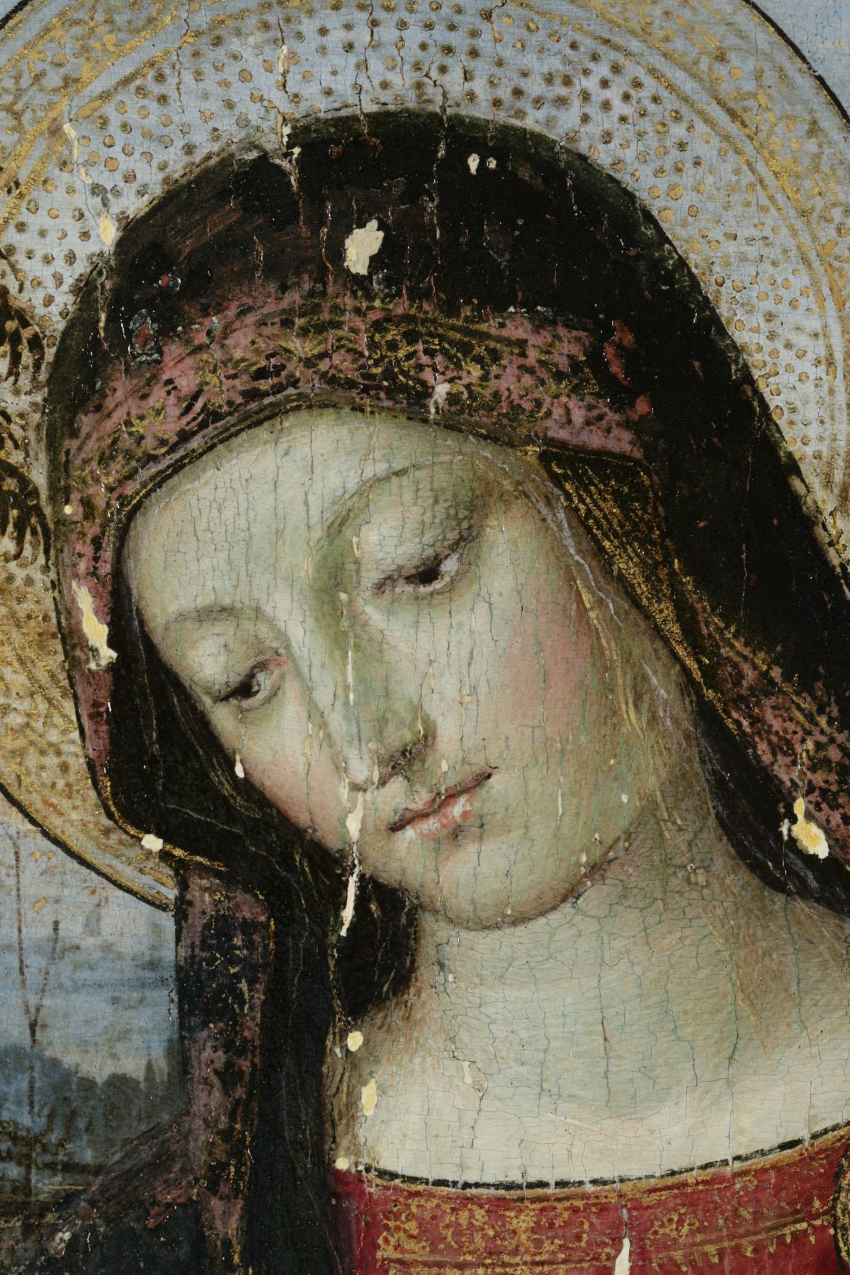
However, one thing really drew the eye: the lime green background . One could see the background looked dubious and was likely to have been overpainted (Fig. 5). Some fake cracks had also been painted in the background around the face, to try and integrate the area better, and the overall surface was cracked, reminding crocodile skin. It was decided with the curators to do some testing and find out if it was possible to remove the overpaint, what was underneath and what condition it was in. 

HKI-3097_img-7.JPG
Fig. 6. Detail of the background (© Polkownik)

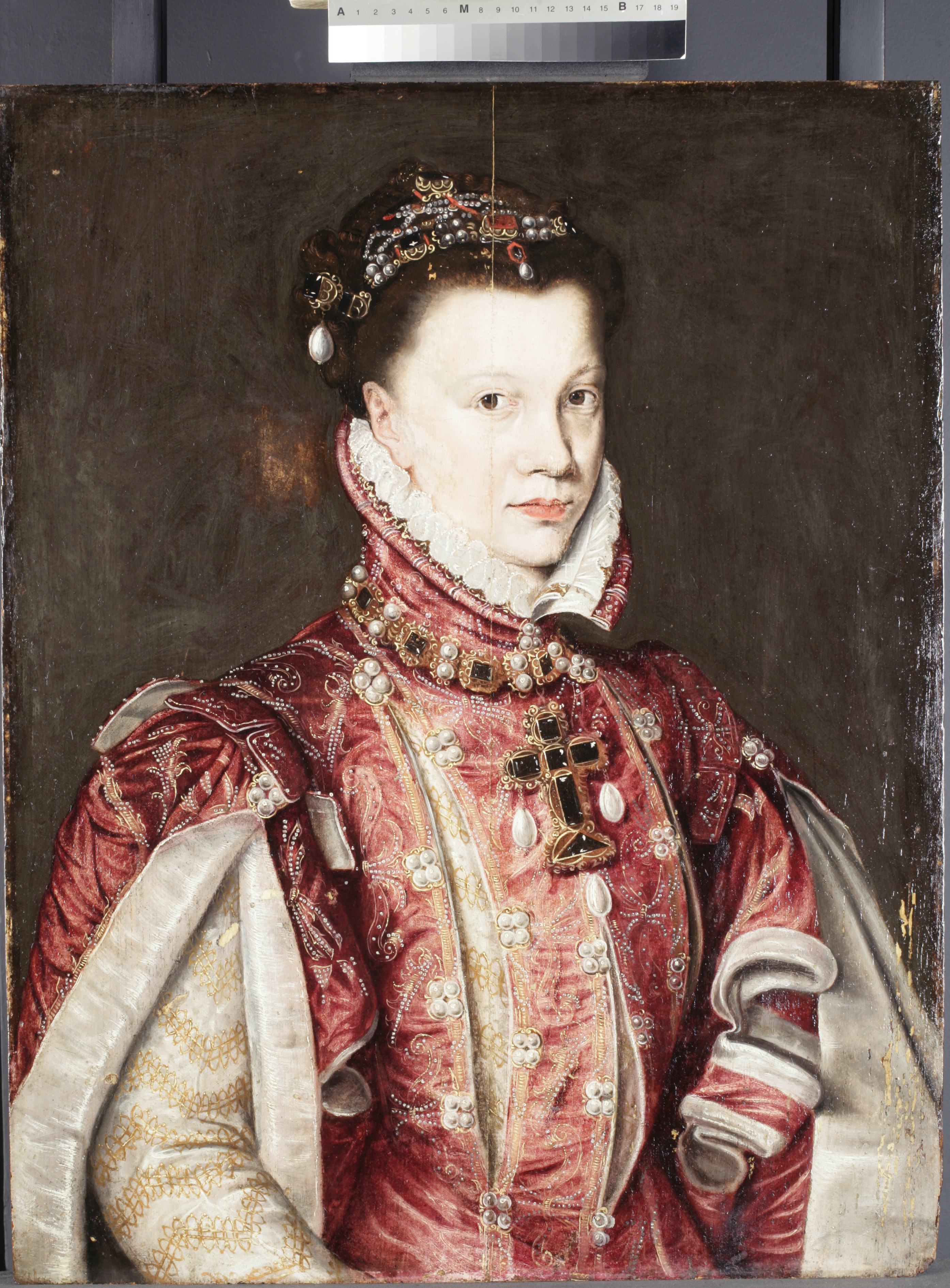
After close observation under the microscope, we came to the conclusion that most of the surface was covered by overpaint (Fig. 6).
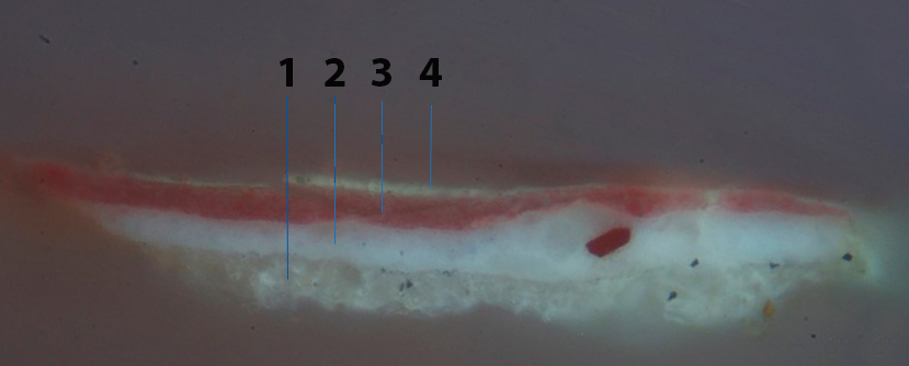
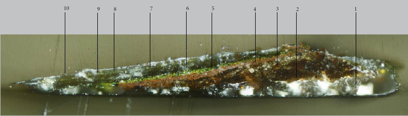
Fig. 5. Diagram showing the overpaint (in red). (© Polkownik)
Fig. 6. Diagram showing the overpaint (in red). (© Polkownik)

Cross-section

A paint sample was taken and set in resin (cross-section). The sample showed the original paint layer (2-3) was covered with two thick layers of overpaint (4-5) and non-original varnishes, tinted (6-7) and untinted (8-9) (Fig. 7).

Fig. 7. Paint sample set in resin (cross section) (© Polkownik)

Conservation Treatment

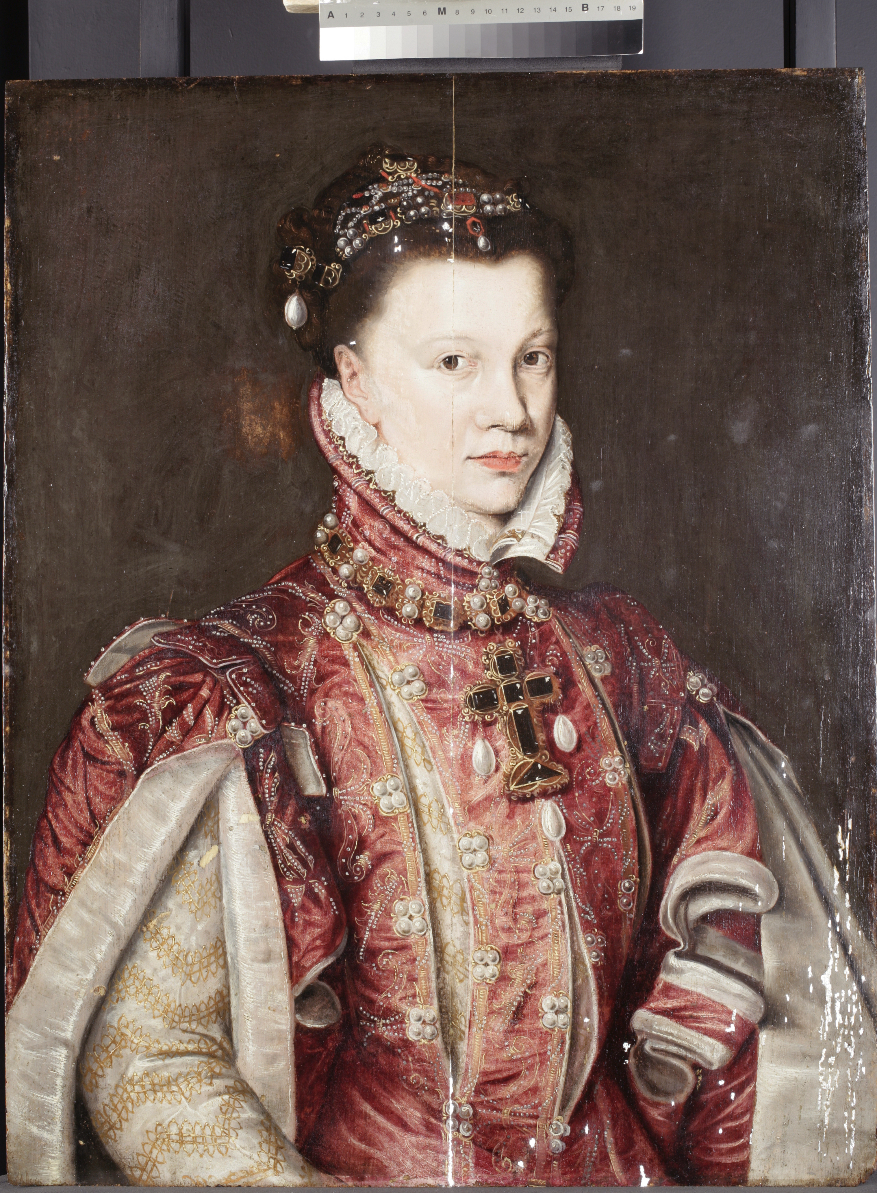
During testing, it was revealed that the overpaint could easily be removed. Three areas were tested; two showed an original paint layer underneath that appeared in good condition, and one test showed an abraded area. It is a difficult decision to remove such a large area of overpaint based on the three small test patches. But as the cleaning progressed (Fig. 8), it became clear that we were right to do this: the background was in good condition, apart from a small abraded area in the background close to the back of the head of the sitter. It seems astonishing that such a small damage warranted the overpainting of the whole background.

HKI-3097_img-15
Fig. 8. During cleaning (© Polkownik)

The original background is a dark green/brown, showing variations in opacity and in brush handling. It looks vibrant and lively, and complements the sitter’s red dress and pale rosy carnation.

Fig. 8. After cleaning (© Polkownik)
Fig. 9. After cleaning (© Polkownik)

After the removal, the painting was varnished (Fig. 9), the losses filled (Fig. 10) and retouched (Fig. 11) with reversible materials, and the abraded areas in the background were lightly dotted in. Treating this painting stabilised the materials (through the consolidation of flaking paint)  and brought it a step closer to its original 16th-century style.

HKI-3097_img-19
Fig. 10. After filling (© Polkownik)
Fig. 10. After retouching (© Titmus)
Fig. 11. After retouching (© Titmus)

Camille Polkownik, 2nd year Post-Graduate Intern (2015-2017)


About the Author:

Ms Camille Polkownik graduated with a Master’s Degree in the Conservation and Restoration of Paintings in 2014, from the École nationale supérieure des arts visuels de La Cambre in Brussels (Belgium). She also has a Bachelor degree in the Conservation and Restoration of Painted Works (2011) from the Superior School of Fine Arts, in Avignon (France). She has interned at the Royal Institute for Cultural Heritage (KIK-IRPA, Belgium), the Royal Museums of Fine Art of Brussels (Belgium), the Museum of Fine Arts in Nice (France), the Art Gallery of New South Wales (Sydney, Australia) and in private studios.

Her current research projects include the study of extenders added to Prussian Blue; the quality variations in lead white and how they affect paint properties; and the characterisation of Prismatic Lead White, an unusual form of lead white, through X-ray Diffraction analysis and Polarised Light Microscopy.

To contact Camille: camille.polkownik@gmail.com


[1] Tyers, Ian, Dendrochronological Consultancy Report 907, pp. 1-4.
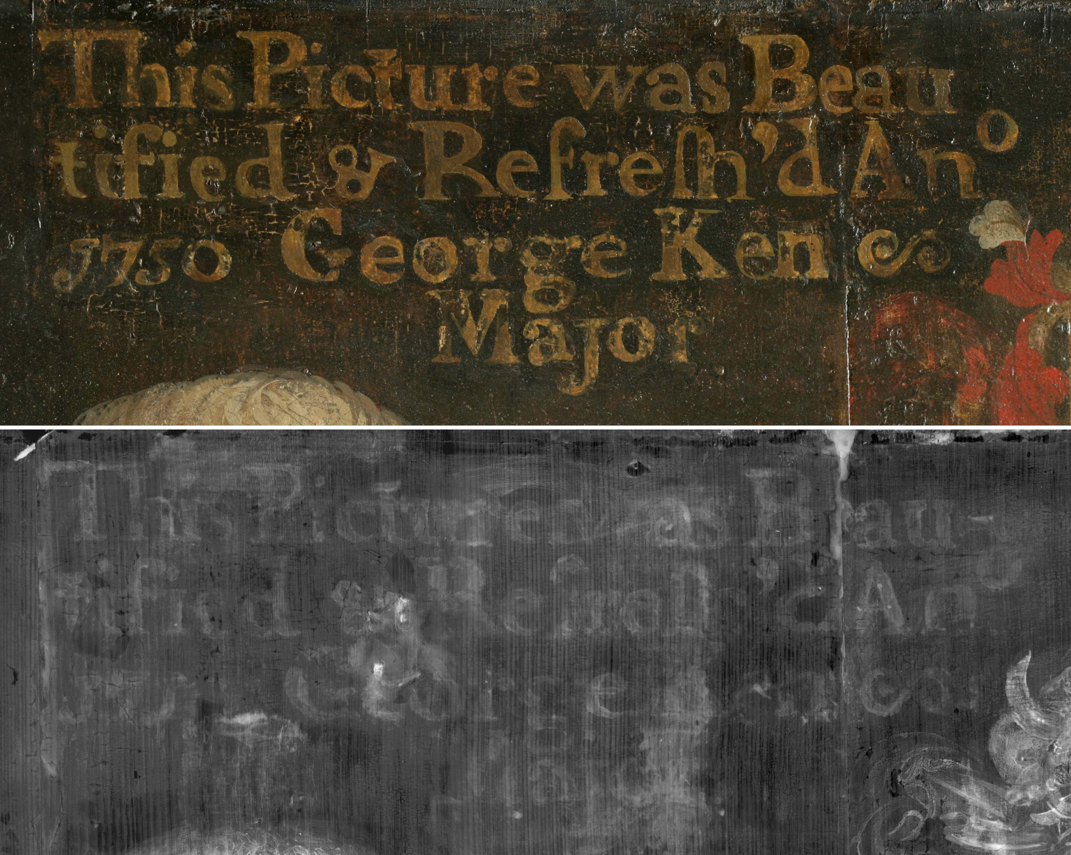
Tickled Pink: Unexpected Discoveries in the Painting Technique and Treatment History of Pinturicchio’s Virgin and Child

Virgin and Child with Saint John the Baptist (Fig. 1a-1b) was brought to the Hamilton Kerr Institute for treatment in the spring of 2016 prior to the painting’s display in the Madonnas and Miracles exhibition. While the painting’s condition was stable when it arrived, the varnish was dull and slightly greyish, and it was decided that varnish removal would provide an aesthetic improvement. Although the treatment was not particularly complex, I found studying the materials and techniques Pinturicchio used in this work and researching the painting’s treatment history to be a rewarding and edifying experience.

Virgin and Child dates to 1490-1495 and was acquired by the Fitzwilliam Museum in 1880. This work is only one of numerous paintings by Pinturicchio of this subject, with two of the most closely related versions in the Ashmolean Museum of Art and Archaeology and the Philadelphia Museum of Art. Variations in the paint handling and quality of these works may be attributed to the involvement of workshop assistants.

Materials and Technique

Pinturicchio painted the Fitzwilliam’s Virgin and Child primarily in egg tempera, enriched with oil glazes and gilding. As was traditional in Italian paintings of this period, the flesh tones are underpainted with a greenish layer termed verdaccio. Additionally, dispersed pigment samples were taken from the Virgin’s robe, and the pigment was identified as high quality coarse azurite using polarized light microscopy. Unfortunately, the robe appears much darker and less three-dimensional than it would have been when first painted. As often occurs with azurite, the paint has discoulored from aged medium and varnish, and the paint layer has suffered abrasion from past restoration treatments. When initially painted, the robe would have been a bright blue and would have appeared to drape more realistically: examination of the painting using infrared reflectography (Fig. 2) revealed extensive underdrawing in a liquid medium, and folds in the robe were both underdrawn and possibly outlined with carbon-containing black paint.

Fig. 2 Infrared reflectogram of Virgin and Child (©Titmus)

Perhaps the aspect of Pinturicchio’s technique I found most intriguing, however, was his method of underpainting. Microscopic (Fig. 3) and cross-sectional analysis of the paint layers in the Virgin’s robe revealed a locally-applied pink underlayer. John Brealey, the paintings conservator who treated the painting previously, estimated this layer to contain madder – a red lake – although analysis was not undertaken to confirm this identification. This underlayer does not seem to have been modelled to any significant extent, since the radio-opacity in the X-radiograph is quite even.

Fig. 3 Microscopic detail of pink paint showing through the abraded azurite of the Virgin’s robe in Virgin and Child (©Rayner)

The purpose of a pink or red underlayer in the mantle would have been to warm the resulting hue once the blue paint had been applied, as azurite can sometimes appear greenish. As Christine Kimbriel and Youjin Noh explore in “Sebastiano del Piombo’s Adoration of the Shepherds: On the Pursuit of Colouristic Splendour in a ‘Lost’ Painting,” it was not uncommon to find blue over pink or red underlayers in fifteenth-century and early sixteenth-century Venetian painting.1 Kimbriel and Noh cite examples of paintings by Giovanni Bellini, Sebastiano del Piombo, and Giorgione with this type of layering.

In contextualizing Pinturicchio’s use of this type of layering, it became clear that there are extant examples of works containing underpainting of lead white and red lake underneath blue robes or sky from as early as the fourteenth and fifteenth century, including paintings by Giotto.2 Raphael, who came to prominence only a generation after Pinturicchio, is perhaps the best-known example of a central Italian artist using this method.3

Additionally, this type of layering was a common technique in the painting of frescoes. For example, a layer of red ochre underlies azurite pigment in Perugino’s The Circumcision of the Son of Moses in the Sistine Chapel.4

While the presence of this pink layer in Pinturicchio’s Virgin and Child was initially surprising, it became apparent through research that the artist’s technique follows a tradition of employing pink and red underlayers under blue for optical purposes.

Elisabeth Petrina, 1st year student, used the information and reconstructed this painting with historically-accurate materials.

Treatment History

It is not often that documents recording the historic treatment of paintings exist, but when they do, they can afford the opportunity to reflect upon past conservation practices and study how specific restoration materials have aged. This was found to be the case with Virgin and Child, which was previously treated by John Brealey (1925-2002) in 1964. Brealey was a prominent figure in the history of paintings conservation, and his ideas and philosophies have had long-lasting significance for the field. He was a member of the advisory council of the Hamilton Kerr Institute at the time he treated this painting, and he left London in 1975 to become the chairman of paintings conservation at the Metropolitan Museum of Art.

The treatment report and photographs of Virgin and Child indicate that a good deal of previous restoration was removed by Brealey, but some old retouching and gilding was left. In Brealey’s words, “The gold hatching indicating the highlights is bogus, but has been left on because there must have been something similar on originally.” The thinking described in the treatment report is in line with Brealey’s well-known philosophy of selective cleaning. Ultraviolet examination of the painting (Fig. 4) confirmed that retouching from at least two campaigns of restoration were still present: Brealey’s and at least one previous restoration.

Fig. 4 Ultraviolet light photograph of Virgin and Child before treatment showing numerous campaigns of previous restoration (©Rayner)

Significantly, the report also specifies that the painting was revarnished with MS2A®, MS2B®, and wax. Both of the MS2® varnishes are ketone resins, with MS2B® having a slightly different solubility and higher viscosity.5 The identification of these coatings accorded with their appearance, since synthetic varnishes can have a tendency to grey and dull rather than yellow like natural resin varnishes (Fig. 5). Knowing the materials used to varnish the painting allowed testing of the theory that the coatings should remain easily reversible over time. While they were certainly still soluble, organic solvents of a surprisingly high polarity were required in order to remove the conservation varnish.

Fig. 5 Virgin and Child during treatment showing varnish removal in progress (©Rayner)

Treatment

In spite of the unexpected polarity of the synthetic coating, varnish removal was relatively straightforward except for within the Virgin’s blue robe. The coarse azurite in this area was found to be under-bound. This means there was a higher ratio of pigment to oil, not sufficient to fully coat the particles and bind them into the polymerised oil network. Contrary to the rest of the painting, the robe was cleaned using a quickly evaporating solvent on cotton swabs, lightly rolled over the surface, in order to solubilize and reduce the varnish without excess mechanical action.

Significant amounts of overpaint and chalk fill material had been left covering original paint, so treatment also involved reducing these foreign materials under the microscope (Fig. 6). Additionally, discolored brown material within the halo was reduced using aqueous solutions and gels.

HKI-2229_img-35.JPG
Fig. 6 Virgin and Child before retouching (©Titmus)

Unfortunately, I was unable to complete the treatment prior to finishing my post-graduate internship in the summer of 2016. The filling, retouching, and revarnishing were carried out by the Hamilton Kerr Institute’s Director, Rupert Featherstone (Fig. 7).

Fig. 7 Virgin and Child after treatment: Virgin and Child (©Titmus)
Fig. 7 Virgin and Child after treatment (©Titmus)

Although I would like to have seen this treatment from start to finish, I learned a great deal from the opportunity to study this artwork. I hope this text provides some insights into the creation and history of the work, and that you will visit the Fitzwilliam Museum to see Virgin and Child for yourself!

Kari Rayner, 2nd year Post-Graduate Intern (2015-2016)


About the Author:

Ms Kari Rayner holds a Master of Arts in Art History and an Advanced Certificate in Art Conservation from New York University, USA. She also graduated with her Bachelor of Arts in Art History, Art Theory and Practice from Northwestern University, USA. During her graduate studies, Kari interned at the Wallraf-Richartz-Museum in Cologne and worked at Modern Art Conservation in New York, NY. Her final-year internship was undertaken at the National Gallery of Art in Washington, D.C., and she completed a year-long post-graduate internship at the Hamilton Kerr Institute from 2015-2016. Kari returned to the NGA in the fall of 2016 as an Andrew W. Mellon Fellow in Paintings Conservation.

To contact Kari: rayner.kari.s@gmail.com


Notes

1 Kimbriel, Christine and Youjin Noh. “Sebastiano del Piombo’s Adoration of the Shepherds: On the Pursuit of Colouristic Splendour in a ‘Lost’ Painting.” In Artists’ Footsteps: The Reconstruction of Pigments and Paintings: Studies in Honour of Renate Woudhuysen-Keller. S.l.: Antique Collectors’ Club, 2013.

2 Sincere thanks to Elizabeth Walmsley of the National Gallery of Art, who shared her expertise in Italian painting and directed me to the following resources on the topic of pink/red underlayers. Borgia, Ilaria, Diego Cauzzi, Bruno Radicati, and Claudio Seccaroni. “Raphael’s Saint Cecelia in Bologna: New Data about its Genesis and Materials.” Raphael’s Painting Technique: Working Practices Before Rome. Proceedings of the Eu-ARTECH workshop. Eds. Ashok Roy and Marika Spring. Page 95

3 Ibid, page 95

4 Santamaria, Ulderico and Fabio Morresi. “Perugino’s technique in the Sistine Chapel: scientific investigations.” The Painting Technique of Pietro Vannucci, called Perugino: Proceedings of the LabS TECH Workshop. Eds. Brunetto Giovanni Brunetti, Claudio Seccaroni, and Antonio Sgamellotti. Pages 99-100

5 “Low Molecular Weight Varnishes.” Ed. Wendy Samet. Paintings Specialty Group Wiki, 1997. Web. Accessed June 4, 2017. http://www.conservation-wiki.com/wiki/IV._Low_Molecular_Weight_Varnishes

Grüße aus Wien! Vienna Study Trip 2017

During the final week of May 2017 the students and interns at the Hamilton Kerr Institute travelled to Vienna for our annual study trip. Two members of staff, Morwenna Blewett and Lucy Wrapson, joined us on the trip, and we are very grateful to them for organising all of the interesting visits that we had during our stay. Throughout the week we were able to explore the vast collections of artworks held by the Viennese cultural institutions, whilst also taking a peek behind the scenes through exclusive visits to the conservation studios at the Palais Liechtenstein and the Kunsthistorisches Museum.

The Albertina & Le Palais Liechtenstein 

During our first day of studio visits we spent our free morning visiting the Albertina: a building with original neoclassical interior decoration, which boasts a broad collection of modern art pieces. Whether your preference is Edvard Munch, Pablo Picasso or the less-known works of the German Expressionist Karl Hofer, this museum has something for everyone. Until June 18 2017 the Museum is also showcasing an exhibition of graphic works by the Austrian master Egon Schiele: a must see for those of you who are venturing to Vienna in the near future.

Following a picnic lunch in sparkling sunshine at Park Burggarden we headed off to our first conservation studio visit at the Liechtenstein Garden Palace. To start off our visit we were given a private tour of the palace’s galleries by head of conservation, Dr Robert Wald. I think I speak for all of us in saying that we were blown away by the splendour of the palace’s art collection. With works ranging from Italian quattrocento panel paintings to large-scale tapestry designs by Peter Paul Rubens, the Princely Collection is perhaps one of the most thoughtfully put-together and well-preserved group of artworks that I have had the pleasure of viewing. A particular favourite was the seventeenth-century carriage that is on display in the main entrance hall of the palace, seemingly plucked from the prop selection of Disney’s 2015 Cinderella remake.

After our tour in the galleries Dr Wald took us to see the palace’s conservation studio, situated in a purpose-built adjacent building. Here we were introduced to the studio’s conservation staff and were also invited to take a look at their current treatment projects. It was interesting to note the similarities and differences between the conservation practices of Wald’s studio with those commonly employed at the HKI. A notable difference was their approach to retouching, which makes use of gouache or watercolour base layers, followed by thinly applied glazes using pigments bound in an oil-resin medium. Although this method differs from the HKI’s use of egg tempera and Gamblin colours, we found that the Austrian tradition offered a comparable result, whilst also serving as an example of differing approaches within the western conservation world.

Kunsthistorisches Museum

Our second day included a visit to the conservation studio of the Vienna Museum of Fine Arts. We spent the morning exploring the collection itself, which was developed from the art collections of the Habsburg Family. This colossal collection is one of the largest of its kind and boasts works by Titian, Rubens and Pieter Bruegel the Elder. I particularly enjoyed seeing Bruegel’s The Great Tower of Babel for the first time, a painting that I had long admired since my adolescent years.

Our tour of the Museum’s conservation studio was very interesting as well. Amongst other things, we were introduced to the treatment of a panel painting by Lucas Cranach, as well as a village fête scene by Bruegel the Elder. It was also interesting to observe the consistencies and differences between the conservation approaches of the Museum with those of the studio at the Palais Liechtenstein. A notable similarity is their shared preference for the use of natural resin varnishes, as well as the latter studio’s approach to retouching. Another aspect of the Austrian conservation tradition, which is less-commonly employed in British institutions, is the thinning of old varnishes, as opposed to their complete removal. The opportunity to learn about the conservation practices and traditions of another country was a fascinating experience, teaching us that there is more than one approach when it comes to restoring paintings.

 Institute of Conservation & Akademie der Bildenen Künste

Our final day of visits included tours of the two major conservation schools in Austria. The first was the Institute of Conservation, where we met with Prof. Gabriela Krist. The school offers a variety of conservation specialisms, including textiles, objects and metalwork, as well as paintings and polychrome sculpture. The focus of our visit was the paintings conservation department, although it was also interesting to see the types of objects that are conserved in the other departments as well.

Our second visit for the day was to the Akademie der Bildenen Künste. We were greeted by the head of the institute, Prof. Wolfgang Baatz, who showed us around the conservation studios. Like the Institute of Conservation, the Akademie offers courses in objects, paintings and polychrome sculpture conservation. However unlike the former school, the Akademie also has a wall paintings conservation department, as well as a newly established department that focuses solely on the conservation of contemporary artworks. The issues involved with dealing with contemporary art pieces were a particularly interesting aspect of our visit, as it is a sphere of conservation that we rarely get to deal with at the Hamilton Kerr Institute.

 Our Final Day- Gustav Klimt at the Belvedere

Sad as we were to be leaving Vienna after such a short stay, we decided to make the most of our last full day by visiting the Belvedere Gallery– home to The Kiss by Gustav Klimt, as well as an impressive collection of Austrian art dating from the Middle Ages to the present day. Needless to say, this last visit served as the icing on top of the cake- or the chocolate stamp on top of the sachertorte if you will. My particular favourites included Egon Schiele’s Mother with Two Children, a beautiful, serene painting that I feel displays the artist’s mastery of form and colour, as well as Klimt’s series of square-format flower paintings. The latter paintings are displayed in a room of their own at the Belvedere, in the section preceding the infamous Kiss painting. It was easy to feel completely lost in this room, as the paintings seem to project their subject matter outwards, whilst also drawing the viewer in, demonstrating Klimt’s simultaneous mastery of the surreal and the realistic- it was difficult to ascertain where the paintings ended and the illusion began.

To sum up, we left Vienna with our minds saturated with images of art and our bellies full of Wiener schnitzel, apple strudel and more than a glass or two of white wine spritzer. I would definitely recommend a visit to this gorgeous city to any art-lover, or indeed anyone interested in seeing a city that is full of history, quirky coffee shops and delicious food. Auf Wiedersehen Wien, bis zum nächsten Mal!

Emma Jansson, 1st year Post-Graduate Intern (2016-2018)


About the author

Emma Jansson graduated from the Courtauld Institute of Art in 2016, having completed the three-year Postgraduate Diploma in the Conservation of Easel Paintings. She also holds a BA in History of Art/Archaeology and Japanese Studies from the School of Oriental and African Studies, University of London. Emma has experience working in both private conservation studios in London and public institutions. Her most recent placements include internships at the Victoria & Albert Museum and the National Maritime Museum in Greenwich, as well as an in situ project at the Houses of Parliament, Westminster Palace. She is also involved in the technical analysis of artworks. Her final-year thesis at the Courtauld Institute focused on the materials and technique of the Impressionist artist Alfred Sisley. Emma is continuing her interest in technical art history at the HKI, where she is involved in several research projects, including a study on the uptake of artificial ultramarine by British artists in the nineteenth century.  

To contact Emma: ej309@cam.ac.uk

Madonna and Child by the Master of the Castello Nativity

In preparation for the Fitzwilliam Museum’s exhibition Madonnas and Miracles: Private Devotion in Renaissance Italy  paintings from the Fitzwilliam Museum collection came to the Hamilton Kerr Institute to be restored, including this beautiful and colourful panel  of the Madonna and Child by the Master of the Castello Nativity . When the painting arrived at the studio, the two main issues were a discoloured varnish layer and a very visible and irregular retouching covering the joint in the centre of the panel from top to bottom. This was my last project at the HKI; I left before I was able to finish it so Mary Kempski, Senior Paintings Conservator at the Institute, carried out the filling and retouching, bringing the treatment to completion.

Before treatment (© Titmus)

The artist

Little is known about The Master of the Castello Nativity. He was an Italian painter, active in Florence and Prato in the mid-15th century, as well as a follower and possible pupil or collaborator of Filippo Lippi (c. 1406-69). He was nicknamed after another of his paintings of the Virgin adoring the Christ Child which originally came from Castello and is now kept in Florence [1] Around 30 paintings have been ascribed to him, a few of them show the same composition, as can be seen in the versions in the Uffizi, Florence and in the Huntington Library, California. All three versions have similar features: the kneeling Virgin praying with the Child in front, the star on the Virgin’s shoulder (probably Stella Maris), the veils covering the head and the hands of the Virgin, the gold decoration of the robes, the vegetation and the golden rays around the baby. The three paintings are of a considerable size and the one from the Fitzwilliam is the smallest.

The panel

The wooden panel (86.7 cm x 59.4 cm x 3.4 cm), most likely poplar, consists of two boards with the grain running vertically. At the back, the surface is irregular and shows tool marks from the initial preparation of the panel. The woodworm damage in the central section is severe and may well have weakened the panel internally causing it to split, a damage now visible from the front. The visible open channels from the woodworm activity on the vertical edges of the panel indicate that the edges have been cut off and the general size reduced at some point. The presence of six rectangular holes on the back could be related to a previous use of the panel, although their function is currently unknown.

Before treatment (© Titmus)

The X-ray examination revealed the presence of an original piece of canvas covering the joint top to bottom and located under the ground and paint layers. It was common practice at this period to cover the defects and joints of the support with canvas soaked in glue before applying the ground layer. This would help level the surface and strengthen the weakest areas. Curiously, the canvas is missing just at the very bottom of the painting, but the reason for this is so far unknown.

X-ray (© Titmus)
X-ray (© Titmus)

The painting technique

The paint was in good condition, apart from extensive retouching along the split, as well as in the bottom corners. Based on the appearance and handling of the paint, the figures are most likely painted with tempera, while the landscape appears to be done in oil. The detailed areas of vegetation display very thick impasto. Upon ageing, the oil layers have become more transparent, allowing the previous layers of oil underneath to be seen, as is the case in the roses and the trees.

The gold, probably water-gilded, has been re-gilded in some areas. To recreate the volume of the curtain of the pavilion, dark glazes have been applied to the gold drapery, and some engraved marks (scoring and punching) were applied to give the gold different textural reflections.

The treatment

The work started with a full optical examination. Ultraviolet light revealed a discoloured varnish layer (probably a natural resin as it fluoresces in UV light, although not strongly) and a discoloured and irregular retouching covering the joint.

Joint before treatment (© González Juste)
Joint during treatment (© González Juste)

The painting was surface cleaned and the varnish removed. After removal of the top varnish layer, it was evident that there was still another varnish on the surface, in particular on the blue of the robe and the greens of the background.  A stronger solution was used in order to remove the last remnants of the varnish. The removal of the varnish layer also involved the removal of the majority of the overpaint, although there were remnants on the joint of the boards in the bottom right corner, and some across the red robe. These remnants were tough and probably older than the rest, possibly in a different medium.

The removal of old fills from the central join revealed at least three campaigns of filling and retouching, covering areas of the original, which had caused bulkiness across the join. The removal of the fills recovered hidden areas of original paint, which were in good condition.

Due to the uneven and dull quality of the flesh tones and the blue and red robes after varnish removal, these areas were examined more closely and samples were taken to try and identify the nature of this top grey layer. The study of the cross-sections suggests that the grey layer mainly consisted of an aged natural resin, too oxidised to lift off with free solvents.

The sample shows that the remaining varnish layer extended into a crack in the underlying original glaze, confirming that it was not original. The cross-section displayed below is a sample from the red robe after initial varnish removal. It shows the ground layer, probably gypsum with some black particles (1), a white pinkish imprimatura with a big red particle (2), a red glaze (3), and the varnish layer (4).


Cross-section from the red robe after initial varnish removal. (©González Juste)

After several tests, it was decided that the painting could be greatly improved by removing this layer. As a result, this revealed brighter colours, such as the astonishing ultramarine blue robe and the delicacy of the veil covering the hands of the Virgin.

During dirt removal (© González Juste)
After full cleaning (© González Juste)
After full cleaning, before restoration (© González Juste)

The painting was brush-varnished and the losses were filled and retouched, and the area of damaged gilding in the halo was re-gilded.

After treatment (© Titmus)

Carlos González Juste, 2nd year intern (2014-2016)


About the author

Carlos González Juste has a B.A. in History from the Complutense University in Madrid and a Degree in Conservation and Restoration of Cultural Heritage from the Escuela Superior de Conservación y Restauración de Bienes Culturales in Madrid.  He has been an intern in the Museo Nacional del Prado (Madrid), other Spanish institutions and the Hamilton Kerr Institute, Cambridge. He has participated in some traditional pigment making projects (“Cuttings: Mindful Hands. Masterpieces of Illumination” by Factum Arte among other projects). He is currently completing his Masters degree in the Escuela Superior de Conservación y Restauración de Bienes Culturales in Madrid and working as a private conservator.

To contact Carlos González Juste: cgjuste@gmail.com

mm-poster-small

Technical Examination of a Portrait of Thomas Sutton

This oil on panel portrait belongs to the City of Lincoln and depicts the founder of the Charterhouse, London, Thomas Sutton (1532–1611). The painting has been lent to the Charterhouse since the 1970s and was recently sent to the Hamilton Kerr Institute for technical analysis and study, in the hope of clarifying long-standing questions about its origin.

Figure 1. Thomas Sutton, Unknown English artist, 1622 (©Titmus/Courtesy of the Charterhouse, London)
Figure 1. Portrait of Thomas Sutton, Unknown English artist, 1622 (©Titmus/Courtesy of the Charterhouse, London)

THE PAINTING

The painting is attributed to an unknown English artist, but the date of the painting has been contested with two different theories as to the origin of the portrait. The date of c.1590 was suggested by Sir Roy Strong in the 1970s, and is based on the sitter’s age (Sutton would have been 58 in 1590) assuming that the portrait was painted from life. It was also postulated that the illustration of a cannon in the book, on which Sutton rests his hand, suggests that the sitter was at the time Master of the Ordnance (an office which Sutton held until 1594).

However, it has subsequently been suggested by the art historian Hugh Trevor-Roper, that the painting could have been a posthumous portrait of Sutton. Painting styles and portrait compositions do not change much between the late 16th century and early 17th century, making it difficult to judge on these aesthetic distinctions the date of a painting of this type. It was hoped that through technical examination, evidence of the painting’s making might come to light that could decide the long-standing question of whether this painting was a portrait from life or not.

During the examination of the painting, both under the microscope and using the other imaging techniques such as infra-red reflectography (IRR) and X-radiography, it became apparent that the painting has been severely damaged in its long history. These damages are old and hidden under several layers of restoration. It is common for paintings of this age to have suffered over time, but this painting is remarkable in the extent of the restorations currently present.

THE MAN BEHIND THE MYTH

Thomas Sutton was an enigmatic and shrewd Elizabethan financier who amassed a great fortune during his life and became something of a myth after his death. He was known to his contemporaries as ‘Croesus’ or ‘Riche Sutton’,[1] and had the reputation of being the richest commoner in England when he died in 1611 at the age of 79. Originating from Lincolnshire, Sutton was a talented civil servant and made money from wise investments and purchasing favourable leases. However, it was really through his somewhat disreputable practices as a money-lender that Sutton accumulated and expanded his fortune.[2] Usury, while legalised in 1570, was not considered wholly respectable and criticised as a way of extorting money.

Sutton bought the Charterhouse in 1611 for the grand sum of £13,000 but died later that year, leaving an astonishing sum of money (some £50,000) for the establishment of the hospital and school in his will. This was not popular with Sutton’s heir-at-law, his nephew Simon Baxter, who, displeased with his inheritance of £300, tried to storm the Charterhouse by force.[3] After his death, Sutton’s will was published, and the astonishing gesture of donating almost his entire fortune to a charitable cause transformed the careful and private businessman into a Protestant saint of charity, hailed by the clergy as a ‘hero’, a ‘saint’ and even ‘the right Phoenix of charity’.

This fame prompted an interest in his life, and since the career of Sutton as a reclusive ‘usurer’ was not palatable to his fans, more exciting tales of Sutton were spread. He was even portrayed as a valiant soldier/merchant prince, who, through his thirty agents abroad and his privateering exploits at sea, contributed to victory in the great patriotic wars against Spain. While these myths have been eroded over time, Sutton’s final gesture of charity in the founding of the Charterhouse has certainly given this sombre character a place in the history of London.

THE INSCRIPTIONS

The painting prominently displays two painted inscriptions and two coats of arms, all of which have been overpainted and are somewhat illegible in places. The two different coats of arms can be identified as Thomas Sutton’s personal coat of arms on the right-hand side, which was assigned to him after his death, and the Lincoln coat of arms on the left.

Donation Inscription blog
Figure 5: The ‘donation’ inscription in visible light and x-radiography (©Bayliss/Courtesy of the Charterhouse, London)
Restoration Inscription blog
Figure 6: The ‘restoration’ inscription in visible light and x-radiography (©Bayliss/Courtesy of the Charterhouse, London)

The inscription at the top, above Sutton’s head, is an unusual addition to a painting and refers to the restoration of the painting in the 18th century by the mayor of Lincoln. The inscription reads, “This Picture was Beau/tified & Refresh’d Ano/1750 George Ken/Major”.

The other inscription is harder to read as it has been damaged and badly overpainted in the past. X-radiography is a technique by which we can see ‘through’ the paint layers, or more precisely, we see the density of the painting mapped out. In this case, the x-radiograph of the painting shows the original inscriptions underneath the overpaint (see figures. 2 and 3). In the x-radiograph, the older donation inscription is quite clear and reads, “In honorable Memorie of this/famous & mor— benefactor/Edm. Blawe major in anno/1622. gave this picture”.

This inscription refers to the mayor of Lincoln in 1621, Edward Blow, but what is less certain is whether the date refers to the paintings making or whether it was added as the date the painting was donated to the City of Lincoln.

THE PAINTING IN LINCOLN

These inscriptions give an insight into the function and history of this painting as a publically owned painting. The portrait is in fact mentioned in a Historical Account of Thomas Sutton written by the historian Philip Bearcroft in 1737. He writes: “The Lea∫e of the Par∫onage of Glentham was bequeathed to the Poor of the City of Lincoln out of Regard to his Father(…) And in Gratitude for this Benefaction, there is now in the Publick Hall of the City of Lincoln a whole length Picture of Mr. Sutton, with this in∫cription, Effigies Illu∫t: Thomӕ Sutton Armigeri, given according to the In∫cription, in 1622 by Edward Blawe E∫q; at that Time Mayor, and beatified and refre∫hed in 1710, at the Expence of the Corporation, whole Poor continue to be Fed to this Day out of the Par∫onage of Glentham.”

Despite the reference to the portrait being a full-length, when there is no physical evidence of the painting being cut down, much of what is written by Bearcroft fits in with what has been deciphered of the inscriptions from the technical analysis. The incongruity between the dates for the restoration became clear when looking at the inscription in the x-radiograph, as the year originally read 1710 but has been copied incorrectly to 1750 (see figure 6). This fits with the name of the mayor, as George Kent was the mayor in 1710, rather than Edward Fowler, the mayor in 1750.[4]

Bearcroft thinks that the portrait was given as a response to Sutton’s bequest of the lease of the Glentham parsonage – i.e. as a gift received after his death. This implies that the 1622 date of the portrait’s donation also corresponds to that of its making. In addition, from what we know of Sutton’s life, it seems unlikely that a personal portrait of the man (he only became a public figure after his death) would have ended up in Lincoln, as Sutton had little connection to the city at that period of his life.

DATING USING DENDROCHRONOLOGY

In addition to the historical evidence for the painting being a posthumous commission by the mayor of Lincoln in 1622, the dating of the panel using dendrochronology provides compelling evidence for this theory. Dendrochronology (or tree-ring dating) is a dating technique that uses the pattern of ring widths within a sample of timber to determine the calendar period within which the tree grew. The results for this painting gave the earliest felling date of c.1605 for the panel. If time is added onto this date for seasoning and processing of the wood, it becomes highly unlikely that this painting could have been made within Sutton’s lifetime.

This date certainly contradicts the idea that the open book is an indication that this portrait was made to commemorate a specific event in his career (e.g. his leaving office in 1594), or that is was painted while he was still the Master of Ordnance. It seems more likely if we consider this portrait to be a grateful representation of a man expressing the virtues of Christian charity, that it eludes to his more exciting and respectable methods of making his fortune.

SUMMARY

Technical analysis has been used in this study to clarify certain aspects of the painting and give weight and further evidence to historical theories about the painting. The clarification of the old inscriptions and the dating of the panel support has given credence to the theory that this painting was made in 1622, after Sutton’s death and rise to fame, and commissioned as a public painting by the mayor of Lincoln to celebrate a Lincolnshire worthy.

Sarah Bayliss, 2nd year Post-Graduate Intern

[1] Neal R. Shipley, “Thomas Sutton: Tudor-Stuart Moneylender,” Business History Review, Vol. L, No. 4 (Winter, 1976): 456-476.

[2] Stephen Porter, The London Charterhouse: A History of Thomas Sutton’s Charity (Stroud: Amberley Publishing, 2009), 9.

[3] Hugh Trevor-Roper, Thomas Sutton, Oxford Dictionary of National Biography, accessed 14/10/2016, http://www.oxforddnb.com/view/article/26806?docPos=3

[4] It’s All About Lincoln, accessed 18/10/2016, http://www.itsaboutlincoln.co.uk/1701-to-1900.html


About the Author

Ms Sarah Bayliss is a graduate of the Post-graduate Diploma in the Conservation of Easel Paintings at The Courtauld Institute in London. She also has a Master of Chemistry from the University of East Anglia in Norwich, UK.

To contact Sarah Bayliss: sarahebayliss@gmail.com